What You Should Know About Big Data Management User Experience
1 Jun 2022
What is UX data management?
Craig Stedman in Techtarget:
Statistics on big data management
From Techjury
- 80-90% of the data we generate today is unstructured
- Poor data quality costs the US economy up to $3.1 trillion yearly
- 95% of businesses cite the need to manage unstructured data as a problem for their business
- Using big data, Netflix saves $1 billion per year on customer retention
- Today it would take a person approximately 181 million years to download all the data from the internet
Data management design is the answer
With the increasing amount of information, another challenge has arisen: data visualization. In the past, companies collected data in finance and accounting. It meant the need to analyze and present tables made up of numbers.
Today there are many more data types - structured data, unstructured data, different formats (images, video, audio, emails, etc.). The flood of data has made it harder and harder to deal with. Does it have to be this way? Of course not. Data management design is the answer.
What is data management design?
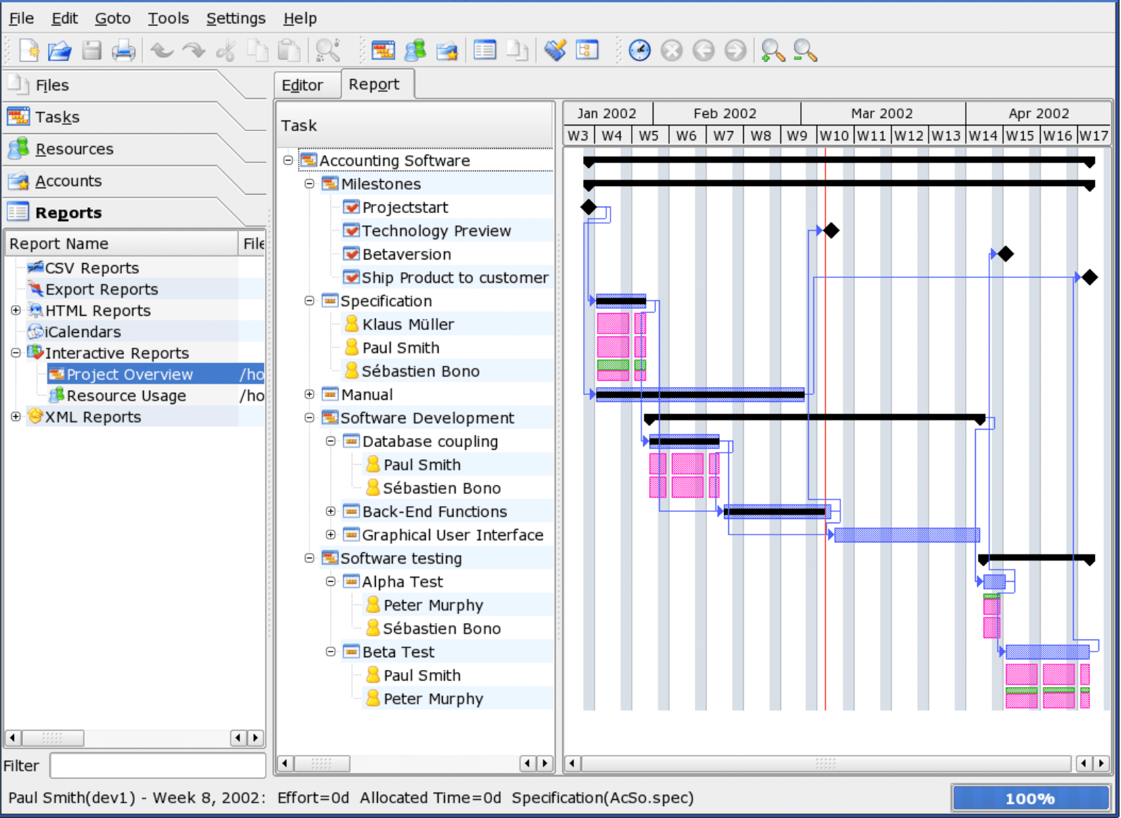
You know that feeling when you open a software and you don't know what it's about? It's bad or no UX data management design. Source: Wikimedia Commons
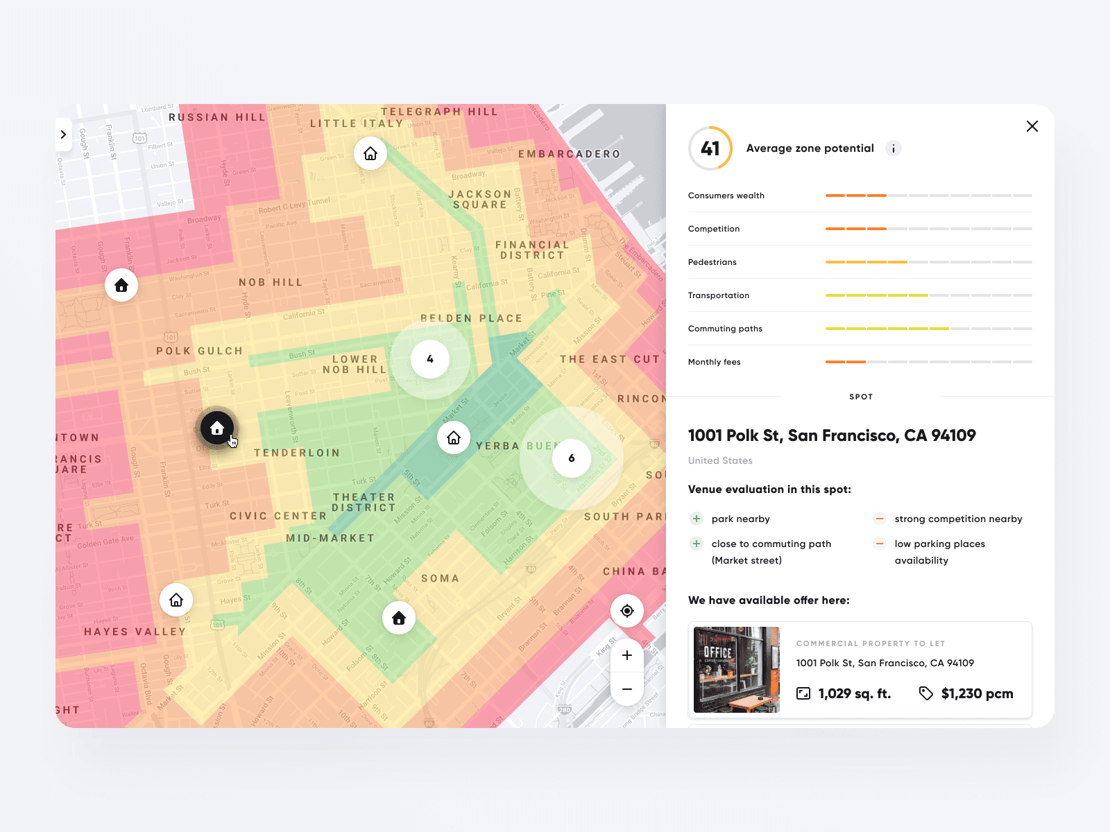
There are many advanced data management tools on the market. However, only a few of them consider big data UX, which means ease of use. The user interface is one of the essential features of an application or website. That is why we propose to their authors a strategy and research to make it as easy to use as possible. You can create the user interface design process in three steps:
1. Get to know the client and his industry thoroughly
These are often highly specialized solutions aimed at the B2B market. You can't create a data presentation interface and search mechanisms well without a deep understanding of the industry.
Ask
No one expects that you will be an expert in a specific client's industry - don't be afraid to ask even simple questions. It's nothing unusual that a client forgets about this fact and assumes you understand everything. From specialised terms used by other stakeholders to business characteristics and principles. You don't understand? Ask a question. Think you understand? Rephrase it and check if the client thinks alike and operates within the exact definition.
Learn the language
Starting from analyzing all business/branch-related terms, abbreviations, or jargon - you have to know the specialized language used by our clients and their users. It will help build more natural messages, descriptions, and labels.
Make a choice
Usually, the business's initial approach is to show everything. The more numbers in the charts, diagrams, and dashboards, the merrier… Well, not here. Suppose you're about to design something useful and valuable for end-users. In that case, you can't just throw all the numbers into the pot and expect the data to be readable. Make a data triage and determine which data is the most critical, high priority to be displayed. And which are only supportive ones that shouldn't shout to the user from the start.
Understand
You have to understand your client's numbers - get familiar with every business-specific notation, check and learn them. The sooner you know the data, the better, especially since the beginning of the project is the perfect moment to ask many questions about them.

2. Analyze the user in detail
The next step after getting to know the industry - you need to find out the answers to questions such as: who is the user of the system, where will they use it (an office with a few dozen inch monitor or a laptop on a construction site, or maybe a smartphone), what are they looking for, what is their business problem, what is important to them, etc.).
Perform a session
The holy grail here is to perform shadowing sessions with real users to see the user-product context, but it's not always possible… Conduct analysis based on the customer's vision. Try to reach the users at least with a survey or other less time-consuming (for the user, of course) techniques and get to know them better.
Create a hypothesis
Data management tools are pretty complex, and starting user research directly with the end-users won't help you focus on the most critical elements. A good practice is to know the business' user perception and create some assumptions and hypotheses that would be validated and challenged later with the users - so business first, users later.
Reuse
If the project is about redesign - try not to reinvent the wheel. Reuse some interface elements that most of the users are familiar with. Working with highly specialized products, you will fight with users' habits sooner or later, so try not to fight fiercely over minor functions that everyone knows well and are comfortable with.
Find a solution
At the same time, try to find every pain point of the actual interface or the lack of one to fight most of the users' problems. Find one unified solution to avoid ending with high interface customizability. Most users will stay with the default rendered interface rather than fiddle with additional options and customizations. The better you understand your personas, the fewer options, versions, and settings you would need.
Check
Check if the numbers and data created by the company are easily readable by their end-users. It happens that the company thinks that their data presentation is clear for their clients. In fact, they don't raise any tickets or suggestions on this matter. Clients often filter received data through their own-made excel sheets to get the easy-to-interpret information, where errors are included.

3. Data compilation for the end user
Based on the previously collected information, create:
- method of data presentation,
- search engine,
- filters,
- forms of visualization (maps, charts, thumbnails).
It isn't easy because, on the one hand, there is a lot of data in the system; on the other, showing too much data at once makes the image unreadable. On top of this, take care of the issue of speed of access to data, and in the case of applications using large data sets, the risk of a situation where the system gets slow is very high.
Sounds simple? Not really, because these three points include several to a dozen or so weeks of hard work. But we know that it is worth investing this time to achieve great results and free up data in your organization.
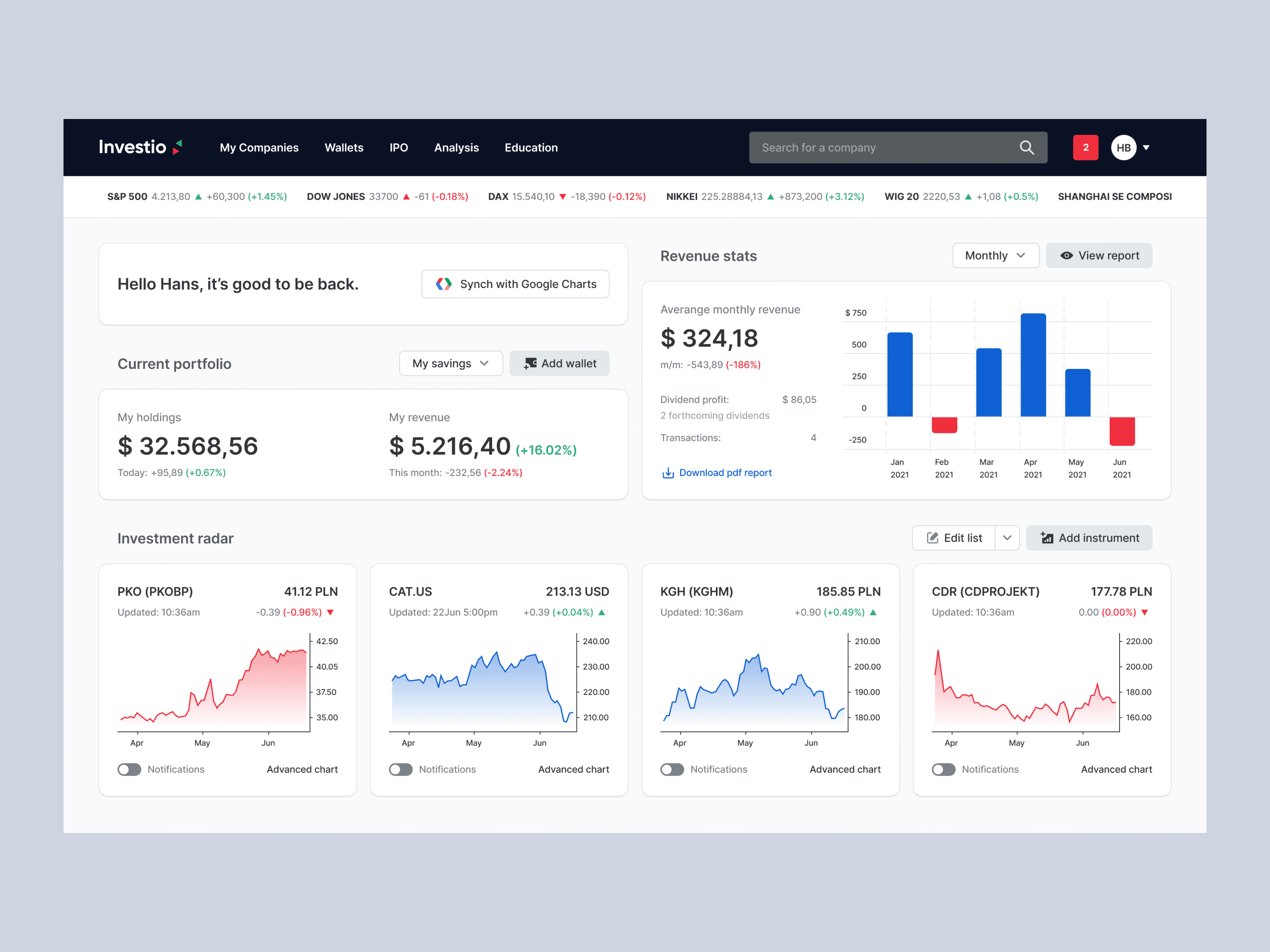
Example of user interface we designed. For more check out our dribbble.
Why do companies need Big Data User Experience?

The growing amount of data meant a need to generate more and more analyses and reports. Therefore, analysis departments have appeared in large organizations, staffed by people with considerable technical knowledge of software and analytical competencies - data managers and analysts.
At the request of the business departments, the analysis staff generates reports answering the questions with the help of complex-to-use applications. The software is often unintuitive because teams of programmers developed it without user experience designers.
The developers often assume that business applications are used by professionals who can handle them, so there is no need for user experience design. They do not support the user in using data (e.g., they do not have a hint mechanism, they do not correct users' mistakes), and using them is practically impossible without proper training.
However, this solution has its limitations: business departments have to wait for their reports due to the workload of the analysis department. Information is not immediately available; sometimes, you have to wait for them even several days, depending on your workload.
If only big data analytics experts have access to the data, using it creatively diminishes dramatically. People working directly in marketing or production departments could generate reports independently and experiment with them - change the scope of analyzed data, look for new relationships, etc. They can read more from them than analysts. Some of the data may be needed immediately, directly in the production plant, on the construction site, or in any other place where business operations are conducted.
Examples from our work
Geospatial data management
We have had the opportunity to design interfaces for several digital projects in the consumer market.
Designing the way data is presented democratizes access to it within an organization. Analytics departments still have a lot of work to do, as they are responsible for the quality of the data collected, creating advanced reports and analyses. Still, they don't have to answer every user query, even the smallest ones.
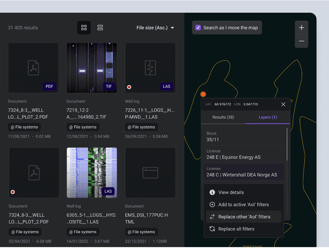
Our main task was to organize the chaos related to data aggregation from multiple sources
One of our most exciting projects was designing and developing a method of data presentation in an application providing geospatial data. This data is needed to explore and identify attractive natural resource locations.
The software is a very advanced tool integrating structured and unstructured data needed in prospecting for raw materials.
The application has great possibilities, and its recipients have been the only data managers who have been able to handle it. It has also been a challenge to present data from GIS (geographical information systems) with other data. Users struggled to find the optimum number of data to display on a single graph so that it was easy to read.
The new interface has significantly simplified the use of the application. It has made it accessible to its target users, i.e., the geologists responsible for the project. They no longer have to wait for data managers to find time to prepare the necessary report.
How to manage data on 150,000 items?
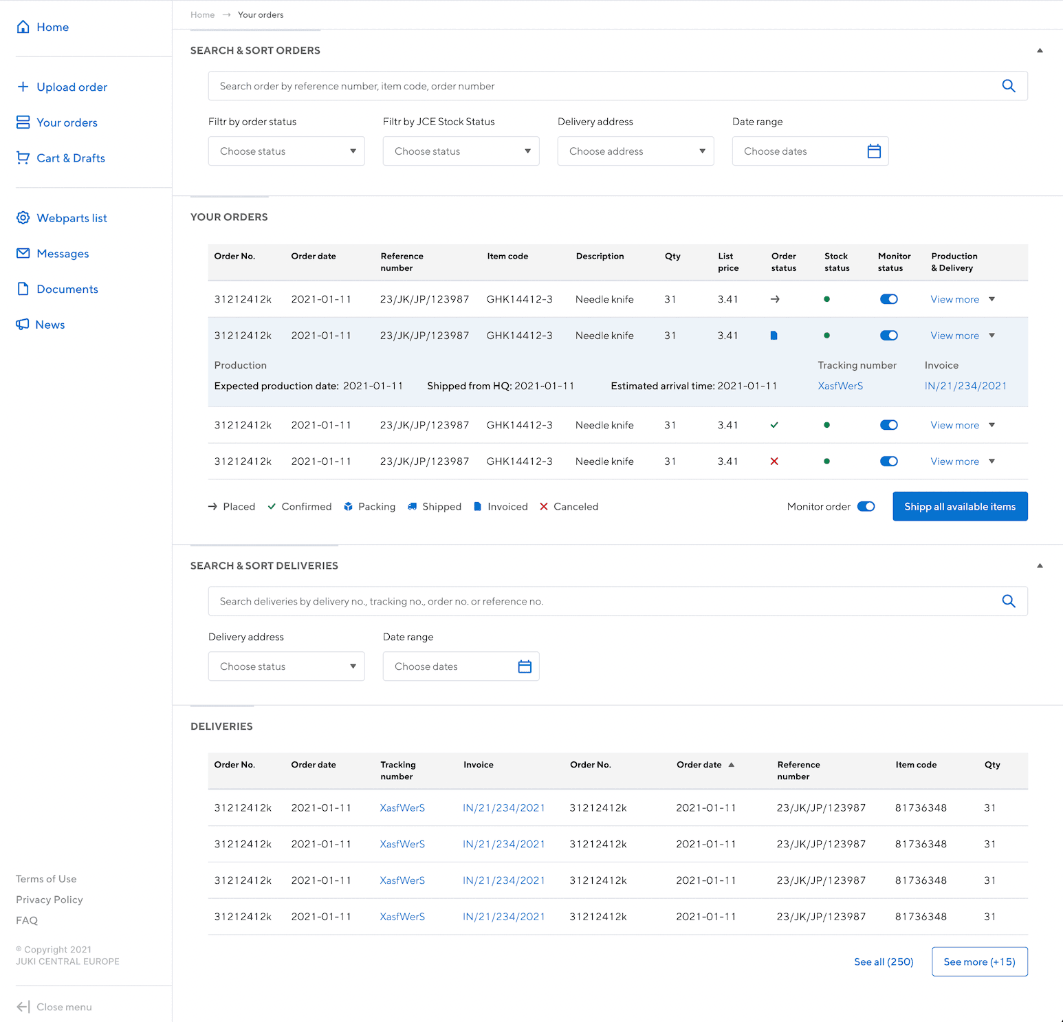
A big challenge was creating a clear and user-friendly presentation of the technical parameters of products - features, functions, accessories, and instructions.
Another project we have completed is an after-sales system for an international factory equipment supplier. The advanced equipment it supplies consists of thousands of parts and, during intensive operation, requires servicing and replacement of worn-out components.
An advanced system that helps navigate through information on 150,000 components. It allows the collection and synchronization of data from multiple sources. The search engine allows both simple and more advanced searching and filtering results. Essential is the suggestion system, which recommends additional items that may fit the order.
The application in its original form was complicated to use, which meant that customers had to contact company representatives to place an order. We designed the application to make it available to customers so that they could place orders on their own.
Our experience building e-commerce sites came in handy, but this type of B2B project has its characteristics. Few people will browse through all the resources in a given category in the same way as consumers browse through the content of online shops. The critical information for each part they are looking for will be whether it fits a specific model.
Image by Lukas Blazek

