The app used by thousands of parcel delivery drivers 8h a day
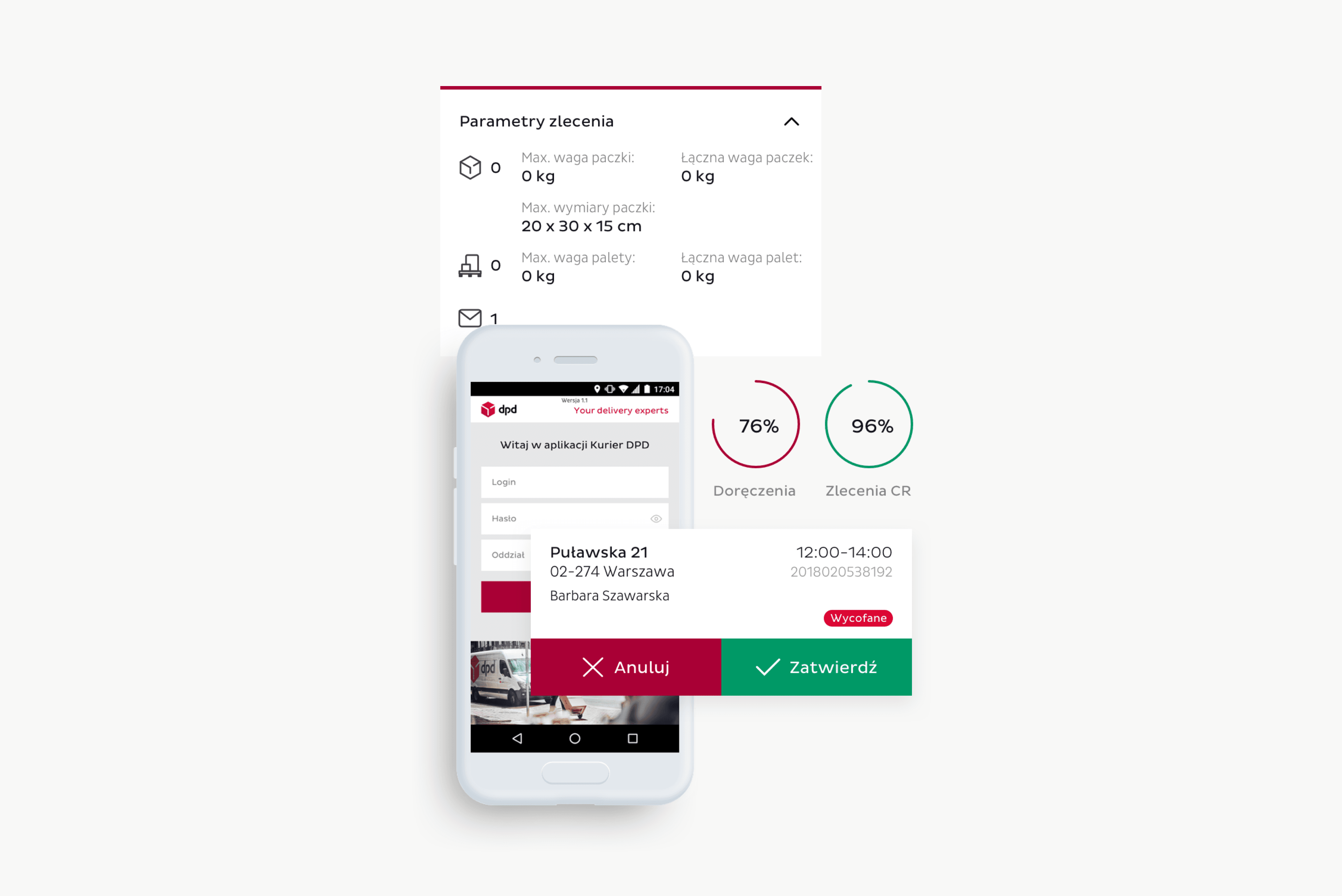
Overview
DPD Polska is a leading force in European parcel delivery and e-commerce solutions. The company, which operates under the Geopost umbrella, is committed to providing first-class services to both senders and recipients while at the same time committing to environmentally neutral practices. With 9,000 couriers in daily contact with customers, DPD Polska delivers thousands of parcels daily – sometimes to very remote locations, in harsh weather conditions, and consistently facing tight deadlines.
Recognising the unique challenges couriers face operating handheld terminals, DPD identified the need for a robust application that would streamline the courier tasks and ensure the efficient collection and delivery of parcels. The planned application was not just a technological solution but a practical business tool tailored to employees' specific needs. It was to provide various functions such as route optimisation, real-time parcel tracking and improved customer service, thus increasing the overall efficiency of parcel delivery at DPD.
The Challenge
Couriers relying on the app often work in challenging conditions, like rain, snow, freezing temperatures, or complete darkness. The application must seamlessly function in these adverse weather and lighting scenarios. Additionally, it needs to operate in diverse locations, sometimes with no network coverage.
Simultaneously, the app should address many essential functions, including parcel services, customer support, signature handling, claims processing, pickup point management, working time tracking, and courier performance statistics. Being that complex, it must be easy to use not just by people familiar with advanced technology, readable and adjusted to users’ gender and age.
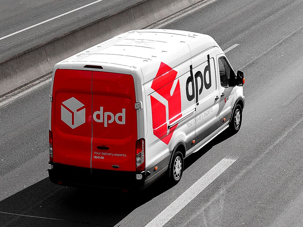
The DPD couriers lacked a reliable tool tailored to their needs and working conditions.
Many processes were unserved or required a lot of user attention. Lack of essential services such as route optimisation and a supportive design that would make couriers' work more efficient.
A new all-in-one, useful app tailored specifically for couriers with intuitive UX/UI design.
Over 400 pages covering 40 core workflows, no matter the conditions. The app is based on Android, which makes it easy to adopt users’ habits from general apps.
work processes covered
pages covering core workflows
Our work
Design matching hardware
The starting point for the whole process was the introduction of new hardware for couriers. DPD decided to equip the couriers with terminals with the Android system, a perfect basis for developing a reliable Android application for handheld devices and smartphones.
We had the opportunity to observe the testing of the hardware devices, which immediately made us more aware of the working conditions of the couriers. During the tests, the devices are exposed to cold and hot temperatures, scratched and flooded with water to test their resistance in extreme conditions. Seeing the team throw, smash and put terminals in freezers did give us a thought about the working environment of couriers.
The choice of device also influenced UI – we had to adapt the app and its resolution to the screen of the chosen device.
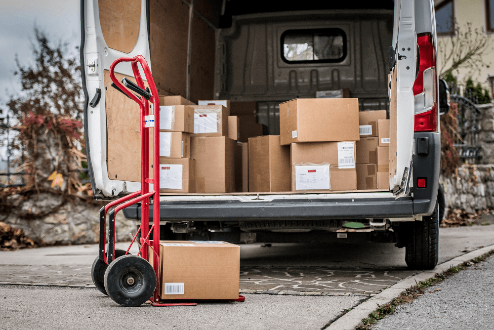
Translating business requirements into functional ideas
Our client had created an extensive business analysis and requirements for the app, consisting of several hundred pages of documentation. Our task was to translate these requirements into functional ideas. The client’s team guided us through the documentation page by page and module by module so that we could understand the specifics of the industry.
We also studied the industry jargon, terminology and expertise about the courier, express and parcel industry (CEP). This was no easy task because at DPD, a “parcel” can have many different names depending on size, type and other factors. It took us a while to dive into the client’s world and create a practical dictionary.
We also mapped the entire and very complex process of the parcel journey, from order to delivery. As it was a business tool, we were determined to capture the essence of couriers’ work and support them in their demanding daily tasks.
Weekly sprints and iterations of the app
We worked onsite with our client’s team in weekly sprints to create app mockups. We showed what we had done each week, discussed it and introduced improvements – it was a purely iterative process. This way, we created a UX /UI design of over 400 pages covering over 40 core processes.
GPS support and optimising the routes of couriers
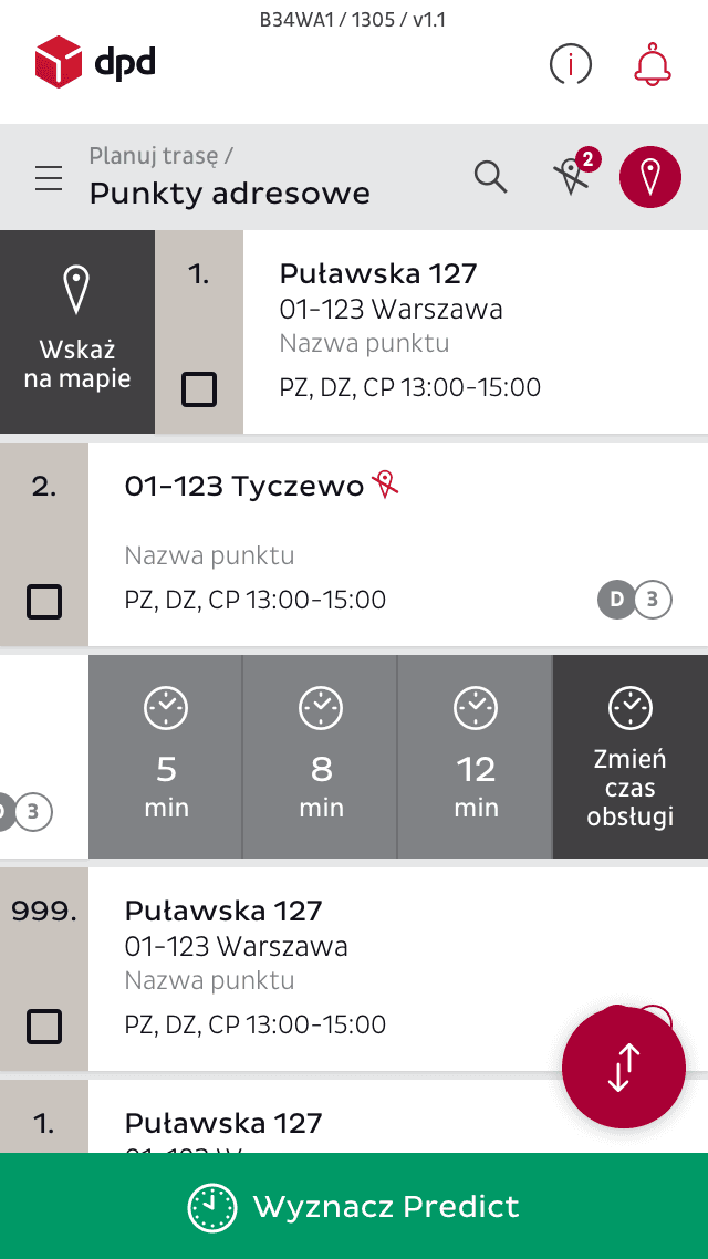
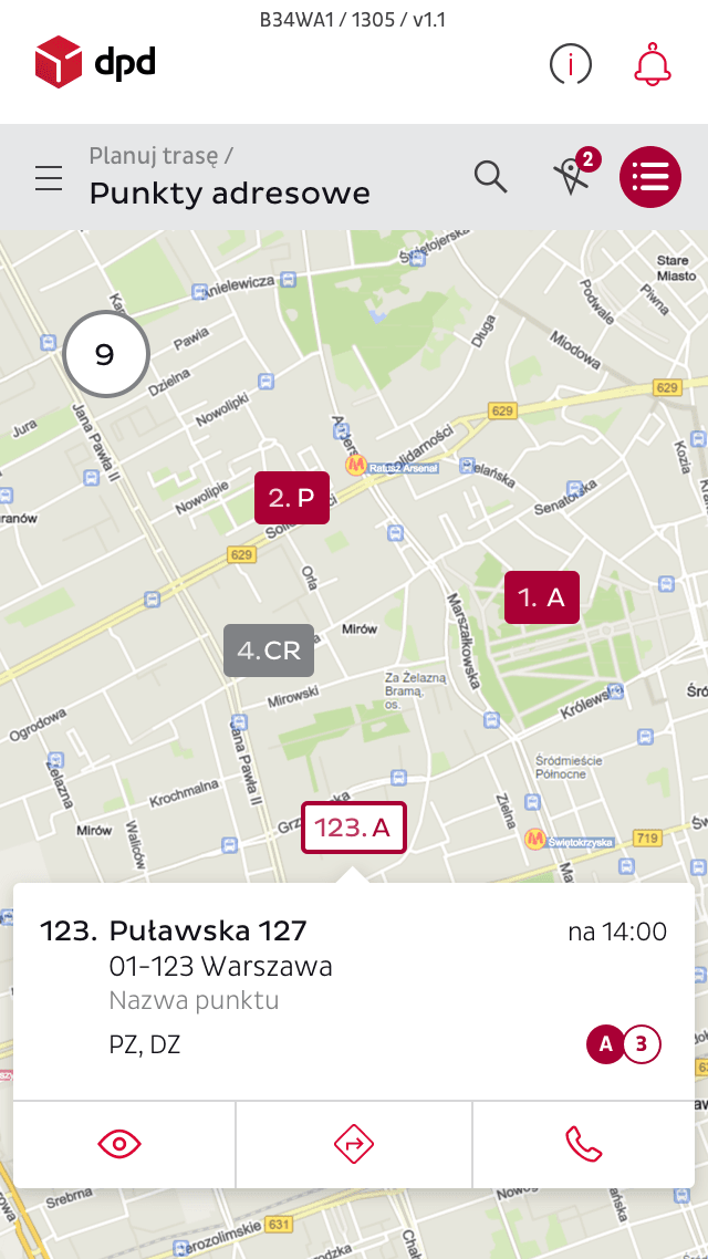
One of the functions we have developed is the optimisation of couriers’ routes. On average, a courier has to deliver dozens or even hundreds of parcels every day, each with a different address and delivery time. The app collected all the data, including location, time and fuel efficiency, and plotted an optimal route.
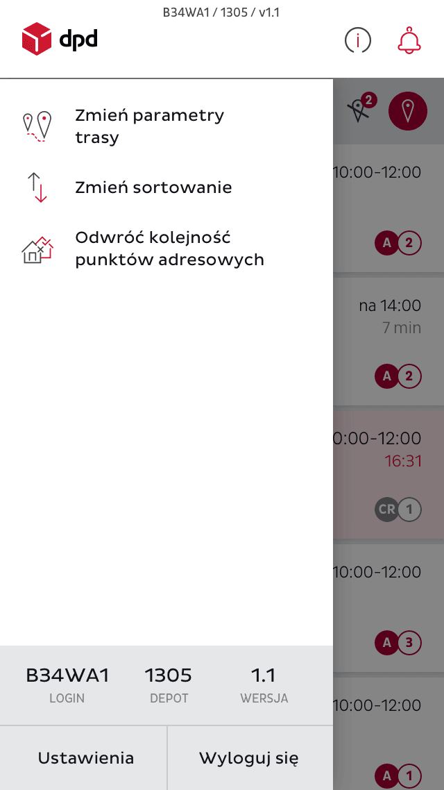
Exploiting the possibilities of the device
As mentioned earlier, we developed the app with the device most couriers use in mind and decided to take advantage of its features.
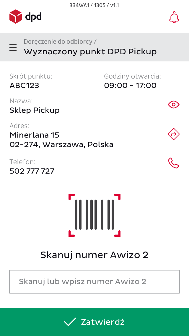
For example, as many couriers work at night, we decided to turn on the flashlight every time a courier scans a barcode on a parcel to improve and speed up the process. In addition, the device is used for the signature of the parcel recipient – to simplify the process, it is sufficient to sign with the finger (additional pens are not required).
We were also aware that couriers sometimes deliver parcels to locations that don't have cellular reception – so the app worked offline, and once coverage was restored, all data was updated.
Handling multiple workflows
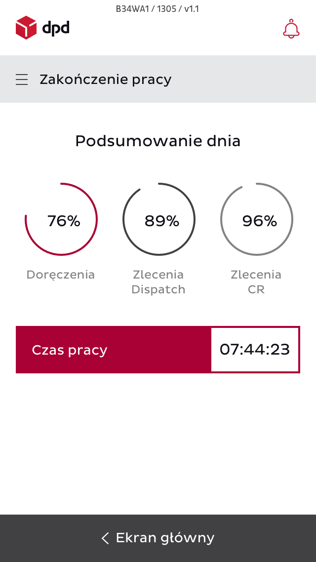
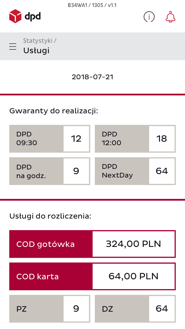
As the app was to be the main work tool for the couriers, many processes were handled through it. We aimed to enable users to do as many tasks as possible through one app and one device. Besides the parcel delivery process, the app can also be used to report a damaged parcel, check, report and account for working hours, which is the basis for remuneration. It also supports payments by monitoring parcel costs and transactions.
Adaptation to the specific needs of users
We had to take into account that we designed a work tool used mainly by men in difficult conditions. The app had to be clear and concise, even if the screen was wet or fogged. The “beauty” of the app was secondary – we needed high contrast, bright colours, visible and large buttons that were easy to press for a grown man wearing gloves. At the same time, we wanted to keep DPD’s style, guidelines and colours. The app also needed to be intuitive and easy to use by all ages with different levels of technical knowledge.
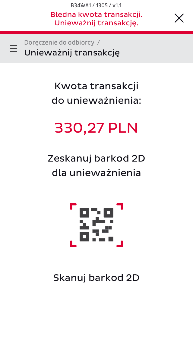
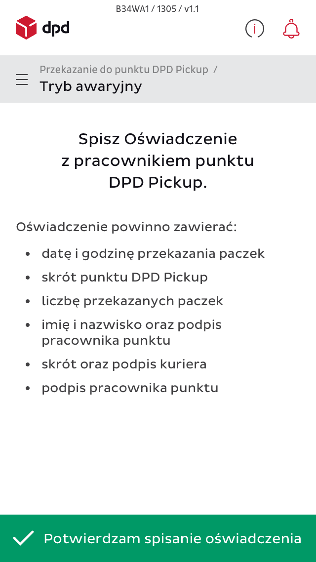
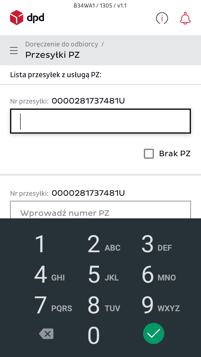
We created one central work tool for couriers that covered all key workflows and matched specific hardware requirements.
work processes covered
pages covering core workflows
What we’ve learned:
Creating a comprehensive dictionary and mapping the entire process was crucial for developing a tool that truly supported couriers in their daily tasks.
Working on-site with the client's team in weekly sprints, allowed for continuous feedback and iterative improvements.
Using the device's features, like activating the flashlight during barcode scanning, showcased the value of maximizing the technology's potential to boost UX.
Striking a balance between offering a wide range of functionalities and maintaining simplicity and ease of use was crucial.
Incorporating habits from classic Android apps and adhering to Google's best practices streamlined user familiarity and optimized the app's performance.
For us, the project demonstrated the value of creating tools that effectively support users in their day-to-day tasks and enhance productivity in a working environment.
