Modern technology can help geologists search for oil offshore

Overview
Kadme is one of the leading software vendors in the hydrocarbons industry. Their tools help many big companies with data management. Kadme uses top-notch technologies such as machine learning, cloud computing, and artificial intelligence. There are apps designed mostly for data specialists and analysts within their portfolio.
But what about geologists and field experts who are fed up with wandering through the maze of numbers, tables, and narrow-specialized interfaces? Kadme needed a brand new application that would be dedicated to this yet unaddressed group.
The Challenge
Geologists' potential is limited by the data manager's availability and the complexity of existing software. The bottleneck affects both the speed and the scope of data analysis. Our goal was to build an app that brings fresh opportunities to the E&P industry by freeing geologists' creativity.
The cumbersome and complicated tool is dedicated to a narrow group of data managers.
A highly useful and usable new app is tailored primarily for geologists and field specialists with a significantly lower learning curve than the previous solution.
2-weeks design sprints, with no delays nor extra costs
components in Storybook allowing easy further development
Our work
To deliver tangible effect within a given time we had to manage an agile approach and focus on fast-paced increment deliverables.
Together, with our client, we’ve built a design team responsible for this project's first stage. Supported by the developers we could quickly verify our ideas and designs. But no project can start without doing:
Discovery phase first
During the intensive discovery phase we had to understand not only the user & business perspectives and needs, but also we went through the domain crash course. It is important to fully understand the specific language, concepts, definitions, and specialized knowledge about the industry.
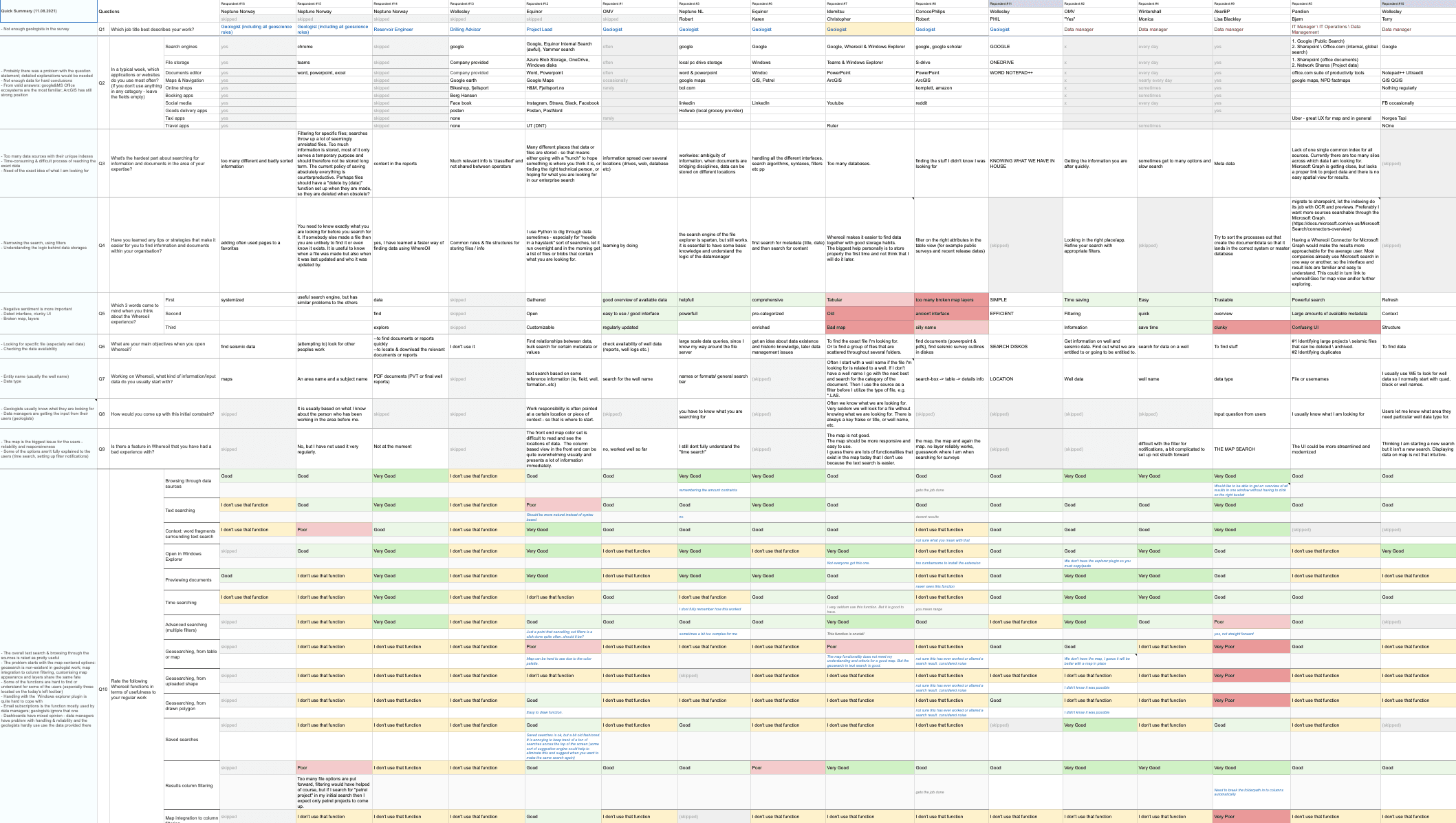
Thanks to our highly engaged client representatives, we could get to the users easily, but researching them was the tricky part. They were out of our reach, and we had to get creative here, using our client’s knowledge about them. Only questionnaire-survey methods were the acceptable way in that time.
Design in many, many iterations
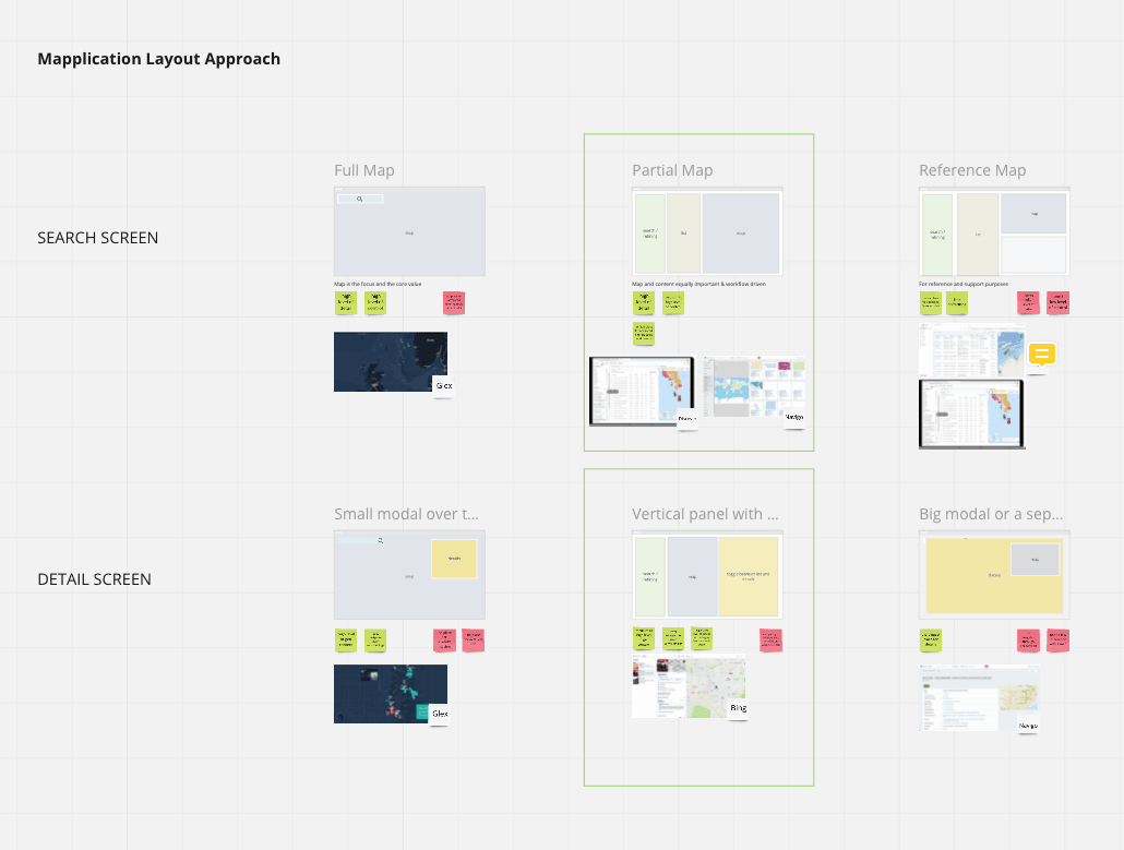
Considering the fact that we entered “terra incognita” and neither we nor the client had a clear idea of the general app layout, we decided to research possibilities but decide later. This led us to the “mapplication” concept, which means an app with the great importance of a map module.
We agreed to go for the Partial map idea among three defined approaches. We also assumed that the final decision could be only made after designing the main GUI components.
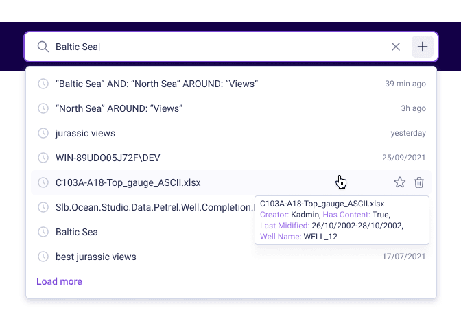
So we switched and dive deep into the processes and ways to complete them first. Our initial work with the interface looked more like creating building blocks rather than a complete design. Those isolated elements were heavily tested and validated internally with the client’s representatives before putting them into a full-page mockup.
All of the UI components were “translated” into React.js library in Storybook.
Iteration after iteration, we maintained the high usability of those single elements alone as well as the whole system interface, once it was started to be put together. We had to be sure that our project is intuitive and easy to use within many various use case scenarios. Our tool could be used not only on a modern desktop computer inside a calm, cozy office but also on a heavy-duty tablet in foul weather on an oil platform.
Work with data
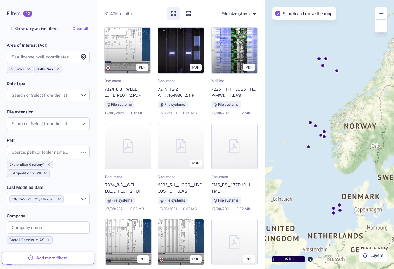
Our aim was to design a system that helps users search through vast amounts of unstructured data, files, and entities aggregated from multiple sources. Each element could contain different information, therefore, we defined the hierarchy and logic, and how those should be displayed without overloading the interface. It couldn’t be a better spreadsheet editor!
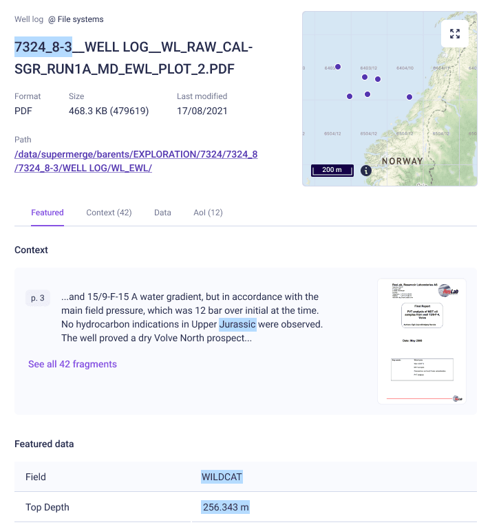
Our main focal point here was to provide visual helpers for quicker orientation (such as a hierarchy for the most important elements with ‘data sources’ or ‘extensions’ standing out) and to make decisions easier at the first glance. We knew that without good search logic we won’t be able to help users dig through millions of results.
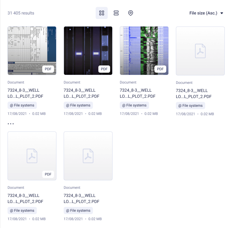
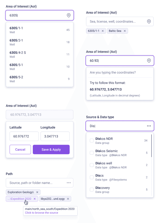
We stick to the search-centered design with a powerful search engine that would allow the user to construct complex queries (using boolean and quasi-regex techniques), boosted with a wide range of filters to narrow down the results.
The map experience
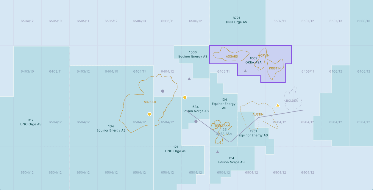
A spatial context is of great value to geologists’ exploration process. Our first rule for map designing was about treating this module as complementary to the rest of the interface, rather than being the first area for interactions. Focusing only on the most important elements we haven’t overloaded the map with each data possible (although it was tempting:).
We worked around major use cases and served as minimal information as needed within the context of the user’s searches. That kind of responsiveness allowed us to avoid potential struggles with hard-to-read maps and huge variations of colors and elements there, speaking of which: we still had to be careful about using shapes, lines, and a limited color palette. It wasn’t easy to come up with usable and eye-appealing colors, because the system we designed would be rendered in one of the three color themes.
Finally, it wouldn’t be an exaggeration to believe we have acquired new competencies in the field of GIS design and data visualization!
Working with color themes
Having the system just recolored into another palette is fairly easy. The challenge starts where the palette has its purpose and specific usage context - that’s what happened with our project.
The idea was to provide a dark theme as an option for our original design. Some of the specialists work in rather dark surroundings, and a bright, fairly whitish interface would quickly tire one's eyes. Using a dark theme the problem is easily solved.
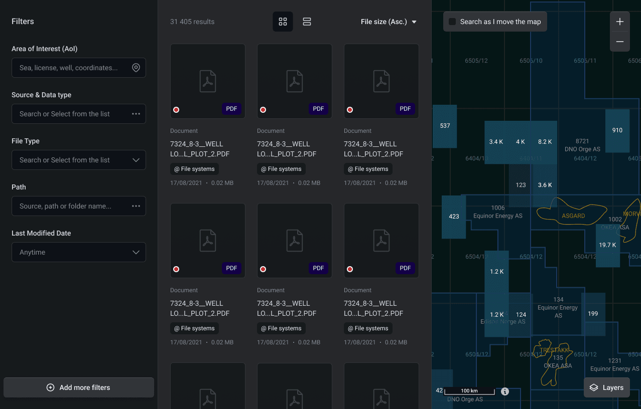
Because we thought about various color usage and themes from the start (which ended with quasi-guidelines and rules creation), organizing a new color palette for spatial data on a map was even easier.
Color-blindness accessibility challenge
One of the biggest challenges was to prepare a unique theme for users with color vision deficiencies (deuteranopia and protanopia).
Initially, we went through heavy research. It wasn’t obvious how we should present some of the information on a map in such cases. We finished in countless iterations, from looking for one, proven answer on the web and various accessibility organizations to checking every possible map scenario and competition’s solutions on that matter. With the help of tools simulating vision deficiencies, we changed the colors one by one.
Finally, we used a dark theme for the base map layer and a light theme for the rest of the interface, because we could get a better contrast there.
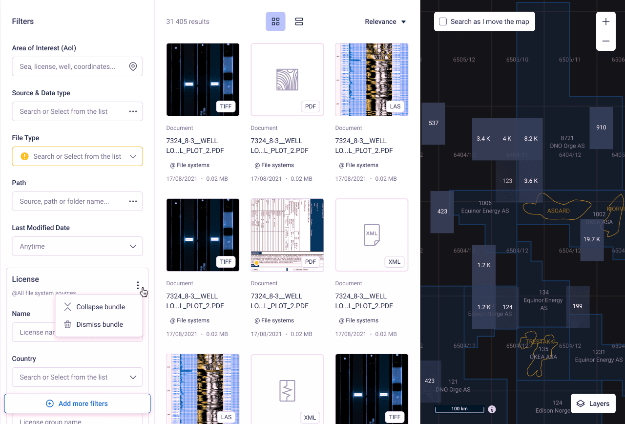
We knew that using a mix of the light and dark themes within one version would be against the idea of having themes suited to different lit surroundings, as mentioned before, but we couldn’t please everyone in our MVP. We wanted to achieve flawless interface readability first.
The design stage is done (Feb 2022), and development is in progress. We can’t wait for the user testing phase when more iterations and changes might be needed.
2-weeks design sprints, with no delays nor extra costs
components in Storybook allowing easy further development
great opinion of a satisfied client
Define the MVP scope accordingly to the given time. Time is a great restriction for the temptation of work increase.
Going from few to many is the best path for the MVP approach. It’s usually easier to add an option than to remove one.
Don’t be afraid of sacrificing perfection and swap it with “good enough” ideas.
Designing without the bigger picture of the interface can be tricky, but not impossible. It might be helpful when you are not sure about the general layout of the app at the beginning.
Data visualization is even harder when dealing with unstructured data. Information pieces have little in common so you have to go for versatility and flexibility rather than complex patterns.
Skilled designers and product owners must know when to stop discussing and searching for the best solution and move the final decision to the user testing stage.

