Interactive migration data application for addressing climate change impacts on human mobility and poverty

Overview
This case study examines the collaboration between our team and the Luxembourg Institute of Socio-Economic Research (LISER) to develop an interactive map-application to visualize migration patterns influenced by climate change. The application aims to aid researchers and policymakers in understanding migration trends and making informed decisions based on detailed, accessible data.
Its core was to create an intuitive, map-based, and scalable visualization tool to present migration data effectively. This enabled LISER to leverage its extensive data and algorithms for better decision-making and stakeholder engagement.
About LISER
LISER is dedicated to high-quality research in social sciences. Its Information Systems (IS) platform supports LISER's research activities by providing a robust, innovative, scalable data and IT infrastructure. The platform integrates privacy-by-design principles, ensuring privacy considerations are embedded into the system from the outset. This approach ensures the data's security, integrity, and privacy, making it a trusted resource for researchers and policymakers.
LISER focuses its research on understanding and addressing the significant challenges of cross-border movements driven by EU free movement policies, political instability, climate change, and global inequality. Their studies aim to assess migration patterns, analyze economic and societal impacts, develop projection tools, and create databases to support stakeholders in policymaking and societal decisions.
The Challenge
The primary challenge was to develop a pilot that could effectively display outcomes of simulations predicting future migration and poverty driven by climate change on a dashboard. This involved several complex factors:
- Integrating sophisticated algorithms projecting climate caused migration and poverty, based on IPCC scenarios.
- Presenting the data in a user-friendly, map-oriented system that was not purely GIS-based but included data filtering capabilities.
- Creating a functional POC (Proof of Concept) to demonstrate the system’s potential and lay the foundation for the full version. From the outset, we aimed to think more broadly, beyond just an MVP (minimum viable product).
- Addressing the lack of direct user feedback, as interactions were primarily with user representatives. The pilot phase did not allow for the target user extensive research context; the discovery stage was based on the knowledge and perception of representatives of these groups.
The client had raw data and algorithms but could not visualize or present the information effectively. There was no existing map or visual representation of the migration data, and the initial blueprint was cumbersome, making it impractical to display the data.
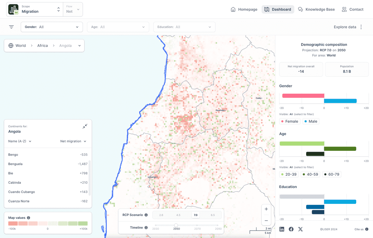
A fast, user-friendly map-based visualization tool which allows for detailed data filtering, supporting decision-makers in local governments. The prototype is minimalistic and clear, avoiding information overload, and designed to be easily scalable for future expansions.
The system handles approximately 2.3 million pixels on the map, each representing a 5x5 km area across the globe.
The project was completed in about two months, an impressive timeframe for such a non-standard and complex undertaking.
See the results of our work! Here's the live application.
Our Work
Discovery and planning
Our project commenced with an intensive discovery phase to thoroughly understand the stakeholders’ needs and the complexity of the data. This was particularly interesting for us, because we had a chance to collaborate with researchers. This phase involved rapid requirements and insights gathering, allowing us to transition quickly to the design and development stages.
Design
In the design phase, we created a test background for data presentation on the map, which facilitated rapid prototyping and proofing. We strongly emphasized a minimalistic and clean UI/UX design to prevent user fatigue and avoid information overload. Our approach led to the development of a contextual and scalable interface that adapts to various data inputs, ensuring the system's long-term usability and relevance.
The application we designed is an interactive map where each pixel represents a 5x5 km area. The map uses colors to indicate migration trends, showing increases or decreases in population. In addition to visualizing migration patterns, the map incorporates socio-demographic data such as age, gender, and education level of migrants. This allows users, including government officials and scientists, to see detailed information about who is migrating and to where.

The system supports comprehensive filtering options, enabling users to isolate specific demographics and understand the underlying trends. This capability is particularly useful for decision-makers in local governments who need to determine where to invest resources, which areas require attention, and what policies might help minimize climate-induced migration.
Development
The development phase of the LISER project was initiated almost immediately, with a strong emphasis on holistic collaboration with the design team. This close cooperation allowed us to implement essential features and ensured that the system would meet the diverse needs of its users.
Initial development and feature implementation
Our initial development efforts focused on integrating fundamental features such as data filtering, breadcrumbs for navigation, and collapsible modules to maximize map visibility. We aimed to create a user-friendly interface that offered multiple methods for accessing specific data regions, catering to diverse user preferences. Users could access information through various pathways: zooming in on the map, using a drop-down menu, or selecting data from a side table. This redundancy ensured that both visual and structured navigation were equally supported, making it easy for users to find the information they needed.
Data processing and optimization
The application architecture utilized Next.js and Tileserver-gl. The client's data was provided in TIFF files with metadata, a format unsuitable for direct web display due to its size, often several hundred MBs. To optimize performance, we preprocessed this data into the .mbtiles format and precomputed as much information as possible. This preprocessing significantly reduced the number of operations required on the browser side, enhancing application speed and efficiency.
Key optimization steps included converting shapefile data into GeoJSON format, simplifying geographic coordinates to reduce file size, and assigning administrative units to each map pixel. These steps minimized the need for additional calculations on the browser side and allowed for efficient data filtering. We also pre-calculated pixel colors, enabling fast and smooth map rendering. The final transformation of the data into the .mbtiles format ensured efficient storage and fast rendering of large map datasets.
GeoJSON and MBTiles formats
GeoJSON is a popular file format for encoding geographic data, based on JSON (JavaScript Object Notation). It is widely used in web applications for visualizing spatial data and supports various types of geometric data, such as points, lines, and polygons, along with their attributes. GeoJSON's flexibility and compatibility make it an ideal choice for web-based mapping applications.
MBTiles, on the other hand, is a format based on SQLite, designed for storing map tiles in an organized and compressed manner. This format allows large sets of cartographic data to be efficiently stored in a single file, facilitating easy management and fast rendering of maps. The use of MBTiles was crucial for handling the extensive data sets required by the LISER project, ensuring smooth and efficient map performance.
Custom map interactions
One of the client's specific requests was to customize the default behavior of the map when zooming, clicking on elements, and other interactions. Deck.gl facilitated these customizations while maintaining excellent performance. This flexibility was crucial for meeting the client's requirements and enhancing the user experience.
The primary challenges during development were selecting the right technology stack, optimizing application load times, and ensuring efficient operations on the maps. Our choice of deck.gl, along with the preprocessing of data into .mbtiles and GeoJSON formats, proved essential in overcoming these challenges. These decisions enabled us to create a responsive, high-performance mapping application that met the client's needs and expectations.
The development phase of the LISER project was a comprehensive effort that involved careful planning, technological innovation, and a strong emphasis on user experience. By addressing the project's challenges head-on and leveraging the strengths of our chosen technologies, we successfully delivered a robust and scalable mapping solution.

UI/UX considerations
UI/UX considerations were central to our approach, focusing on creating a user-friendly interface with minimalistic design elements. We ensured the system could handle detailed socio-demographic data, such as enabling comprehensive analysis for decision-makers. An intuitive navigation system with robust search capabilities and context-aware information displays was integral to our design.
Technical challenges
Throughout the project, we faced several technical challenges. One of them was developing a solution for displaying textual data on the interface without overwhelming users. We created scalable modules for sorting and displaying data by various criteria, and designed the interface to accommodate future growth in data volume and complexity. This includes the potential addition of more detailed demographic data, street-level information, and other relevant parameters.

Benefits for users
Our design philosophy was map-centric, ensuring that the map remained the focal point without being obscured by too much information. To achieve this, we implemented collapsible modules that conserve screen space, allowing the map to occupy as much of the display as possible. This approach provides a clean and efficient workspace for users, enhancing their ability to analyze data without distraction.
To further streamline the user experience, we incorporated group filtering options, reducing the time users spend interacting with the tool and lowering the learning curve. This feature allows for quick adjustments to data views, ensuring that users can isolate and examine specific data sets rapidly.
Our application stands out for its user-friendly interface, scalability, and comprehensive data integration, making it an invaluable tool for decision-makers and scientists. It supports sophisticated analysis and decision-making processes by providing clear, accessible, and detailed migration and socio-demographic data. The prototype successfully showcased complex data in an interactive map format, enabling users to easily navigate and explore vast datasets.
Results and learnings
One of the standout features of our application is its ability to manage and display an immense amount of data efficiently.
The system handles approximately 2.3 million pixels on the map, each representing a 5x5 km area across the globe.
The project was completed in about two months, an impressive timeframe for such a non-standard and complex undertaking.
What we have learned:
The rapid, iterative discovery processes significantly accelerated the project timeline, demonstrating the effectiveness of a startup-like approach in managing and executing large-scale projects.
A holistic, collaborative approach between design and development teams led to better synergy and robust solutions, ensuring that all aspects of the application worked seamlessly together.
Scalable design was crucial for accommodating future expansions, allowing the application to grow and adapt to new data requirements without compromising performance.
The focus on clarity, minimalism, and intuitive navigation resulted in a user-centric design that enhances the user experience. This approach ensured that the application remains accessible and easy to use for a wide range of users, from laypersons to experts.