How to clean up a back-office system at an online media giant?
Overview
Some projects make you feel like you’re working on a career milestone. We’re not planning to retire any time soon, but still it feels like Wirtualna Polska allows us to take advantage of everything we have learned and apply the vast experience we have gained in IT.
We’re talking about one of the biggest tech holdings in Central Europe. This company reaches nearly 21 million users (as of December 2021) who spend more than 70 million hours interacting with their news portals and services. 3,6 billion impressions each month. Sounds impressive? That’s Wirtualna Polska.
The Challenge
For the past 25 years, WP has been developing its own back-office systems (including editorial, advertising, and IT). They also manage numerous software applications obtained through acquisitions of other companies. As time went by, their ecosystem grew and became more and more complicated, which led to some maintenance issues and hindered further development, not to mention how it influenced user experience.
25-years-old legacy of dozens of apps. Each has a different look and unique way of operating. Business processes are dispersed through many systems.
A coherent back-office software ecosystem. Set of solutions that support the growth of existing and development of new tools.
first prizes in the Develop & Deliver and People’s Choice categories at DesignWays 2022
of users say the editor is intuitive upon first contact
of users positively evaluate the time they need to complete their tasks using the editor
decrease in the number of people who say the tool is faulty
coverage of editor components within the Design System
It took only 42h to design one of the applications, thanks to Design System components
Our work
For over four years of our cooperation, we took part in so many WP projects that we could probably make 10 case studies out of our entire history together. Although, in summary, its tens of thousands of hours of work, we will try to present it in short based on the most crucial achievements and milestones:
WP Blast
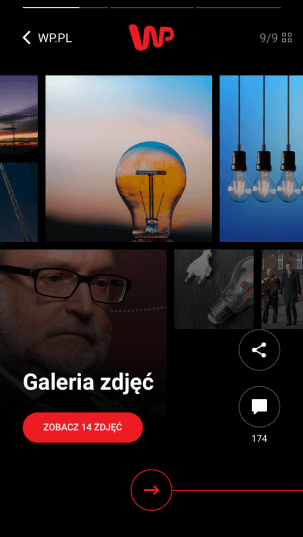
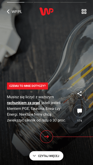
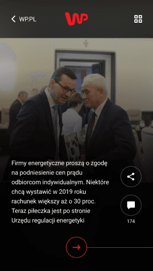
It all started in 2018. We have designed a proof of concept for an innovative format of online media consumption. It’s not news these days that the young generation of news consumers have incredibly different customs than older generations. Mobile, social media, apps, and multitasking are all elements of the daily routines of 18-25-year-olds.
We tried to balance out an avant-garde interface approach with a classic article format by creating a new concept practically from scratch. As a result, we created a design that allows the reader to become familiar with a preview of a news article or go deeper into details. Interactive navigation mechanisms follow market patterns (Instagram Story, Facebook, TikTok - which at the time was still called Musical.ly!).
Content editor
These days, at the heart of every media organization, lies their content editing software, a tool where journalists create their articles. You may associate it with some good old CMS and faulty solutions that only by name had anything to do with WYSIWYG (What You See Is What You Get)? That’s not what we mean. A modern content editor supports the process of creating multimedia-rich content following all SEO best practices and making it accessible to the intended audience. Another critical factor is the so-called TTP (Time to Publish). A leader in the news industry has to outpace the competition, right?
So, why do journalists love our tool?
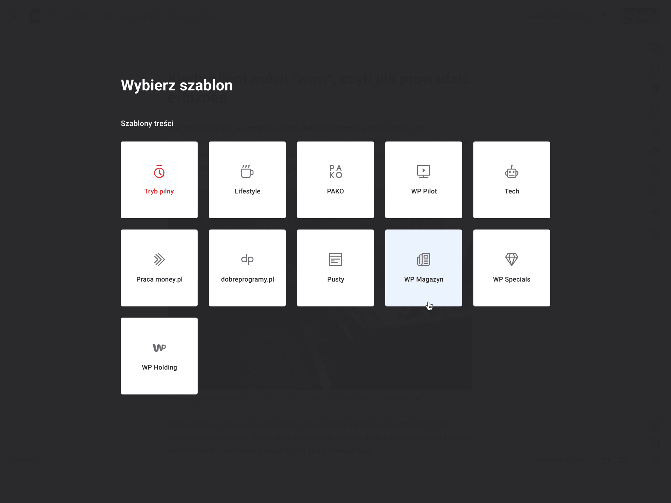
Templates , that adapt the tool to the planned content from the very beginning and speed up the creative process.
The use of local storage and the autosave feature eliminates the risk of losing any work done.
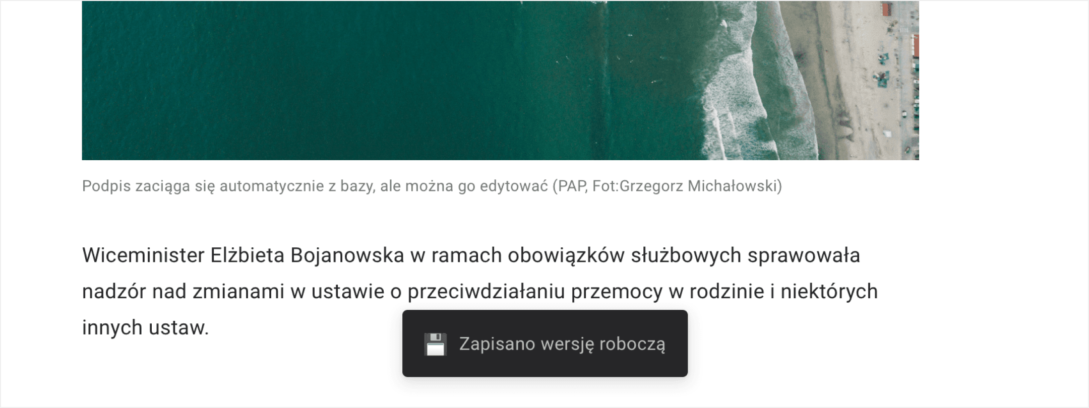
Content parts architecture – an article is created with the use of a rich multimedia component library: image, video, interactive galleries, social media posts, citations, specification tables, stock and currency exchange quotes, e-commerce components, event timelines, pros&cons, reviews, and many, many others. The CP library allows for creating truly engaging content for the contemporary reader!
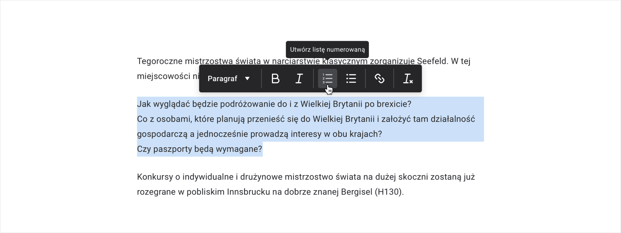
A comfortable text formatting panel allows for highlighting the key elements of created content and controlling the rhythm of the story.
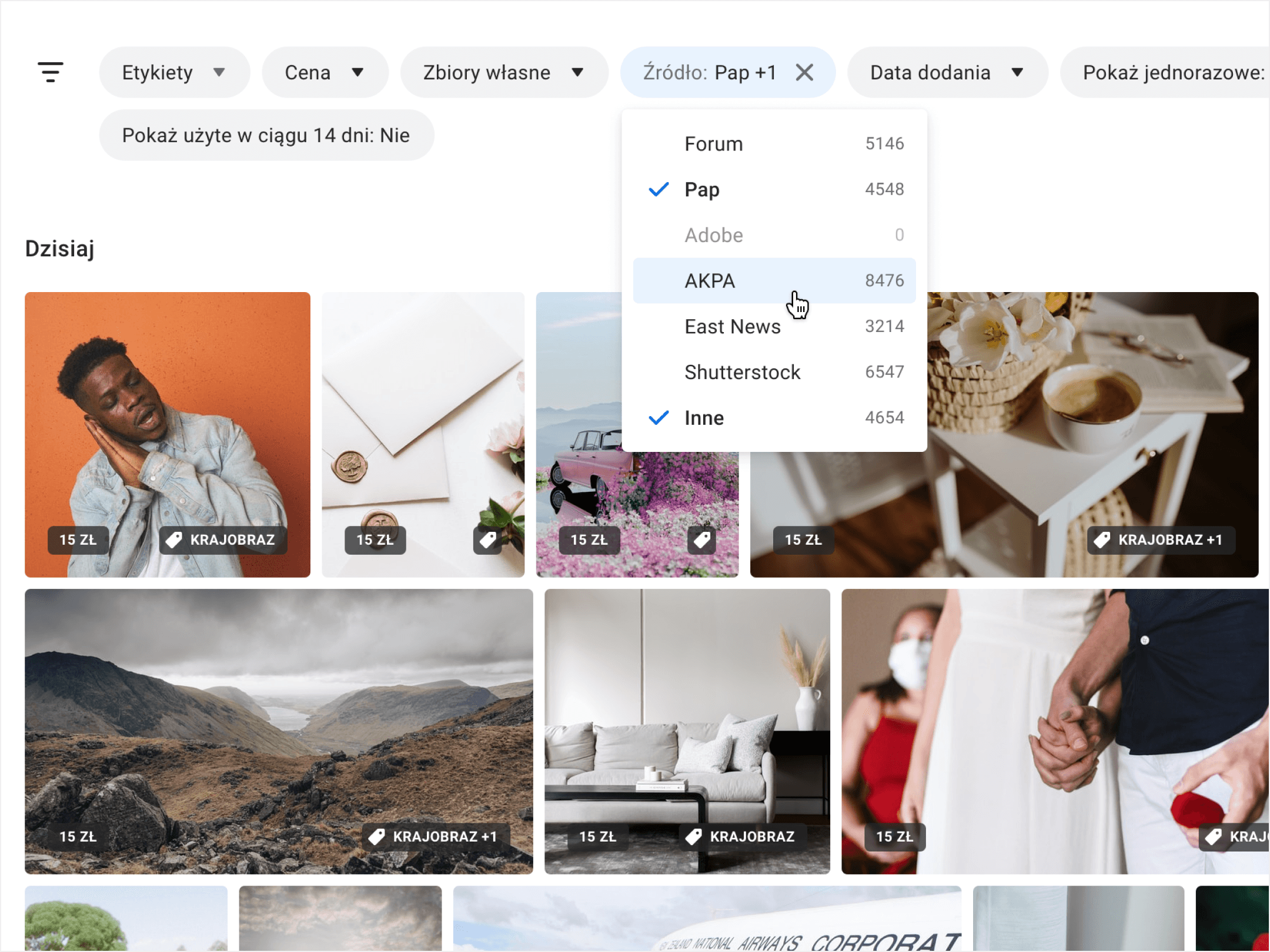
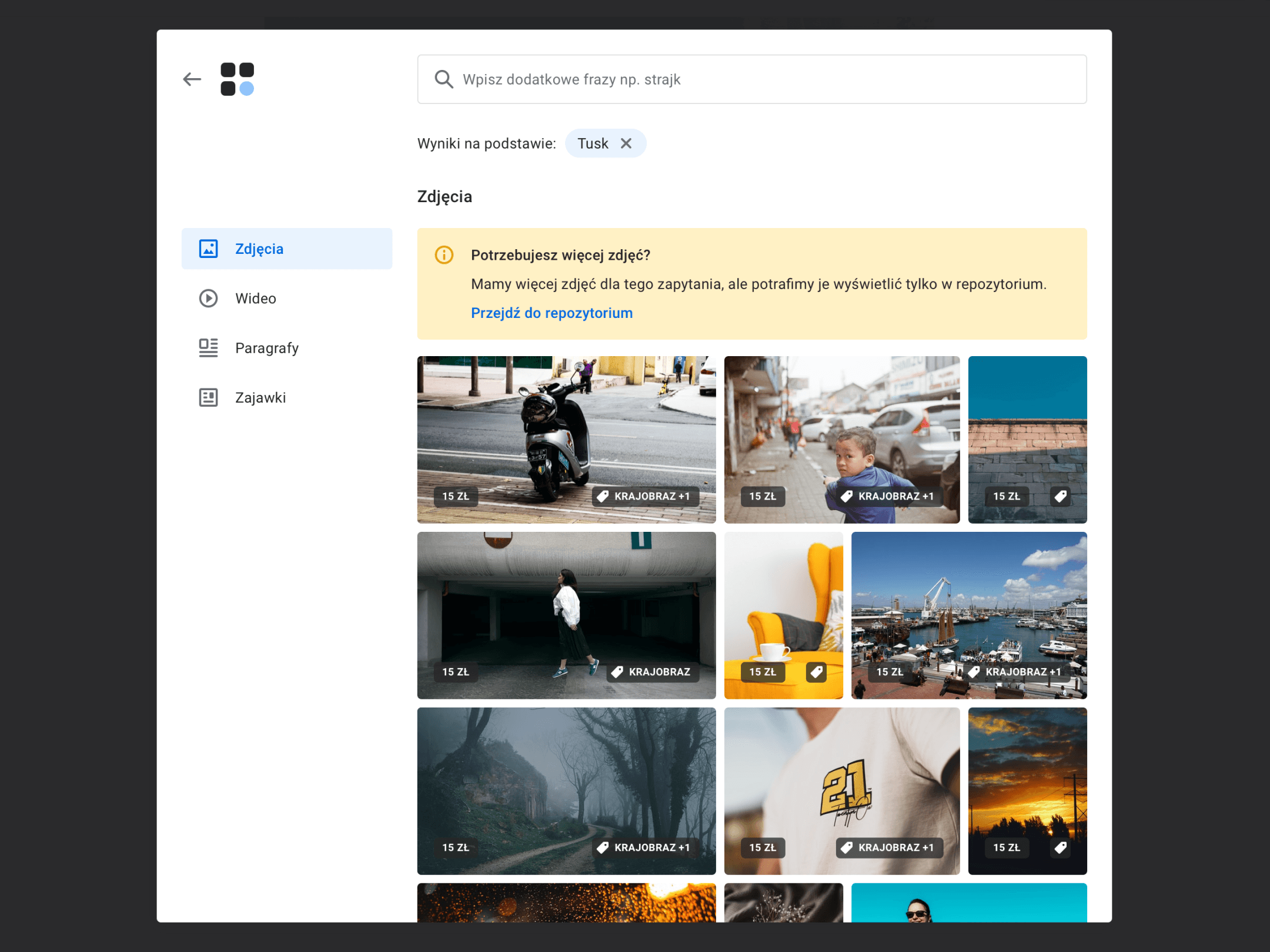
Integration with an image repository and the possibility to use the resources of many agencies at the same time significantly decreases the time required for preparing content for publication.
Recommendation mechanisms - images, links, tags, and categories are suggested by systems (AI + Machine Learning) based on the article's content. It all supports high visibility in Google and makes the publication more interesting for the reader,
Readability score - the article's content is analyzed to fit with the particular target audience (wording, grammar, punctuation, etc.). It puts an end to lengthy sentences and words which no one understands,
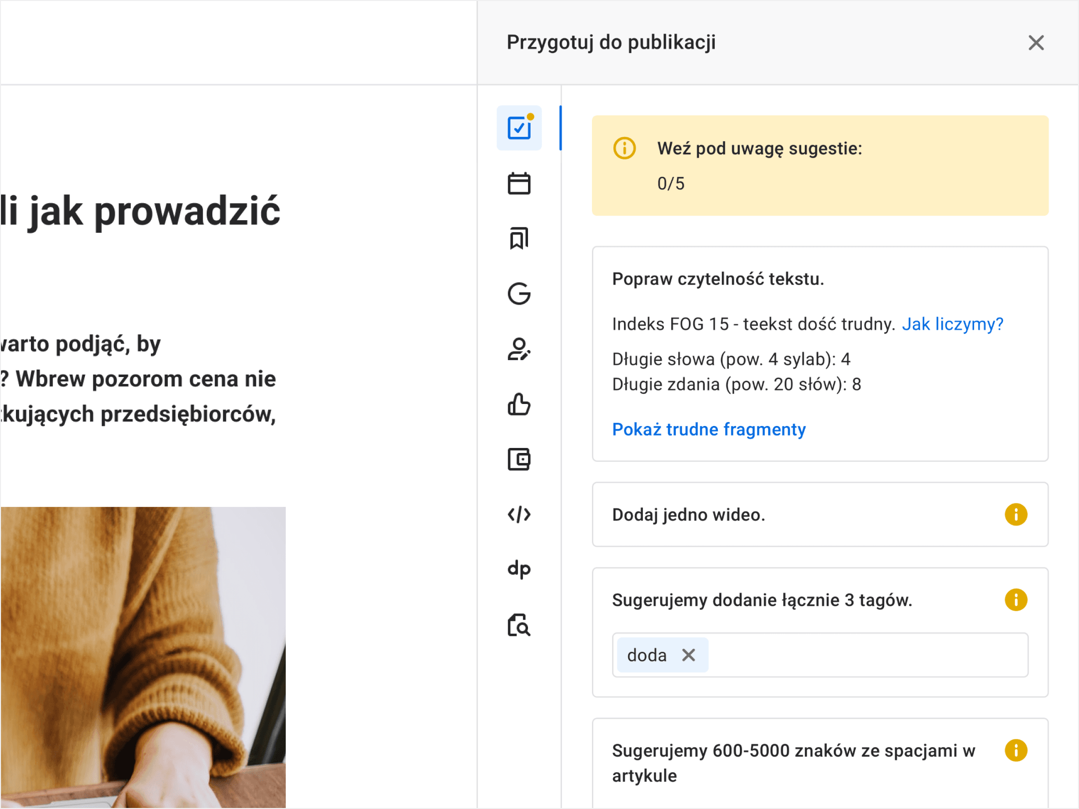
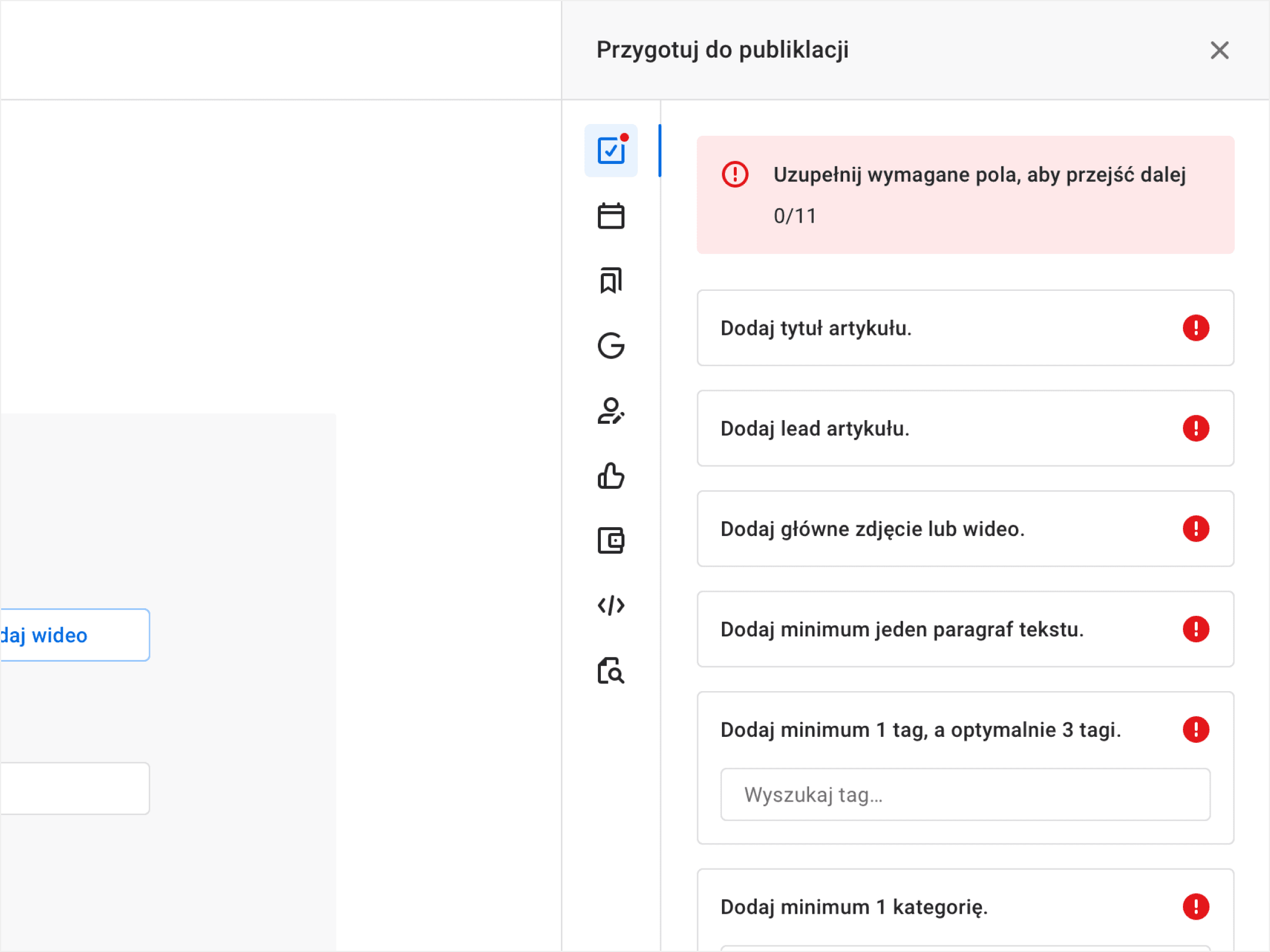
Smart validation pinpoints errors and guides the use of good practices, and suggests how to solve any problems. We’re doing the editors’ job of checking the technical side of news submitted for publication.
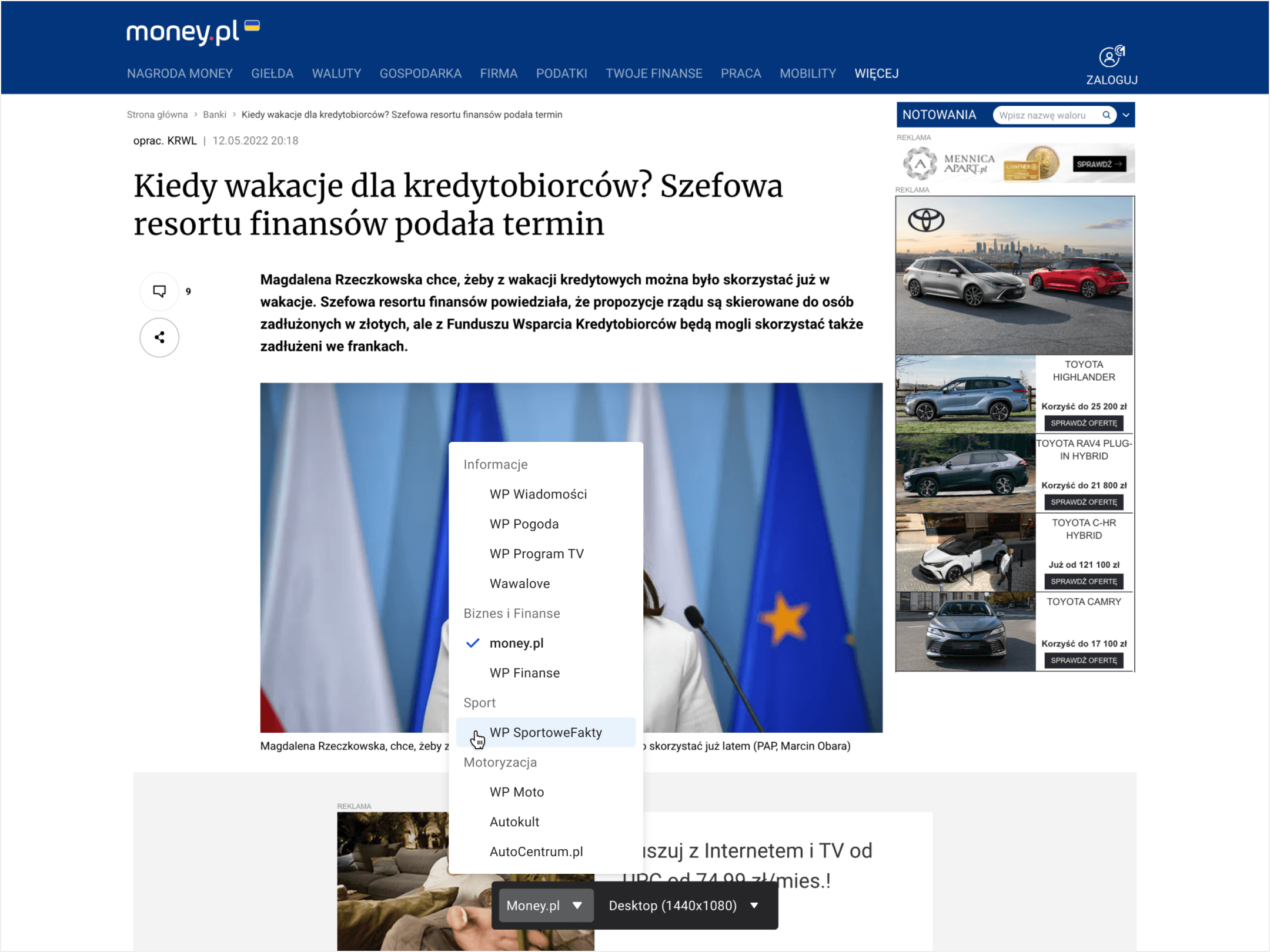
Article preview within the design of the portal in which it will be published (including mockup views for mobile devices and advertising grid) allows journalists to review the content as to be seen by the reader.
Editorial process
The complete article content is just the beginning of the struggle for attracting the reader’s attention.
News piece
An article is represented by a news piece (news story) preview on the homepage and in other listings. The seemingly simple and unimportant element, in practice, plays a vital role! The clickability of the news piece will determine whether the entire publication reaches a broad audience or if it remains unnoticed. The different variants of titles, images, and additional settings influence the article's popularity.
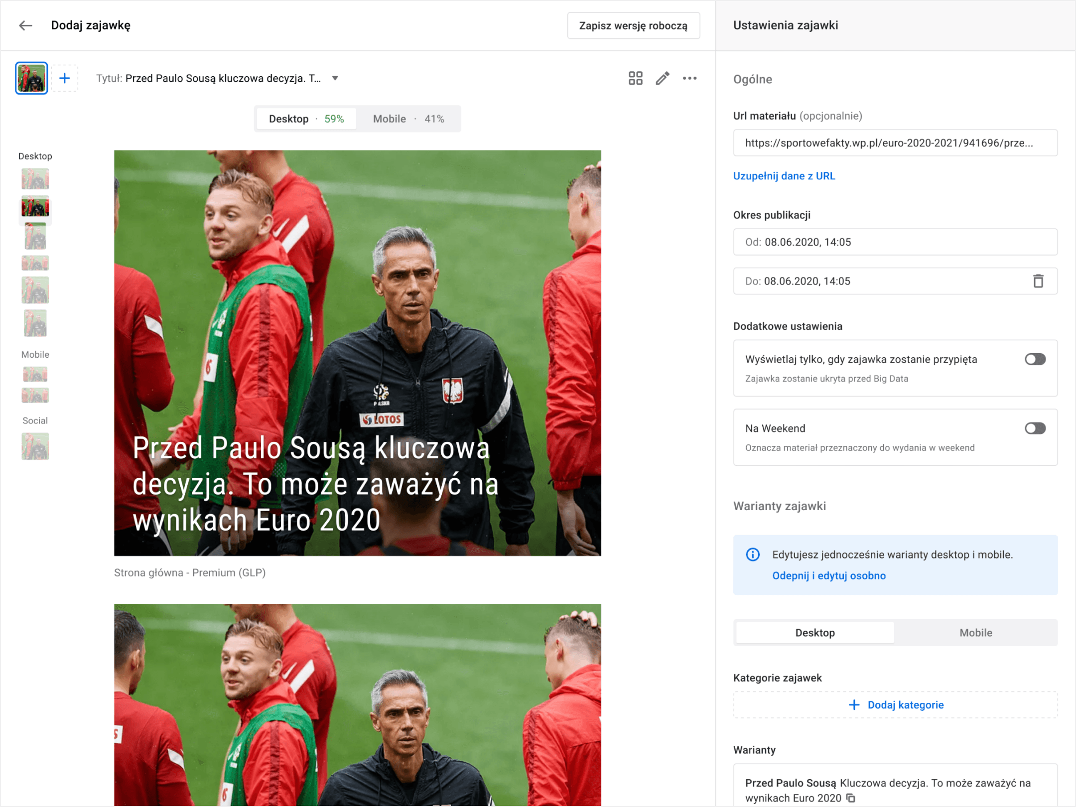
Selection
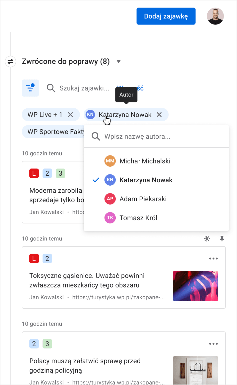
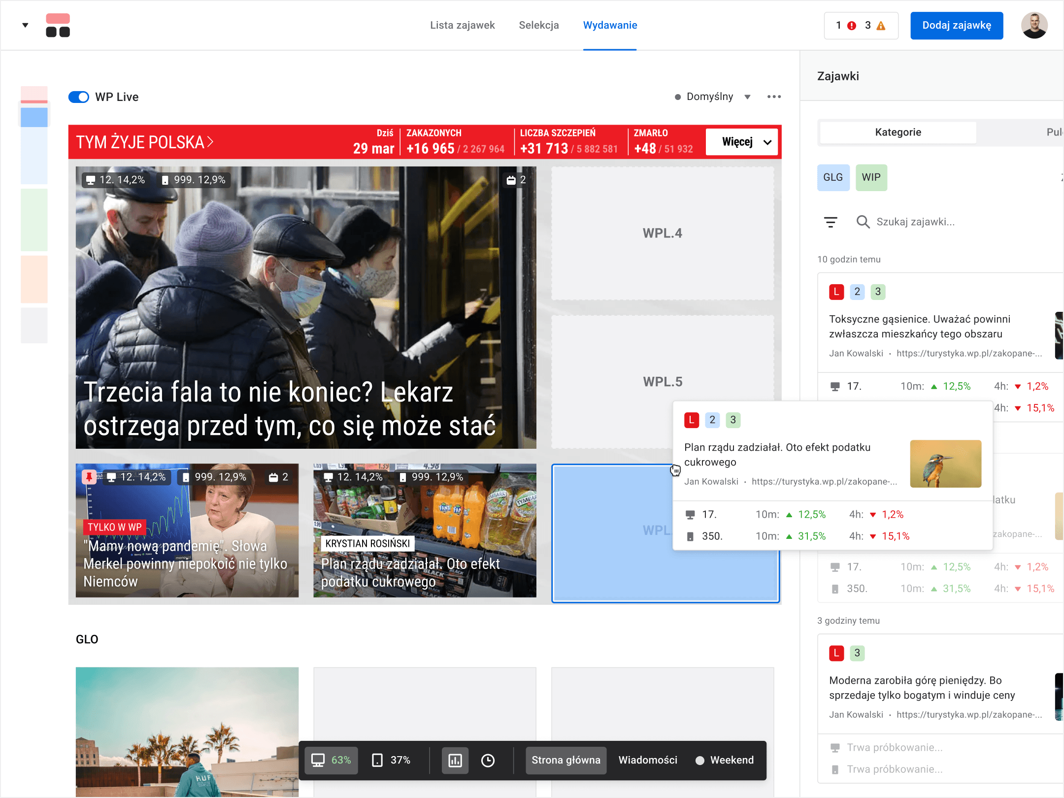
Before a news piece is published, it is thoroughly verified by editors. While they’re at it, it can make numerous rounds about a kanban table, until one of its versions will gain approval.
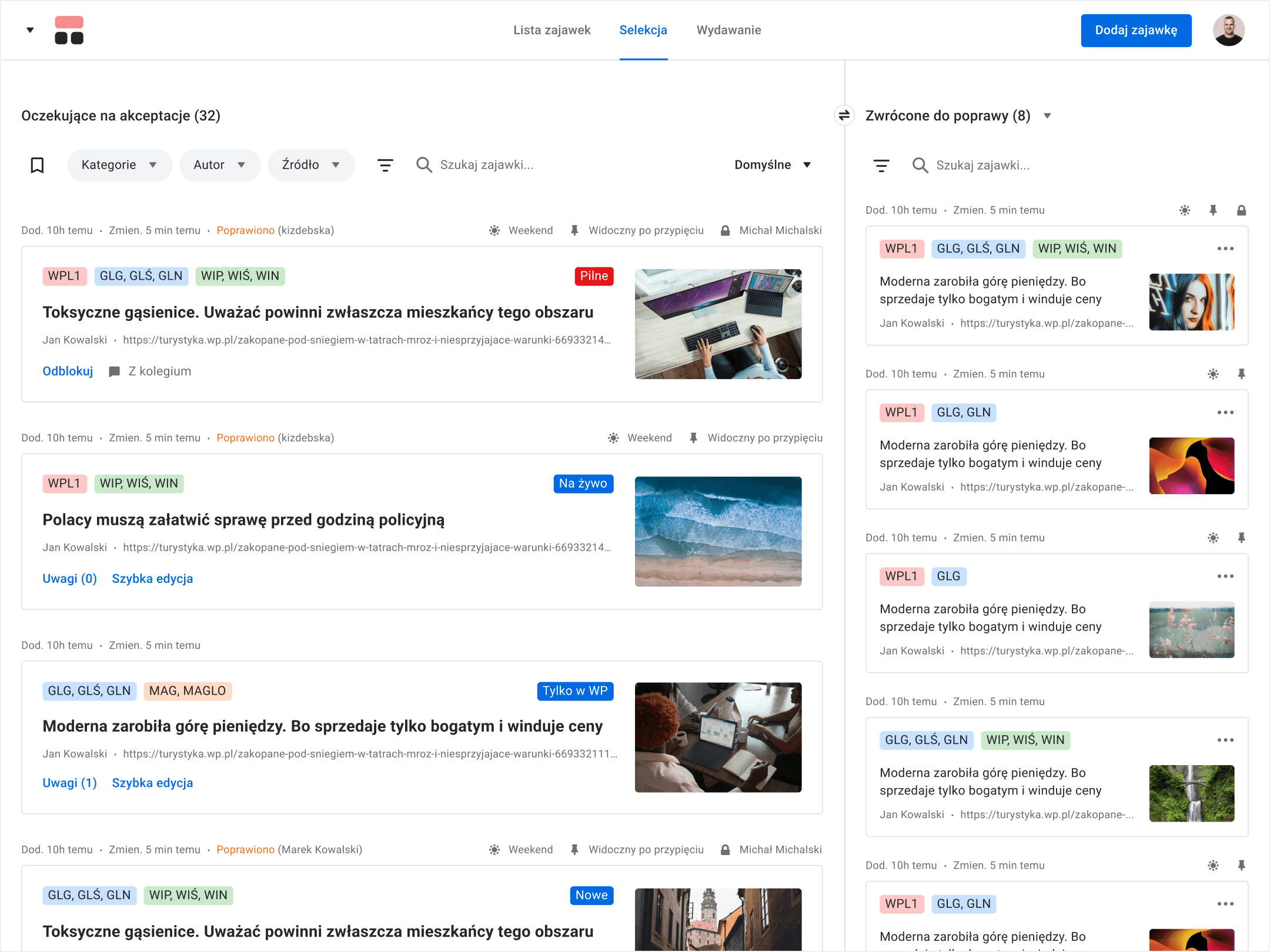
Publishing
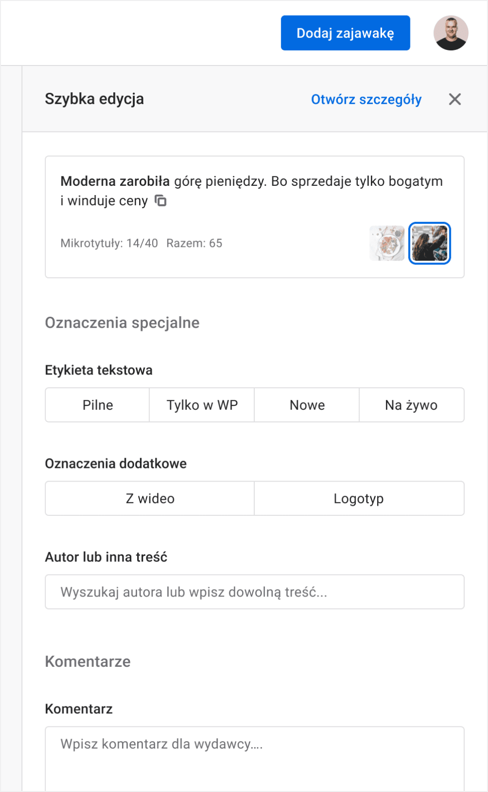
Every news piece has its 5 minutes of fame. In practice, it's actually a bit more. During that period, Big Data mechanisms analyze the clickability results. The publisher improves the effects by pinning the preview within a selected place on the homepage. We can call this The Attention Command Center for millions of Wirtualna Polska readers, without exaggerating.
Article list
With as many as 4 million articles, you need a pretty good idea and means to review, search and filter content. The search engine has a built-in command list, which allows for activating any available filters. All this without taking your hands off your keyboard!
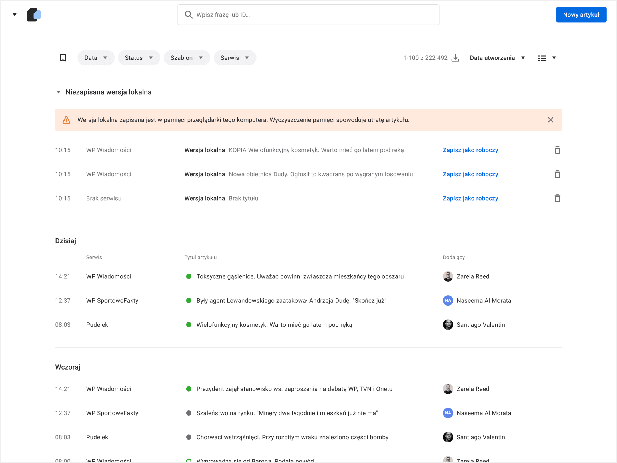
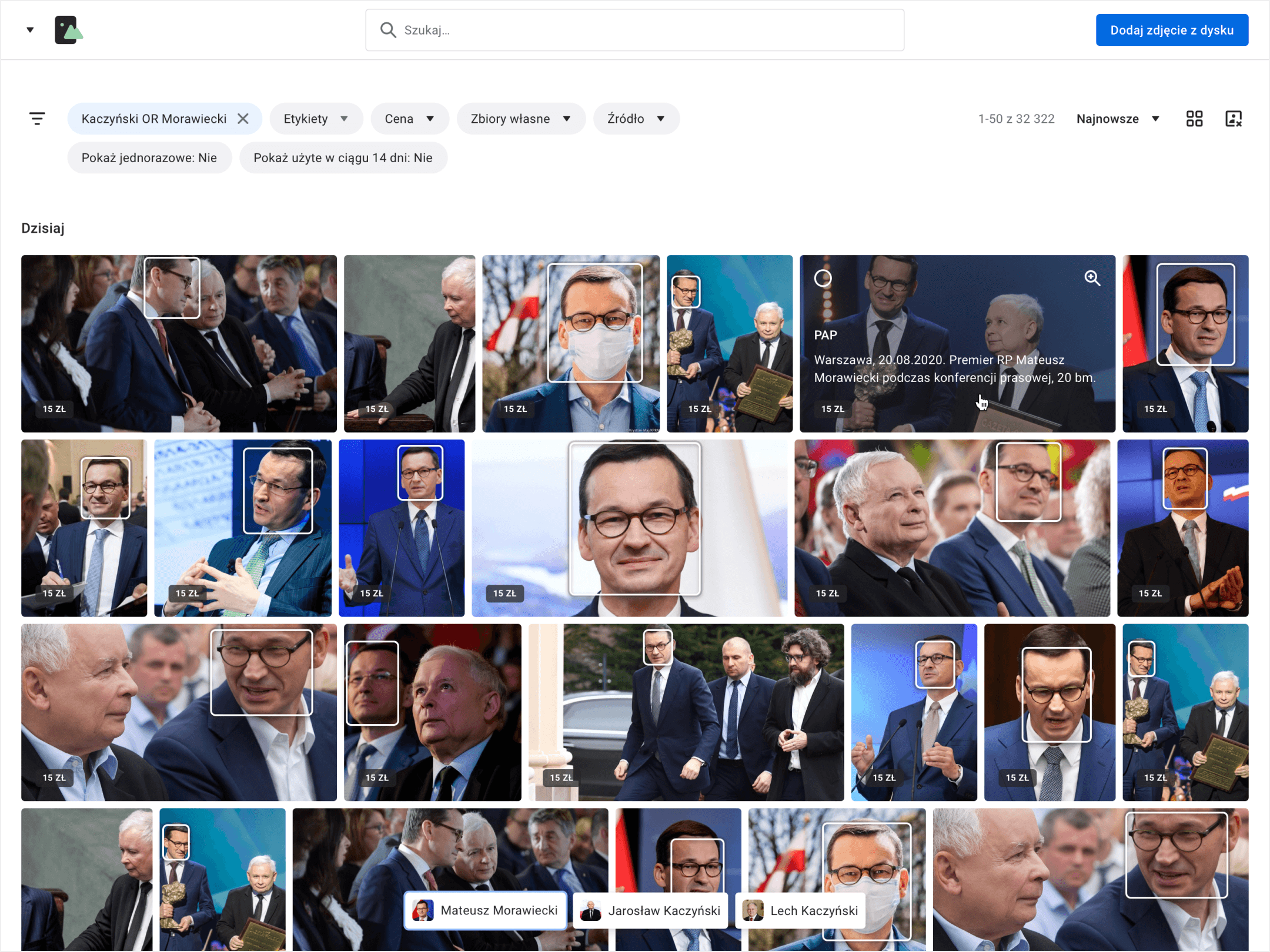
Photo Repository
One of the most critical issues in editing content has always been the selection of images. Each news piece needs at least one image. Searching, selecting, and pasting images into articles always took time.
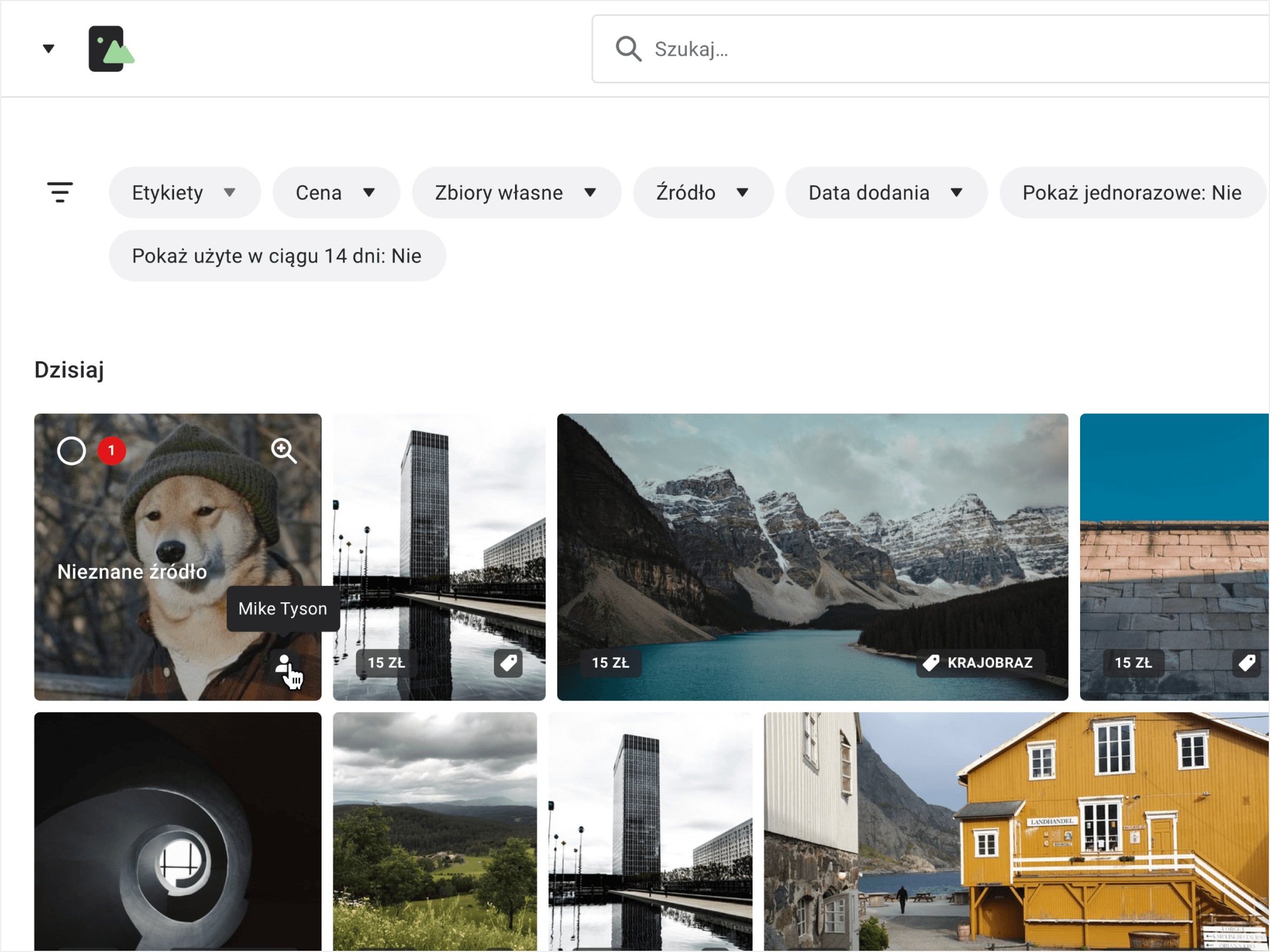
Suppose the revolution of the editing team’s work was really to take place. In that case, it could not have happened without an image repository. A centralized repository that aggregates the resources of many different agencies, groups other licenses, and manages metadata became a hugely important solution in the everyday work of every journalist. Also, don’t underestimate the advanced cropping mechanism, which eliminates the need for editing images with external software.
Design system
Knowing that we had years of work ahead of us to complete the entire software ecosystem, we simultaneously worked on creating a Design System from the very beginning.
A Design System is a collection of rules, tools, and processes that simplify digital products' designing, construction, and development. Read more about Design Systems.
The team we have assembled is responsible for constructing a React.js component library and for creating relevant documentation. With the possibility to reuse elements, we save a lot of time and guarantee a coherent experience for our users.
You can read more about this in a separate case study regarding the Design System created for Wirtualna Polska. (soon!)
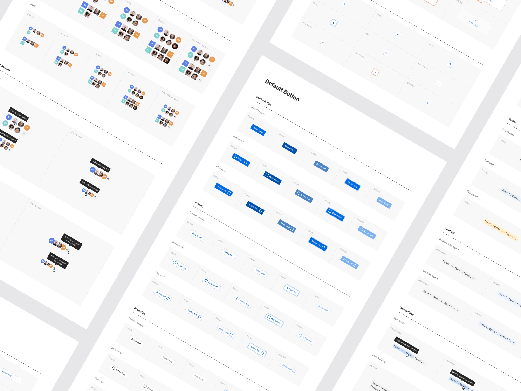
Other apps: authors, tags, products, and many more…
The above mentioned core applications are gradually being extended with additional tools. Such huge organizations handle vast amounts of data, which must be managed efficiently.
Thousands of tags, hundreds of authors, and media products are just some of the information the team of our client works with every day.
Each application got its own identification and location within the ecosystem. WP employees can effectively switch between systems but remain within one coherent environment.
Dashboard
Such a broad network of applications needs a central control unit, which gathers data to present a “helicopter view” of the effects of our work. The Dashboard provides information regarding statistics and allows for selecting preferred settings for the system.
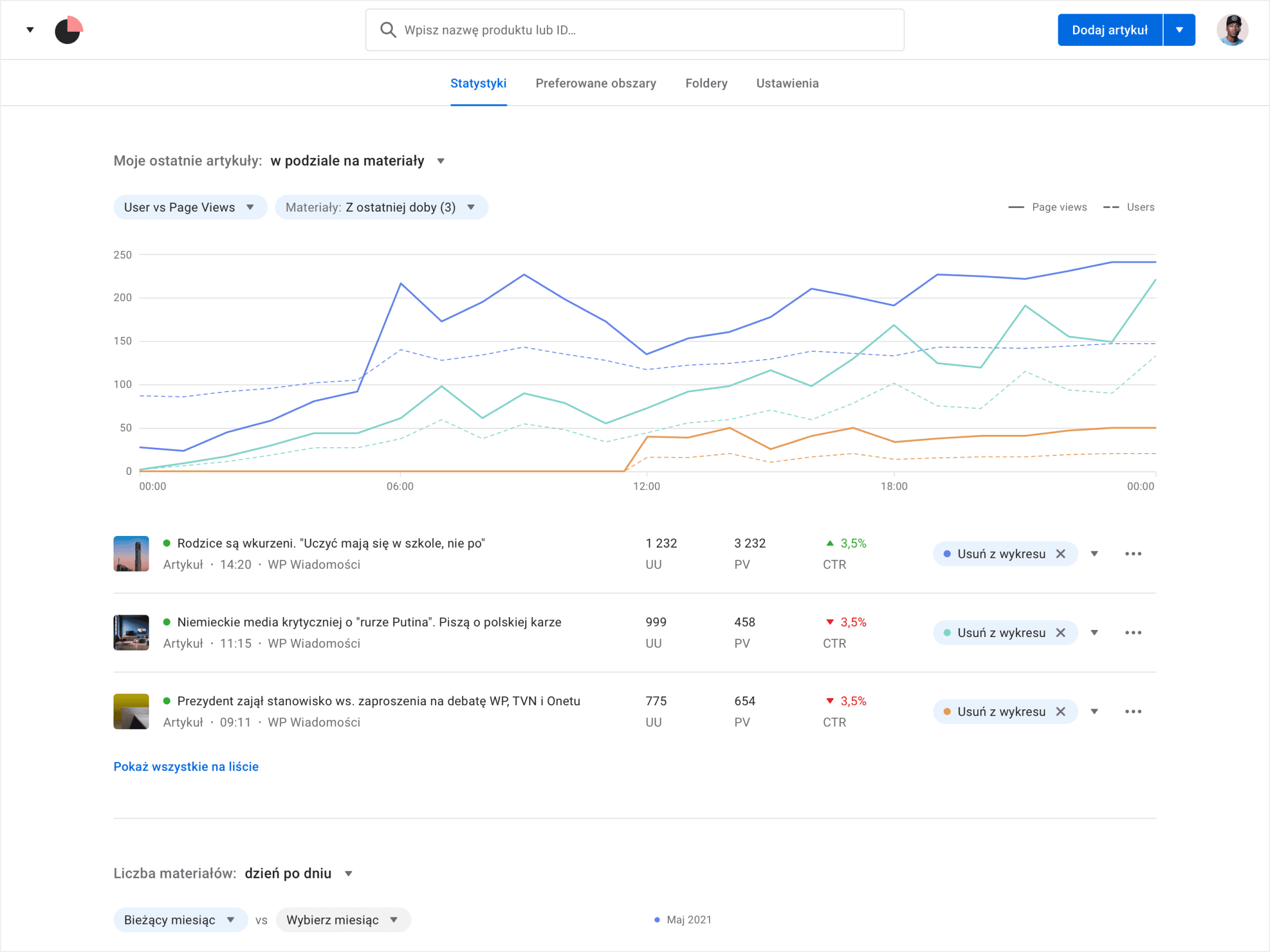
WP Ads
Changes also take place in other parts of the company. We support the advertising department by designing the WP Ads application, which advertisers can use to conduct campaigns on their own. This tool allows creating campaigns based on a product feed, integrations with e-commerce platforms, and email databases. Results of campaigns are presented in the WP Metrics analytics panel.
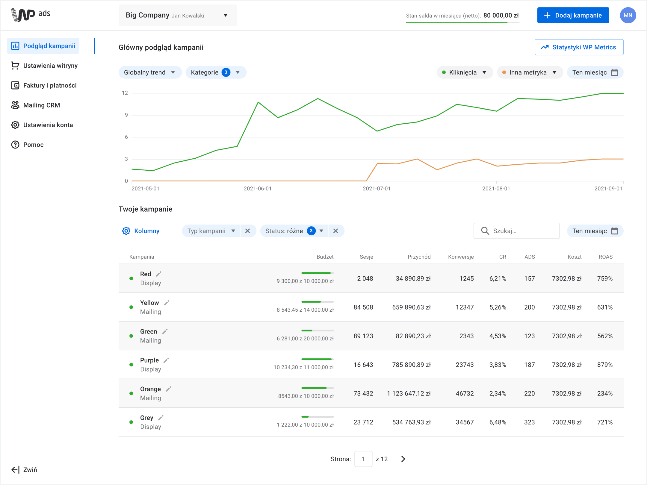
The project is still ongoing, but we have already implemented numerous improvements.
first prizes in the Develop & Deliver and People’s Choice categories at DesignWays 2022
of users say the editor is intuitive upon first contact
of users positively evaluate the time they need to complete their tasks using the editor
decrease in the number of people who say the tool is faulty
coverage of editor components within the Design System
It took only 42h to design one of the applications, thanks to Design System components
Forge innovative ideas into proof-of-concept and confront them with the end-user quickly. This is the only right way to progress, which the market will appreciate.
We do not design web tools without at least having prepared a component library, or at best, a Design System.
We do not design any single element for now. We design for the consequences that it will bring in the future, so let’s think, predict, and prevent.
While working with a bundle of applications, we have to think about them as a part of a larger whole. An element of an environment where the user switches between systems many times a day. This is the level at which the fight for positive reviews about the coherence of the entire system will take place.
If the perfect problem solution no. 1087 is an idea for a completely new pattern; think three times before implementing it. Often it's a much better idea to use one of the existing UX solutions, even if it's not absolutely perfect. Whoever controls the dev team’s budget will appreciate it a lot.
The quality of the work done by a designer is much more often evident when they develop existing solutions than when they create new ones. It is simply a more difficult task than starting from scratch…
