13 numbers that show measurable results behind the improved publishing workflow
6 Mar 2023
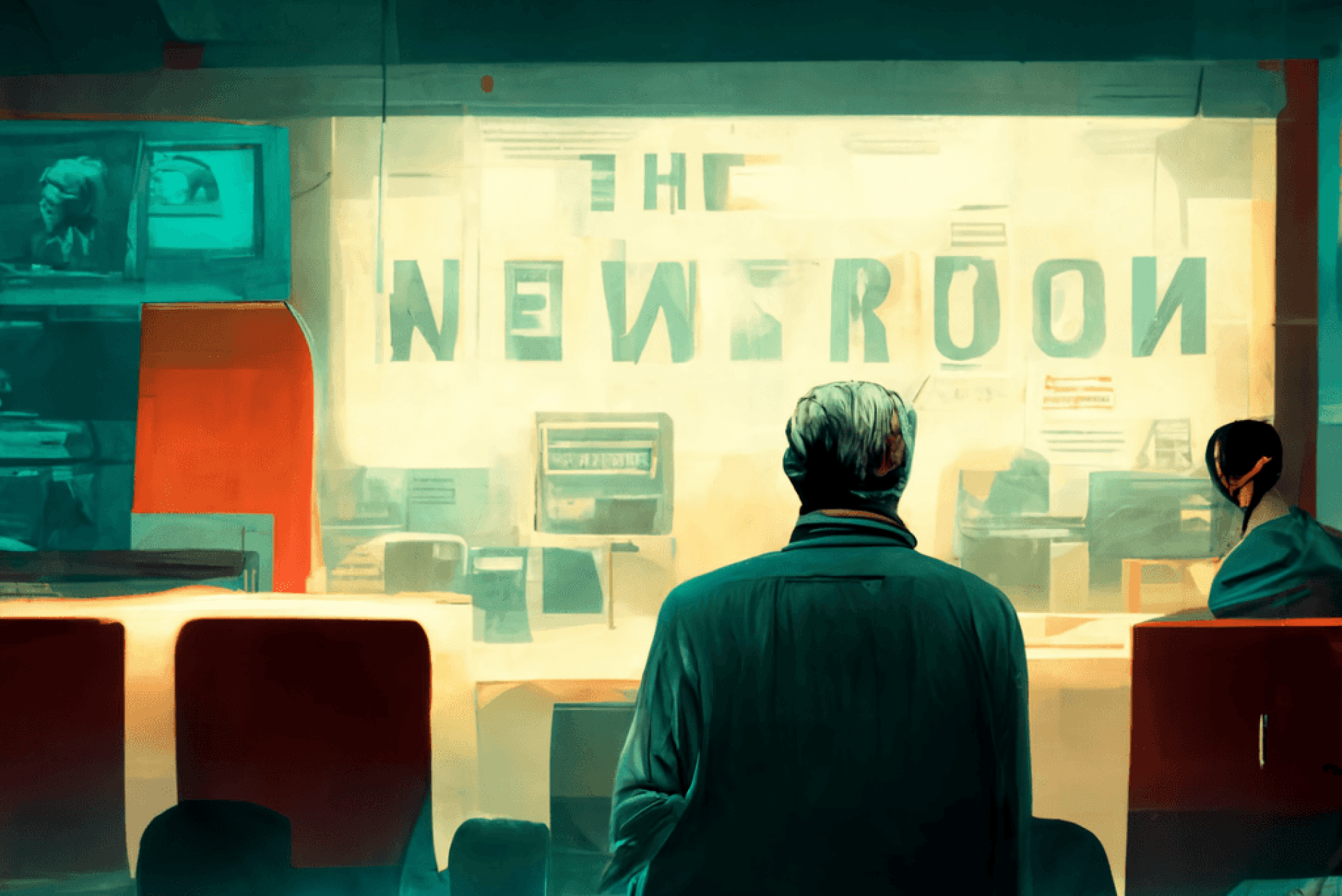
AI generated newsroom by Midjourney
Written by Autentika Team
We often use big visions and words when discussing digital transformation in a newsroom. But not this time. This time, we get down to raw numbers and the measurable impact of initiatives we have developed for a media holding with 23 million monthly users.
Let’s start with the context. For 25 years, Wirtualna Polska – one of the largest media groups in Central Europe – has been developing its back-office systems and managing dozens of apps obtained through acquisitions. This led to a universe of systems and tools with different looks and functionality. Journalists, editors and media workers had to switch between various internal apps to get their job done. It took them a lot of time – and clicks – to publish an article and push it to the main page.
Does that sound familiar? Well, it's not uncommon for a media company to maintain 20 or 30 systems that serve different purposes. This practice often leads to quite a bit of chaos. Work processes are decentralised and vary from team to team; employees use external software and lose valuable time on manual tasks; newcomers struggle to learn which tool is used for what. We all know this costs time, money and the nerves of those who fight with the software instead of doing what they do best.
We partnered with Wirtualna Polska to clean up their system. We have developed a portfolio of inspiring projects for over four years of cooperation. All of them led to creation of a coherent back-office software ecosystem that supports existing and new tools' growth. We have spent thousands of hours working on integrational processes that changed effectiveness (gains in output, quality, and outcomes) and efficiency (savings in time, effort, and money). You can read more about the entire process here)– but now, we’ll focus on the results it brought.
Goals of the system redesign
The objectives of the entire system redesign were to improve five crucial areas:
Speed
The goal was to publish news faster and help people work quickly without compromising the quality of their work.
Usability
We wanted to reduce costs by removing tools that didn’t bring much or any value to the publication process but were still sustained by the organisation.
Intuitiveness
It was crucial to introduce an intuitive design and limit the number of distractors to help journalists and editors focus on the content.
Consistency
The goal was to replace several independent apps with one consistent process to streamline the workflow and make employees’ work easier.
Scalability
We wanted to create a coherent design system which enabled designing new app modules faster.
Measurable results of implemented changes
1) Time to publish reduced by over 70%
"When it comes to credibility, speed kills," wrote The Washington Post columnist Margaret Sullivan in one of her opinion pieces. Although a common saying is that "there is almost no story that isn't improved by holding it back for a day," this scenario isn't possible with breaking news that must appear immediately on the main page. For this reason, there should be no technical obstacles when something goes online.
Many factors can slow down the publication process. For example, the CMS page or its components load slowly, or a journalist has to use several different tools to publish news. They also need to manually fill in many sections or spend a lot of time looking for the proper illustration for the news and then framing it.
And then – when the post is ready to go – the system crashes, an error occurs, and all the work is lost. This happens in almost all the media, and you know what it means: You’re the last to break the news. You lag behind the competition. And you know that readers or viewers may turn to them next time and stay with them forever.
The audit of the publishing workflow conducted at Wirtualna Polska allowed us to identify critical factors necessary for speeding up the publication process and to propose appropriate solutions when building the new editorial system.
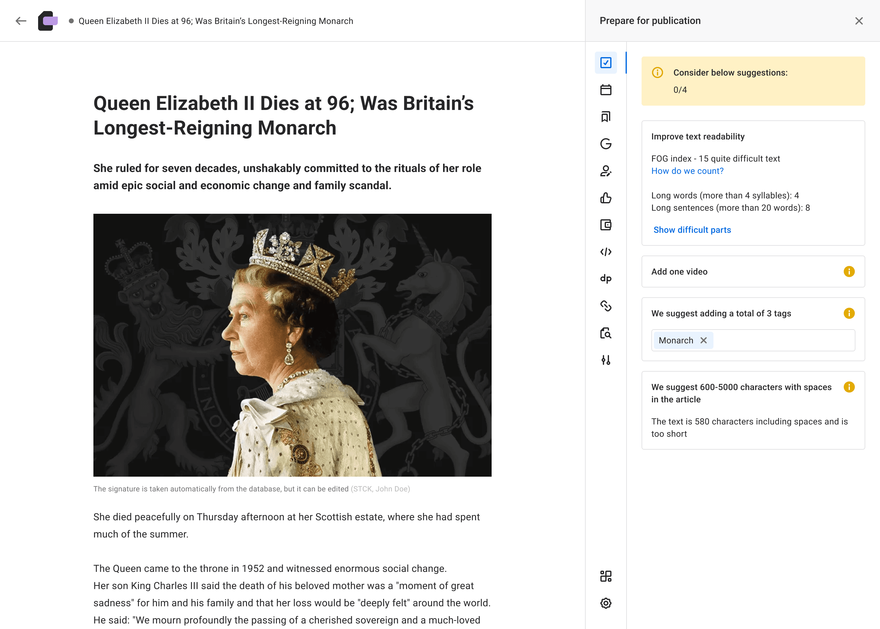
First, we implemented a "fast track" function. This feature allows journalists to prepare an article with a predefined breaking news photo, categories and tags. After adding a headline and a lead, the article is ready to go. Second, we developed improvements that allow journalists to add photos and additional content elements faster and more intuitively.
The results:
-
The average time to urgent news publication decreased by more than 70%.
-
The average time to publication of breaking news decreased to 120 seconds.
-
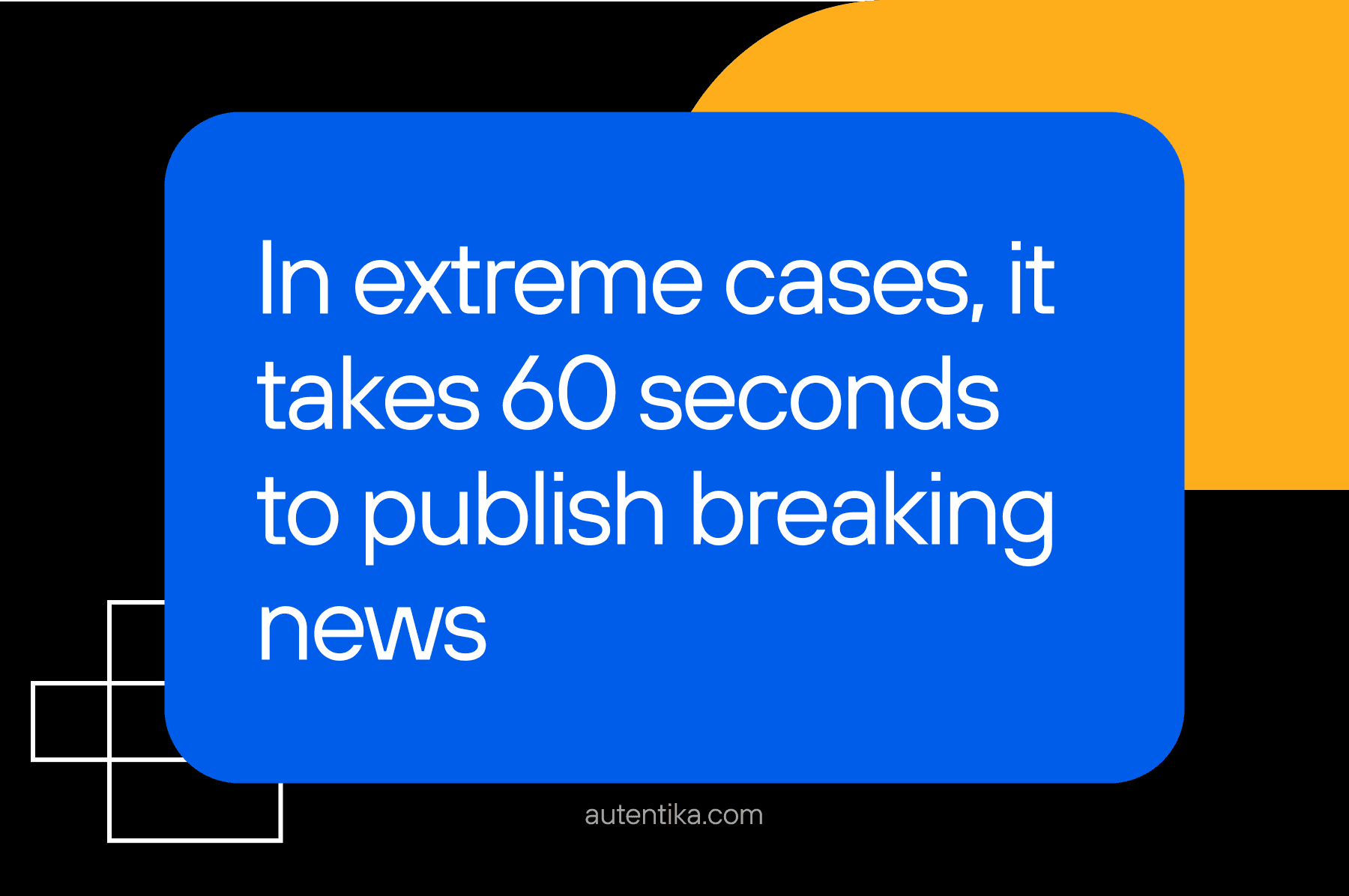
In extreme cases, it took 60 seconds to publish breaking news (measured from when the "fast track" template is clicked to when the article appears on the site).
-
The overall time to publication in the organisation decreased by 10%.
-
The efficiency of daily content production increased by 10%.
What was equally essential for us:
-
79% of users working with the new system positively rated the speed of inserting photos into an article.
-
90% of users positively rated the speed of inserting additional content elements.
-
83% of users positively evaluated the time needed to complete their tasks in the new editor.
2) Improved intuitiveness of the new system
There are many definitions for an "intuitive design" – but for the sake of this article, we’ll adopt the simplest one – that it as a design that is easy to use. It means that it works the way users expect it to and that they can subconsciously apply their knowledge to interact effectively with the tool. It's a design that doesn't require hours of training and explanation because it ties into people's previous experiences.
To achieve intuitive design, it's critical to consider the user's background, work culture, and habits. As we've learned in our work with newsrooms, innovation isn't always the best solution because what's intuitive to one group may not be understood by others. In the case of Wirtualna Polska, we are proud to say that we managed to improve the intuitiveness of the editorial system.
The results are as follows:
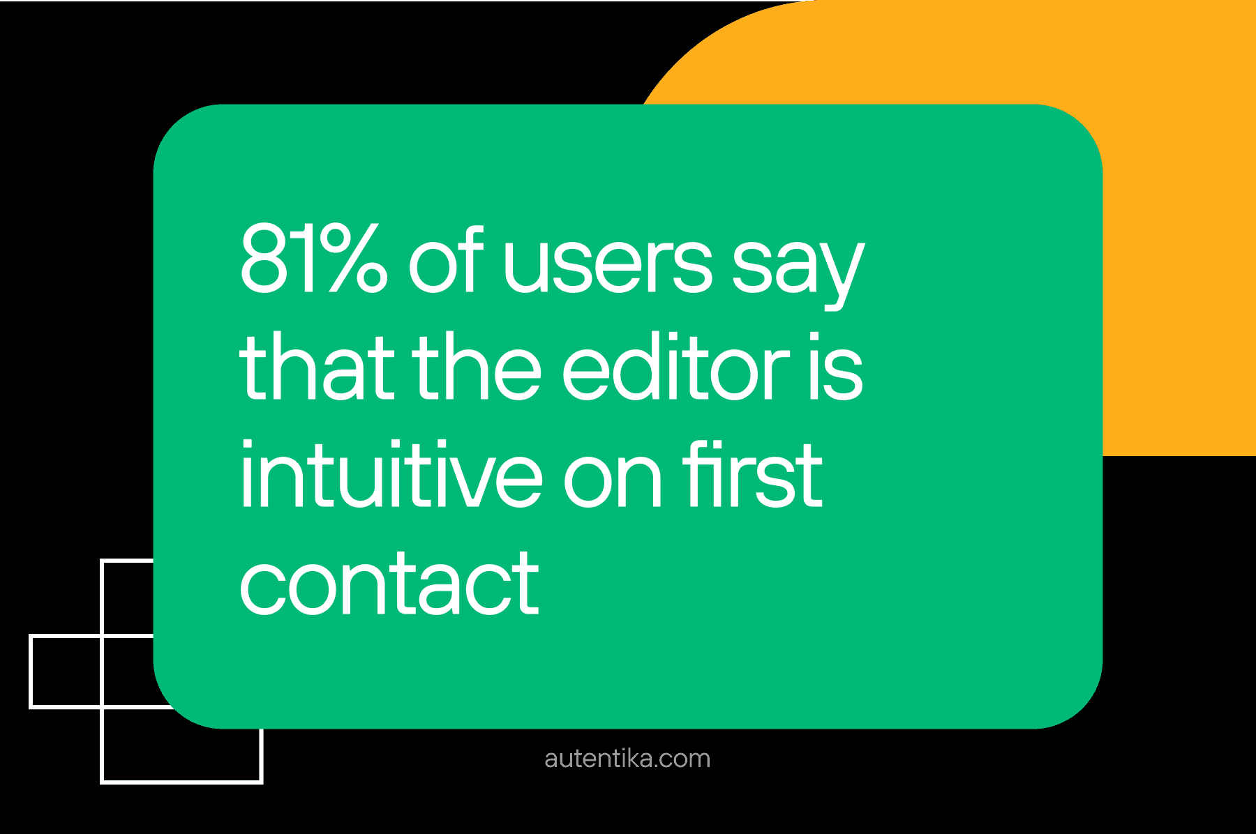
- 81% of users stated that the editor is intuitive on first contact.
- 79% of users positively evaluated the intuitiveness of adding photos to an article.
- 80% of users positively rated the intuitiveness of adding additional content elements to the article.
The importance of intuitiveness
Why is intuitiveness so vital? It's not just about making users' work easier and faster. It's about equipping your staff with reliable and modern tools, which can impact employee satisfaction. Journalists dealing with outdated, non-intuitive software may feel their work isn't being taken seriously. In some cases, a lack of modern tools combined with the pressure to produce better results can lead to increased stress, a lack of motivation to work, and higher turnover.
It's also worth noticing that the intuitiveness of the work tools helps with employee onboarding and allows newcomers to find their way around more quickly. Someone starting in your newsroom shouldn’t have to spend weeks learning new systems and constantly ask colleagues how to insert an image into an article. The more intuitive the interface, the easier it's to learn and use, which can mean significant time and cost optimisation.
3) Reduced effort required to create new products thanks to a design system
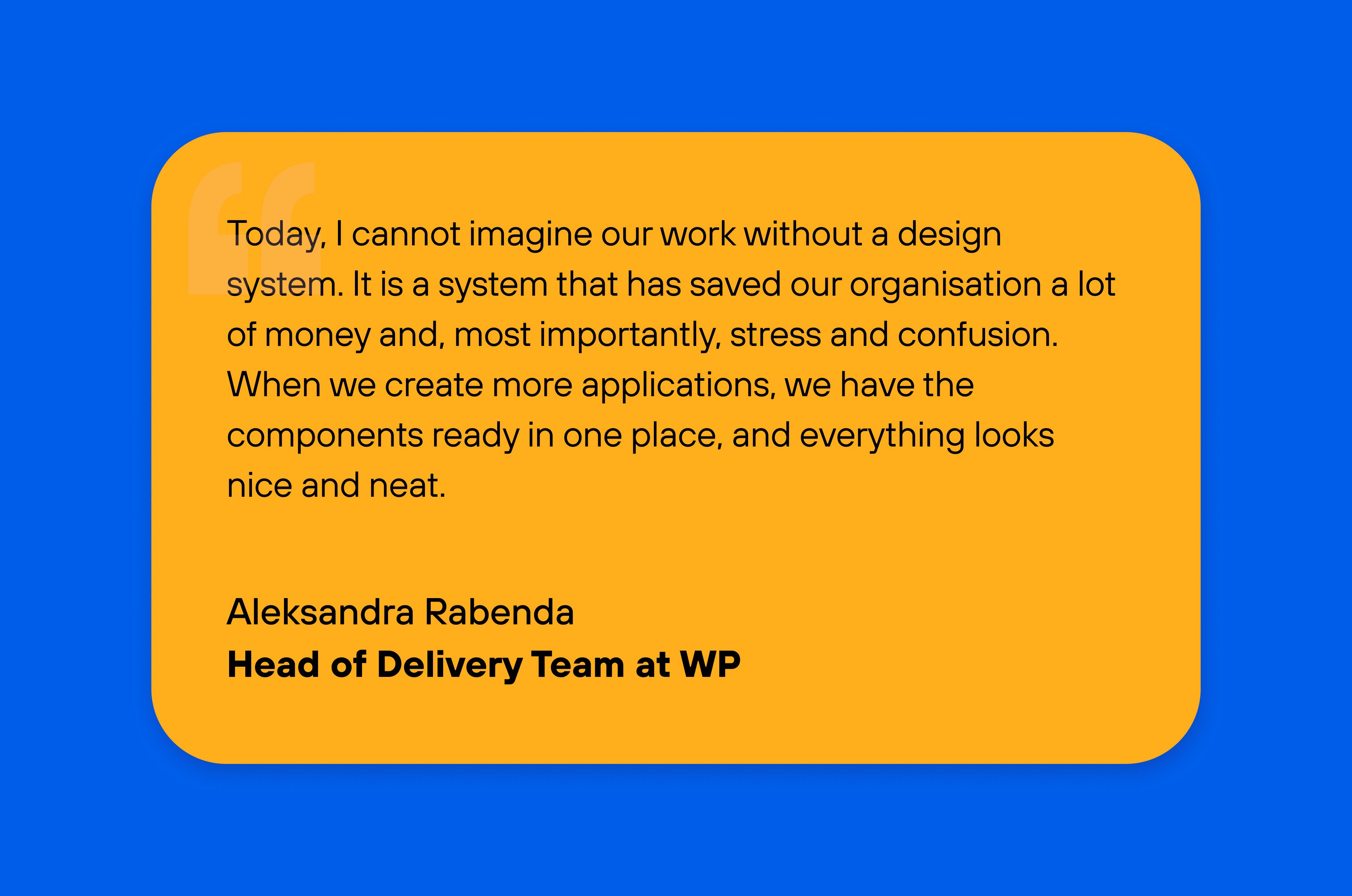
One of the most important achievements of our work for Wirtualna Polska is the creation of a design system – a library of reusable components that combines design, code and the knowledge of how to use them. This makes it possible to build new products based on a single source of code, reducing the time and effort required to create, develop and test a new product. You can build thousands of different applications on a single design system.
A design system also limits chaos and lawlessness in the organisation. It provides consistency across the company and helps avoid teams working according to different workflows and using various (often external) tools.
We'll be frank with you: creating a design system is not a piece of cake. It takes an experienced team with particular skills and competencies, the right tools and technologies, and of course, time – but it's worth it.
Moving to a unified structure reduces the staff needed to maintain legacy systems, lowers the cost of creating new products and enhancing existing ones, and provides a consistent experience for system users.
Introducing a design system at Wirtualna Polska has led to the following results:
- 90% of the editor components are covered by the design system.
- Designing one of the applications took only 42 hours, and new modules can be created four times faster than before.
Conclusion
The results described above are just one example of what is possible when designing a digital transformation in an organisation. It all depends on the KPIs you have, the challenges you want to solve, and the results you want to achieve. A system redesign can look very different depending on your needs and transformation stage.
We wanted to share these insights to show that change leads to measurable results. Plus, it's something people do appreciate. No journalist can work with pen and paper anymore. To be efficient and deliver news quickly, they need the right technology – and your job is to equip them with it.
We can help you do that. We'll tell you honestly what makes sense and what does not, and clear the way so you can achieve your business goals.
Let’s talk about what we can build together.
