6 pillars of editorial analytics at Mediahuis – with Yves Van Dooren
29 May 2023
Yves Van Dooren tells Autentika how the data team democratised data at Mediahuis (image enhanced by Midjourney)
Written by Joanna Kocik, content specialist at Autentika
Mediahuis got it right: for this media group, editorial analytics is much more than a dashboard only a handful of people can read. Data has been democratised and is the basis for real-time decision-making and future publications. Yves Van Dooren, Data Science Business Partner Newsrooms, told Autentika how the team made it happen.

Yves Van Dooren
An engineer turned media expert. Yves Van Dooren used to work as a project manager, dealing with the challenges of search engines, social media and newsletter optimisation. Since 1999, he has been working with VUM Media and then Mediahuis , one of the leading media groups in Belgium, the Netherlands, Ireland, Germany and Luxembourg, with more than 30 brands in its portfolio, including De Standaard, Het Nieuwsblad, De Telegraaf, NRC and The Irish Independent.
Yves describes his role as a business partner responsible for traffic and audience measurement and coordinating various data and insight projects for the holding. Together with the Mediahuis team, he has created a data framework for journalists and editors in the newsroom to help them with their daily tasks.
Now Yves has agreed to share some of his analytical kitchen. Here are 6 pillars of editorial analytics at Mediahuis, described by Yves in an interview with Autentika.
1) Using an in-house data tracker
Mediahuis developed its own data tracker as external analytics platforms did not meet the publisher’s requirements. The team wanted to draw correct conclusions and access the data in real time.
“Equally important, by using a single tool, we have a single version of the truth that everyone uses – so there is no room for doubts and disagreement,” says Yves Van Dooren. As he points out, this creates more confidence in the data and gives Mediahuis complete control over data collection and processing, which is critical in light of the GDPR directive. It also helps the team develop their own data products and roll them out to the newsroom.
2) Attention time as a north star metric
The north star metric in the Mediahuis newsrooms is net attention time. Every ten seconds, the system scans users' activity: whether they are still interacting with the page, scrolling, watching videos, or listening to audio.
To evaluate the quality of the content, Mediahuis uses the median net attention time, which is much closer to the truth than the average.
As Yves says: "What’s also crucial attention time is a metric widely accepted by our newsrooms. This is a major advantage, especially when we compare this metric to page views and clicks."
"Also, the net attention time enables us to value other journalistic formats like video and podcasts properly,” Yves explains.

In the world of constant fight for attention, net attention time is a widely accepted metric that shows the value of the content produced (image generated by Midjourney)
3) The story behind the story
Each article produced by Mediahuis journalists has a “business card” with key metrics juxtaposed with the KPIs, with a real-time preview and data histogram. The team can track the total number of page views, total and average attention time, and changes in those metrics over time.
Another metric that counts is recirculation, the percentage of users visiting another page after reading a particular article. This allows the team to examine whether a piece of content is performing well and track which pages readers are likely to visit next. “Of course, recirculation depends on the traffic source – social media or newsletters users tend to stay on our website for a shorter time than those who use the home page as their entry page,” says Yves.
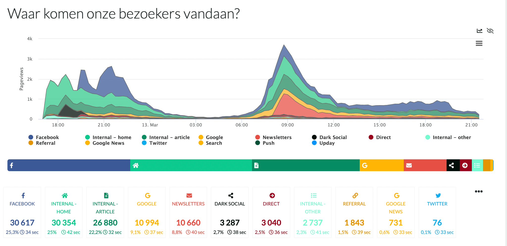
The key metrics are also the traffic sources and their distribution over time. “With our data tracker, we can track the entire lifecycle of an article and see whether it was included in our newsletter, pushed via a notification, or shared on social media. Then we can analyse how well the article performed in each channel and how many reactions, clicks, and comments it received”, Yves adds.

The key metrics are also the traffic sources and their distribution over time (screen from the Mediahus system)
4) One-stop shop newsroom analytics
Yves admits that from the beginning, his team’s goal was to give everyone in the newsroom access to all data from the data tracker and external sources such as social media, newsletters, mobile apps, podcasts and video platforms. Still, the road to achieving that was not easy, and the team learned its lesson.
“First, we worked with data engineers to create comprehensive dashboards with information about our content performance and some insights about the competition. We learned a lot from the dashboard experiment but decided to change tactics at some point. The reason was that maybe 10% of people were looking at these dashboards!” describes Yves and adds how they tackled the challenge:
“Using the design thinking framework, we started asking journalists why they were so reluctant to use the dashboards – and we got valuable feedback. For most journalists, the dashboards were way too complicated, and they could not make much sense of them. ‘Just email us or show us the list of articles,’ they told us. ‘And make it fun!’."
5) Democratising data
Interviewing the journalists and editors helped the data team see how people felt about the figures they saw. It turned out that all those metrics and dashboards were way too advanced for them – while the goal was to make people feel competent and knowledgeable about what they were doing. “We wanted to make the data more accessible and communicate it through the channels people already used, like TV in newsrooms, email and Slack,” explains Yves.
"Every time we show insights, we explain what people are seeing. Sometimes we even leave out the numbers and focus on explaining what the data presented means,” he adds.
Another communication channel Mediahuis uses is email as a daily newsletter. Instead of logging into the data dashboard, journalists receive key insights directly into their inboxes. The data team keeps it simple and tries not to overload it with data but lists the KPIs and illustrates the findings with images.
Mediahuis also introduced author newsletters – each author gets a personalised email every Monday to see how their content performs. “This made data a topic in a newsroom and sparked healthy discussions about what stories to write and how to pitch them to the front page”, admits Yves.

Data is now the talk of the newsroom at Mediahuis (image generated by Midjourney)
6) Invest in foresight analytics
As Yves describes, we can name at least four levels of data analysis:
- descriptive analytics (what happened?)
- diagnostic analytics (why did it happen?)
- predictive analytics (what will happen?)
- prescriptive analytics (how can we make it happen?)
“These levels can help us move from being simply data-informed and having insights to being data-driven and predictive analytics, which creates more value for the business. Of course, it is extremely important for any newsroom to know what is happening in real time, but what we are trying to do at Mediahuis is create suggestions and recommendations for journalists,” he says.
An example of this initiative is a Slack bot that recommends posts that should be shared on social media. The audience team can then decide whether to accept, snooze or ignore the suggestions – and these decisions feed into the algorithm to make better suggestions in the future.
As he reveals, the data team is working on better analytics for subscription sales according to the user demand model (i.e., which articles sell more subscriptions), headline classifiers (based on headline structure) and gender bias classifiers.
Mediahuis also benefits from the Article DNA – a project supported by the Google News Initiative that defines articles based on journalistic intent and format. Article DNA allows editors to make the best possible mix of story types independent of the topics covered.


