How to hand over a UX/UI design project and drive software developers into astonishment
13 Feb 2022
The previous year at Autentika is marked by a significant increase in the number of projects where we are responsible mainly for UX/UI design. This required us to adopt a new approach to handing over the effects of our work to the external team.
“How is this any different from a project which you would develop on your own?” – you might ask. First of all – it’s about communication, particularly, how it gets more difficult when you have independent teams working on a project. Two companies (three, including the client!), a bunch of strangers, different procedures, a lack of common experiences, and real-time communication. There’s no place for miscommunication flowing over between project stages and hoping for immediate consults when necessary. Knowledge has to be comprehensive, complete, here and now. Moreover, it needs to be systemized and presented in a way that will be clearly legible for anyone who encounters our work for the first time ever.
We don’t take any calls!
I know, it sounds strange, and it should be considered a bit tongue-in-cheek, but we did set this as our goal when putting together a plan for the final “package” to be handed over. We want to face the expectations of software developers and deliver the most possibly comprehensive set of materials and information. No more “Which screen should we go to after registration?” questions, or “Send us the icons for this screen” requests. As designers, we are always available, but let’s not get any questions that would make us look incompetent.
What’s more important is that on our end it was to be painfully repeatable. Regardless of the designer and the project, everyone has a clear manual on what and how to create.
Cut to the chase! What are you giving us?
#1 The discovery phase
First we draw up ** a project card**. It gathers information about the business goals, key measures, and performance indicators. It introduces the stakeholders. The project itself is presented in the form of a high-level scope, a kind of “helicopter view”. Risks and limitations are clearly listed. Finally, it also includes a schedule, and budget and indicates the settlement model.
The meaty part is called the product card. To draw it up we use the User-Centered Design methodology. We list the characteristics of the target group, along with their pain points, motives, and worries. The product is defined through the prism of ways to solve users' issues, as well as existing alternatives to the product. This part is summed up by the definition of competitive advantages of the planned undertaking and its unique value proposition – the benefit gained by the user when they use the product.
The chapter regarding the market is a description of the industry and its local and international competitive environment. Most often it includes a detailed competitive analysis, which in itself can include several hundred pages of material.
While speaking about the technological layer of the project we gather information about the environment in which it is supposed to operate: devices, systems, software. We are mostly interested in the ability to influence the area of UX/UI.
At this stage, we also analyze any research conducted by the client in the past. Data gathered from Google Analytics, Hotjar, or qualitative research is forged into particular conclusions, which help us make the right design decision. Here we often provide recommendations for further methods of analysis of user needs and behaviors.
The final element of the product card is the language of communication. We get to know the brand, its signature and visual identity, style of language used, and design system, although the latter is still rather rare, even among large corporations. We also review decision-makers from the perspective of their preferred graphic style (so-called draftest, which is our own proprietary method).
#2 The ideation phase
First, we divide the functional scope of the solution into areas, and modules. This allows us to draw up a framework, which makes it easier to pinpoint a particular process (hence the name “process mapping”). From the get-go, we impose a well-organized numbering model. For example
- News 01.01 News admin 01.01.01 Adding news articles
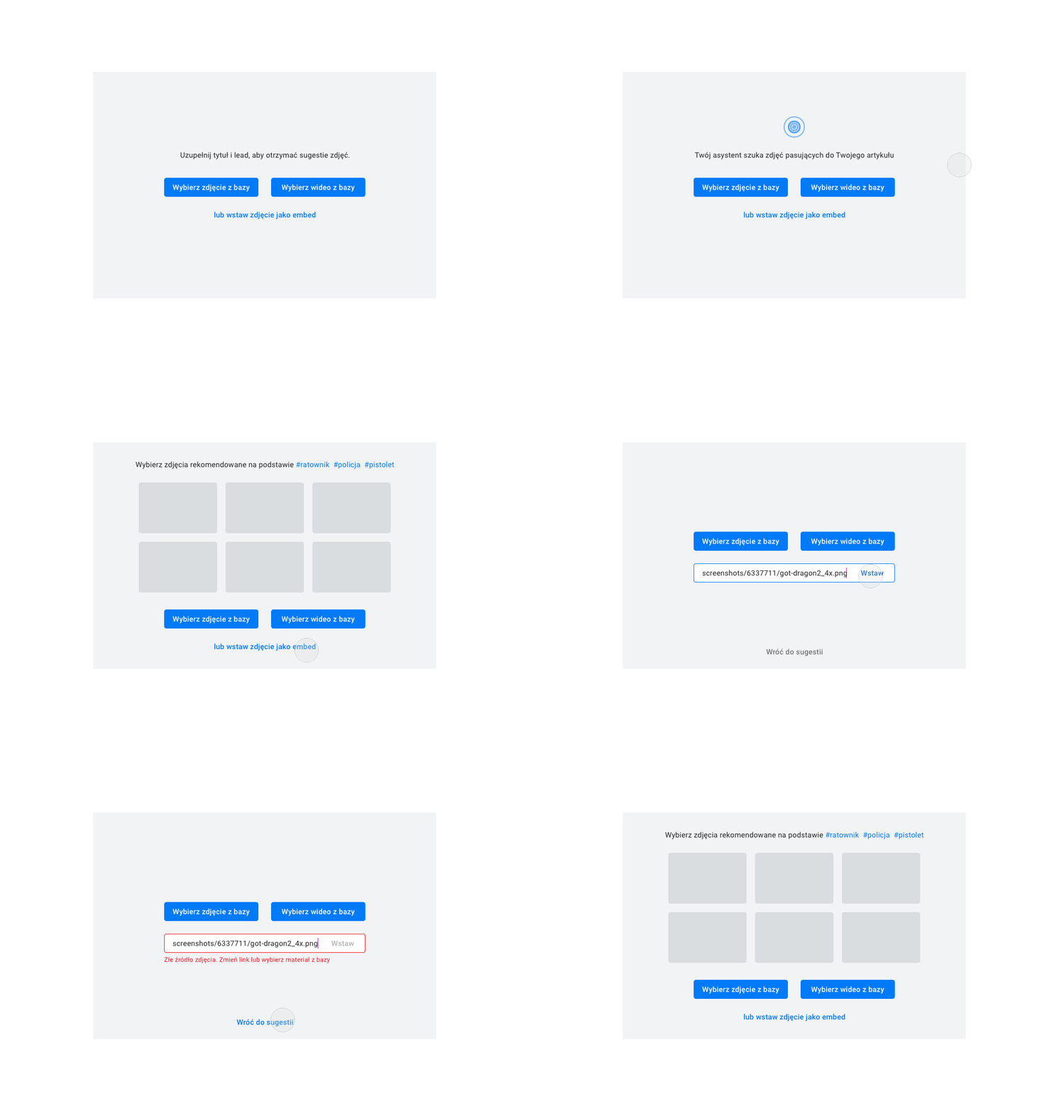
The flow of each of the processes involved is presented in graphic form using a diagram. It demonstrates the beginning and each step of the process all the way to the result of the given scenario in a clear, legible way.
#3 The design stage
The bundle of files which are created at the design stage is made up to industry standards:
- Highly detailed mock-up for each of the views including states (validation, interactions). Naturally, this is compiled for desktop and mobile as necessary,
- graphic designs prepared based on the mockups,
- .sketch source files for mockups and graphic design with well-organized artboards and layers,
- presentation of the project in INvision along with a history of comments from the screen review process,
- UI Kit - a collection of graphic designs including their different states and interactions for the complete system interface,
- a clickable prototype (if required) in Invision, animations which present the behavior of interactive elements, fonts used in the project,
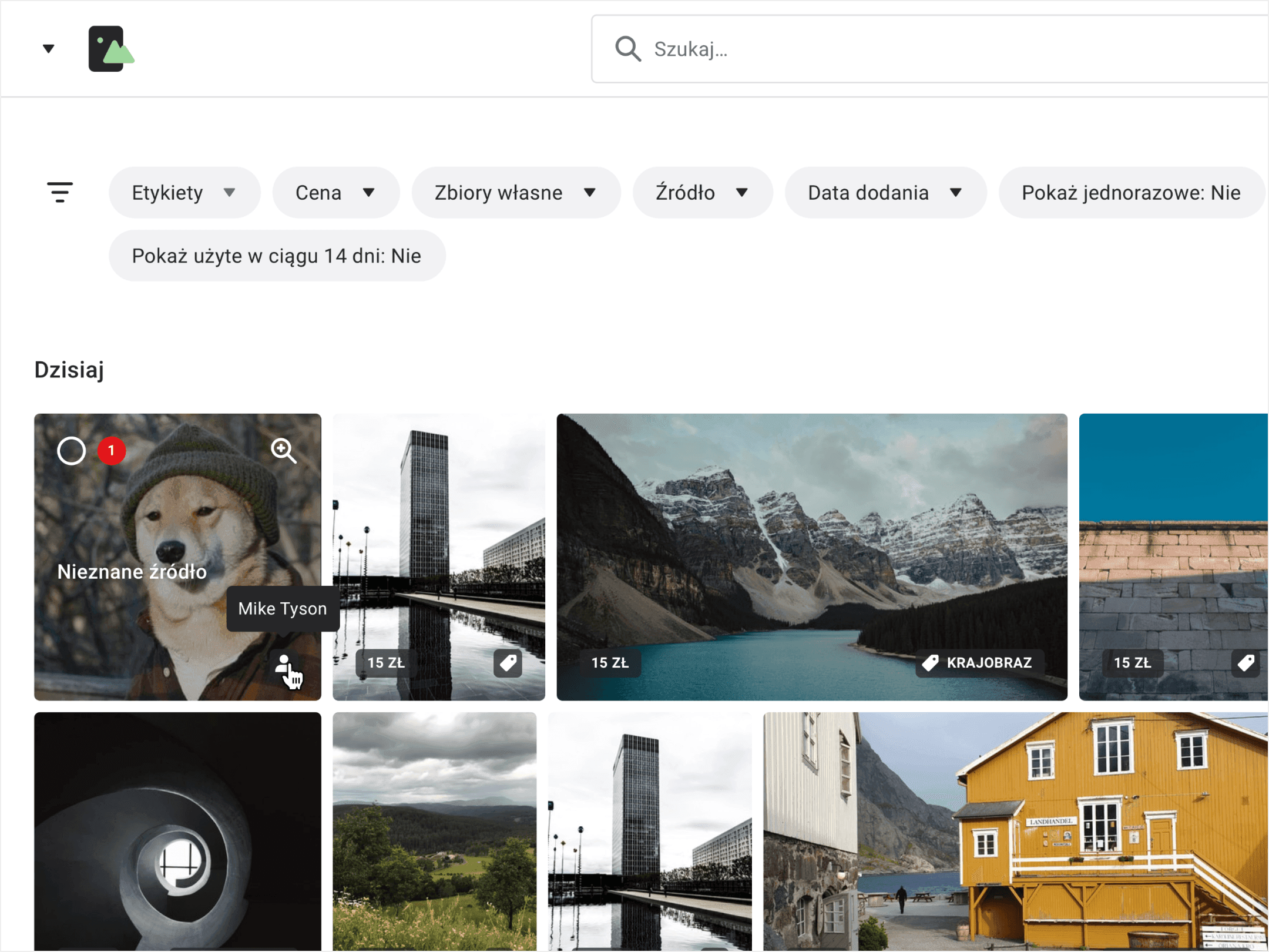
- assets, i.e. graphic elements included in the project (icons, images, illustrations), most often exported to .svg, .png, .jpg formats.
And this is where many designers end their involvement, while we add another portion of solid value for the implementation team…
#4 Ideation stage continued – requirements
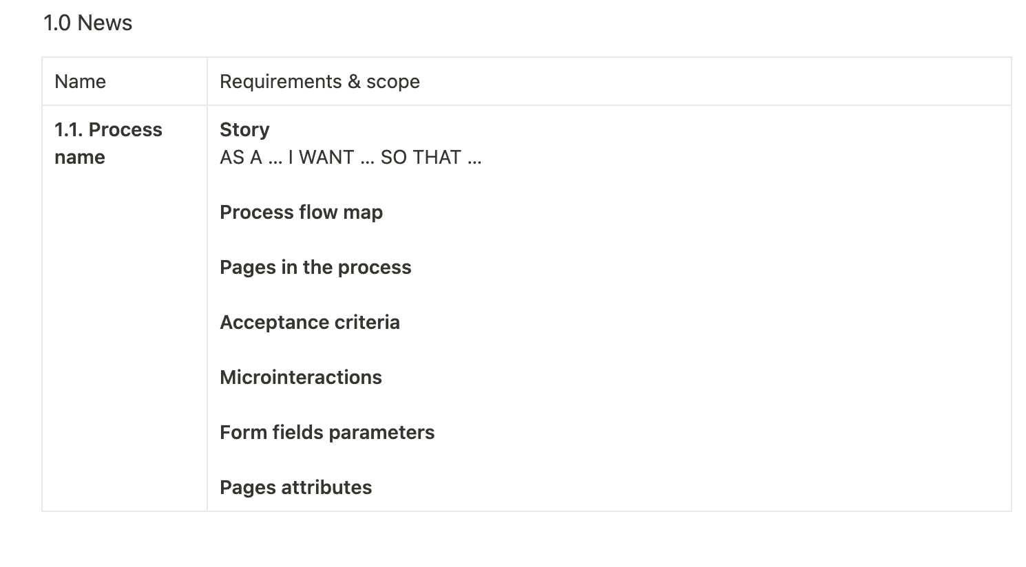
Yes, we go back to the drawing board, or in our case, to the process map, a document, for which we have laid foundations previously. Enriched by the decisions taken at the design stage, we have to supplement the views we created with detailed descriptions of requirements. Graphic designs, although they say much, they don’t allow you to see what happens off-screen, on the backend, management side.
We supplement processes with information regarding functional and non-functional requirements (qualitative, performance). Along with the created diagrams, they create a knowledge base including every single function within the system.
1.0 News

As a supplement we also describe microintentions, often using links to our own animations.


Each form is deconstructed into detailed elements in a form that is made ready to be implemented.

Process name, label, type, requirement, placeholder, captio, tooltip, error and success messages, interactions, data range, special formatting, character limit with spaces, comments. This is how we describe each form field.
Optionally, depending on the scope of our responsibility, we recommend basic parameters for different views within a process: URL construct, Tag Title, Tag Desc, OG: title, OG: description, OG: image.
TL;DR
The way we see it, only this bundle of information is enough of a knowledge base that allows the external team to operate. Let’s summarise:
Discovery stage Project card Product Card Research Competitive analysis
Ideation stage Process map Process diagrams Map of views Process requirements
Design stage Mockups Clickable prototype Graphic design UI Kit Animations Fonts Assets
We hope many Project Managers and software developers will cuss with a bit of satisfaction when they see this and think to themselves “those guys at Autentika know their… business”. And how about you? In what form did you get materials for the last project you worked on?
At Autentika we call ourselves a UX UI Design & Custom Development team. For nearly 17 years we have been creating web applications and websites, mobile applications, and e-commerce systems.
If you’re planning to work on a software project for your company in the near future learn about our competencies and get in touch.


