Enhancing UX: A design system journey at media and tech holding
Overview
About the client
Wirtualna Polska is one of the largest media and tech holding companies in Central and Eastern Europe. It operates over 50 websites and applications, including 40 media outlets and reaches 23 million monthly users. For 25 years, it has developed multiple internal systems and acquired more than a dozen external companies with their own editorial processes and back-office systems.
About the project
Wirtualna Polska invited us to rebuild their back-office system and develop a new, enterprise-wide application for content editing. From the early stages of our discovery process we realised that we needed a design system to build the application.
The client already had several design solutions acquired with applications throughout the years. We proposed replacing them with one design system to unify more than 20 services and ensure a coherent brand presence. It was the best and most logical answer to the problems with disorganised styles and inconsistent user experience.
The challenge
Over 20 complex applications, each designed separately and with no consistent UX.
Different editorial teams used separate systems and tools for the same tasks, which drove up costs and hindered the development of new products or features.
Issues arising from differences between applications obtained through acquisitions, maintenance issues and barriers to further development.
A unified design system that encompasses most application components.
The content editor serves as a leading application with a complete ecosystem for adding media and components and other applications related to the editor.
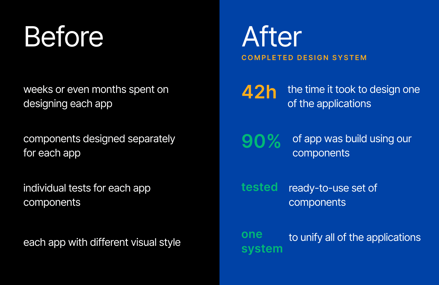
Shortened design time and improved the speed and intuitiveness of the system. The system is less prone to crashes and errors.
of new applications are covered with components from the design system; only 10% are one-offs.
time reduction in creating new applications. It took only 42h to design one of the applications.
Now, what is a design system?
(Skip this part if you already know that and scroll down to “Our work” section)
A design system is a comprehensive set of standards, tools, components, and styles that ensure design consistency and user experience across platforms. It includes UI elements, typography rules, colour schemes, and interaction and usability guidelines. It is also a set of rules that define how these elements should be used and combined.
It’s more than just a UI kit, style guide or library of components – it’s the entire system whose idea is to create it once and use it many times – although by nature, it is never a finished product, as it evolves over time and needs to be well maintained.
Benefits of a design system
When properly implemented and used, a design system brings many benefits, including:
- Increased time and cost efficiency when building new products,
- Coherent branding of applications within the ecosystem,
- Reduced costs of developing existing applications,
- Better user experience,
- Optimised control over roles and permissions.
If you are interested in learning more details, read our guide about design systems here, or answer these 10 questions about introducing a design system into your organisation.
We also recommend a separate case study focused on redesigning the back-office system for Wirtualna Polska.
Our work
Roles and responsibilities
As Autentika, we formed the design system team fully responsible for the DS creation and development. Here’s the division of roles we adopted within this team.
UX designer
- Inventory of apps - processes and screens
- Qualification of components to be included in the library
- Creating documentation
UI Designer
- Supporting the work of the UX designer
- Creating the component library and style guide
Front-end developer
- Creation of the component library, e.g. in React
- Supporting the documentation creation
- Taking over the documentation from the designers
- Introducing DS to the other developers
Client's team
Several dozen people were engaged in the project from the WP side. They were involved in developing applications and creating new products based on the emerging design system. They were the DS's first users and reported needs, bugs, and enhancements as we developed the system.
Methodology
First, we started building the design system according to the concept of Atomic Design. This method for designing user interfaces divides them into five hierarchical levels: atoms, molecules, organisms, templates, and pages. Atoms are the smallest interface elements, such as buttons or labels. Molecules are groups of atoms that form functional units, and organisms are complex sets of molecules. Templates or pages are surface structures and end products filled with content.
However, we quickly realised the drawbacks of such a solution. The boundaries between levels often seemed unclear, and it was difficult to determine whether a component was considered an atom, molecule, or organism. Moreover, it did not always reflect the reality of the coding.
We developed our own methods based on Atomic Design and the idea of modular construction of components, but not rigidly adhering to an artificial subdivision. We began to group components not by complexity but by functions, use and families of those components.
How we worked
Here’s how we approached the challenge and the steps we took in the process:
1) Application inventory
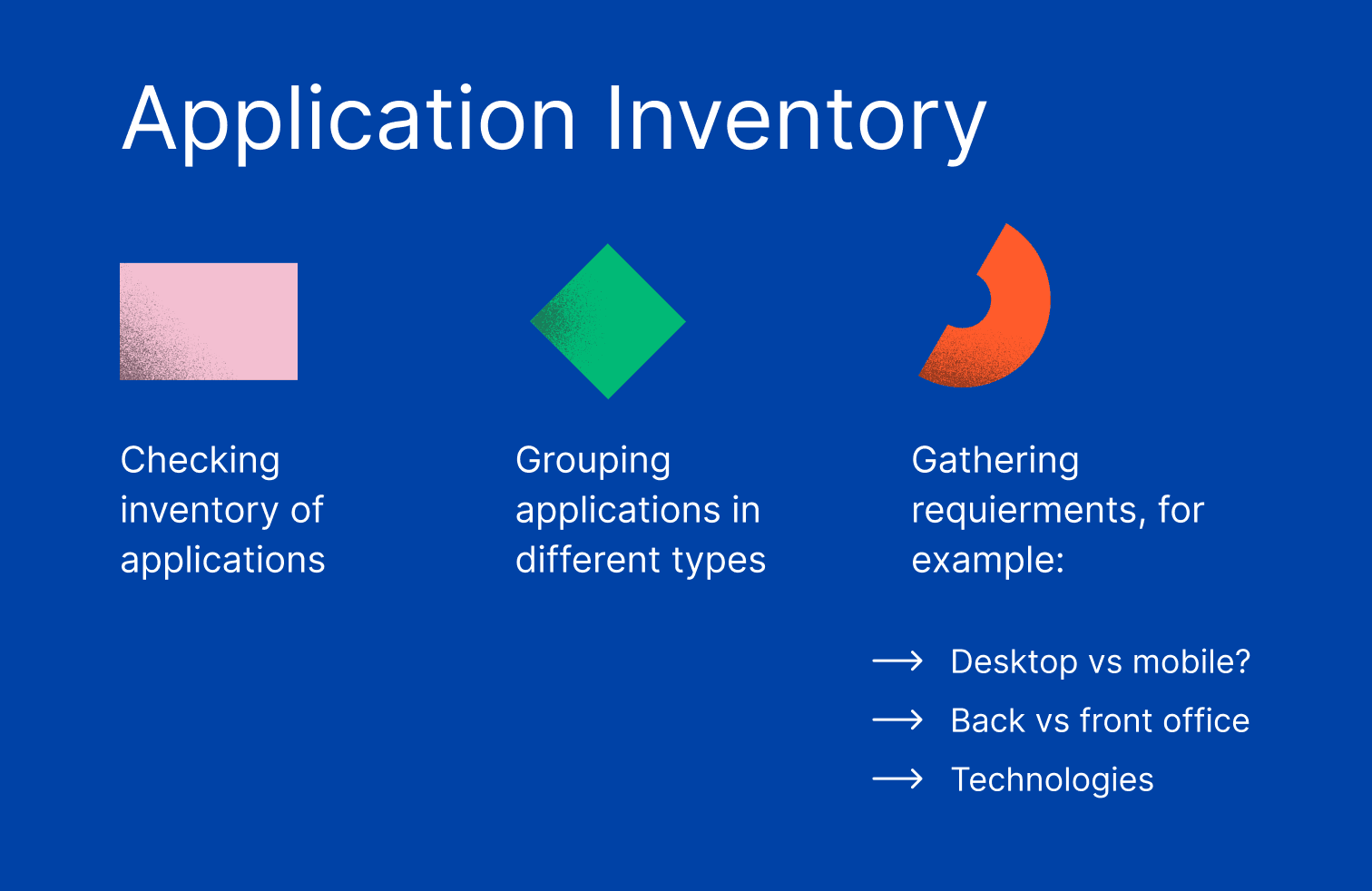
First, we examined WP's existing application system and made a detailed inventory of all existing apps. We grouped them by type and differences and researched the requirements (technology, mobile vs desktop, back office or front office).
After examining the applications and capturing the system's full scope, we selected the main app – the content editor – as the basis for creating a design system. We then did a detailed inventory and review of the content editor’s components and selected design prototypes, patterns, and possible components for the design system.
2) Development
This was the core phase of the project, during which the design team focused on creating and customising foundational components while developers primarily implemented UI/UX components.
Here’s how we worked in more detail:
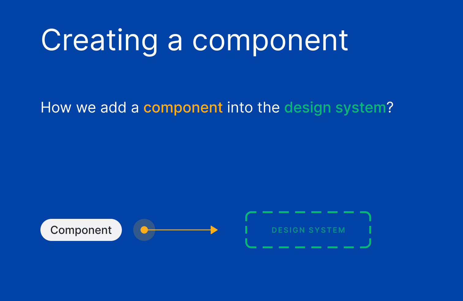
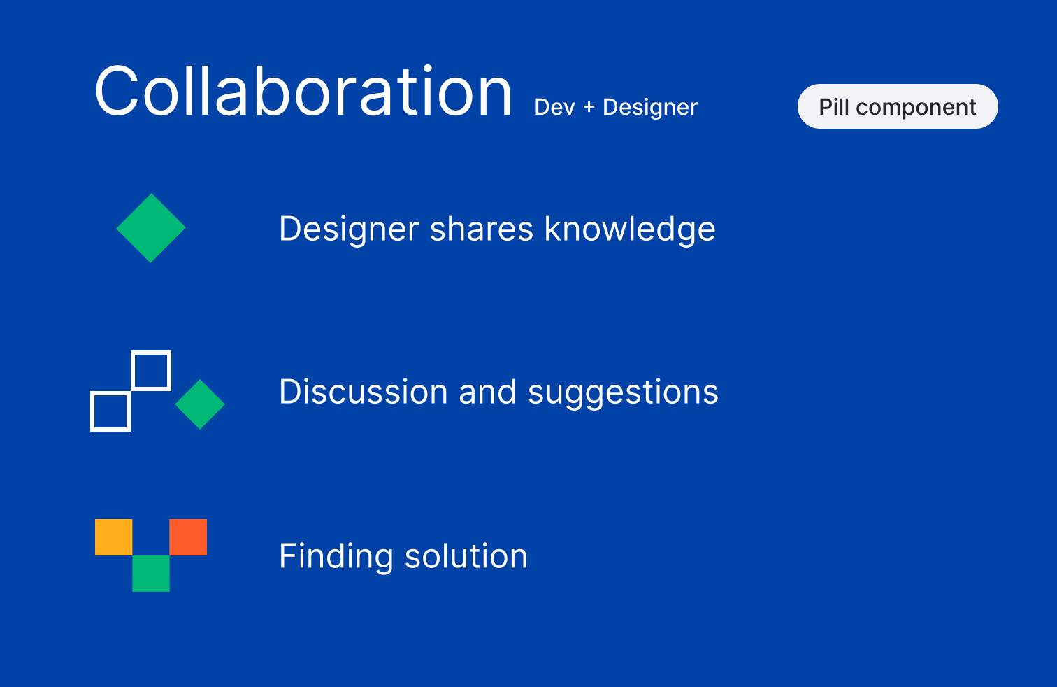
It was time to consider which elements would suit the design system. We began designing a component, exploring all possible variants and considering the states that would find use in these applications. Once the designer published the component in the design library, it was time for development. The designer then shared both the component and the relevant knowledge with the developer.
Together they discussed how the component should work and exchanged feedback – all to create the best version before adding it to the component code library.
We applied this process multiple times to every component.
3) Documentation
In the world of product development, documentation is often written at the end of the project. With design systems, however, it is crucial to start the documentation process as soon as we have a component ready to be added to the library and do it simultaneously with the development process.
In the case of Wirtualna Polska, we spent a lot of time discussing and analysing all the components to ensure that the documentation contained all the necessary information for the design and development teams and ensured proper system use.
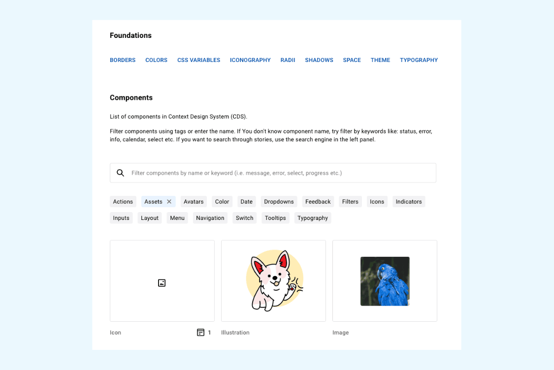
We have collected detailed information about all user interface components available in the system (UI). The components are fully described, with information on how and when to use them, their properties, their dependencies, and how they can be changed or extended.
Here are examples of what the documentation looks like:
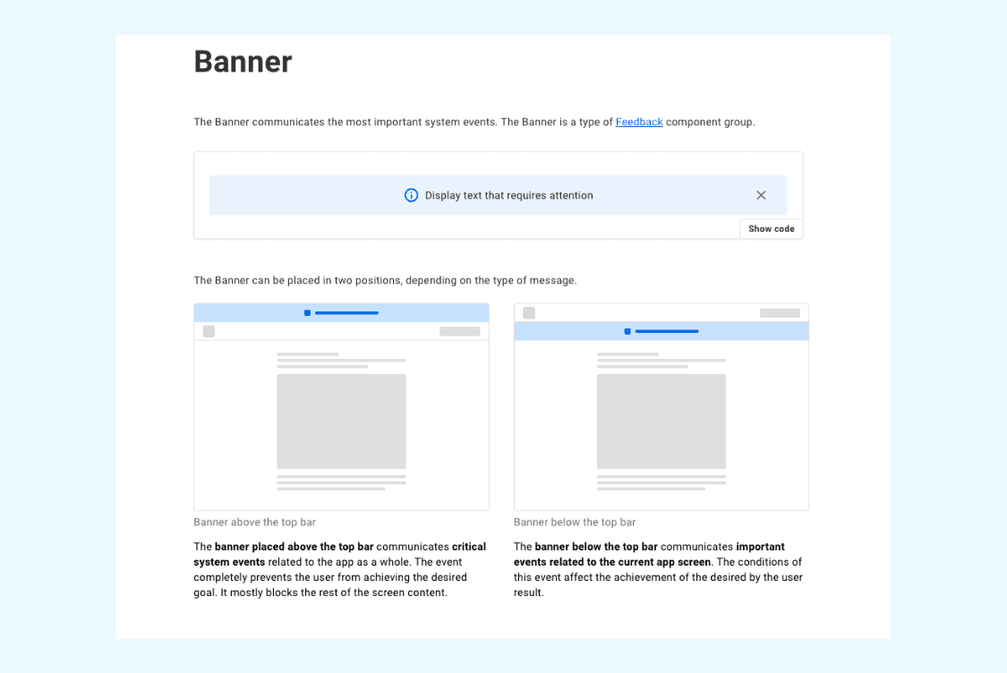
Code examples are provided for each component so developers can easily understand how to use them. In the case of our system, which is based on React components, the examples include JavaScript/TypeScript code snippets.
We prepared two types of documentation:
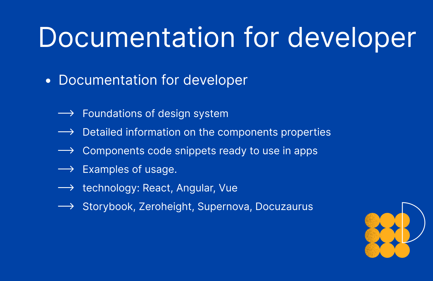
For developers: technology used in the process, components snippets ready to be used in apps, components’ properties, examples of usage, rules and guidelines. Documentation serves as an instruction manual for the developer on implementing and configuring each component into the application.
Documentation was made in Storybook.
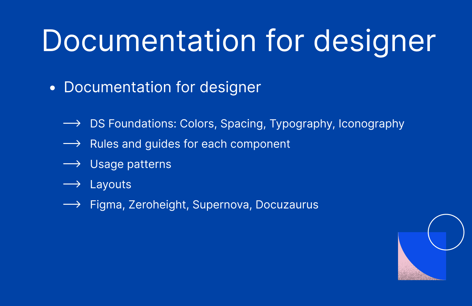
For designers: rules and guides for each component, DS foundations (colours, spacing, typography, iconography), and usage patterns. Here, the documentation helps the designers learn the design rules and guidelines for creating new elements and maintaining consistency and quality in user interfaces.
Documentation was made in Figma.
We have also created a guide that introduces the design system, with filters that make it easy to search for components.
4) Maintenance
Design systems are not static and finite products – they are projects that grow and evolve. As the system and applications mature, the focus naturally shifts from creating novel components to optimising and enhancing existing ones.
In this evolution, the designer's role transitioned into an advisory position – the designer mainly assisted the development team in effectively utilising the design system. Additionally, developers addressed the need for new components, drawing from their experience.
These changes are natural and expected as the design system integrates into the client's daily work.
If you're interested in design systems, listen to this episode of our podcast, where Dominika Kiszkiel explains the process in details.
What we delivered
1) Scalability and consistency: from simple to complex elements
As we have mentioned, we used the basic principles of the Atomic Design methodology, building the design system from the smallest to the largest units. Thanks to such an approach, we could guarantee the system's consistency, maintainability and scalability.
We started with the simplest components (atoms), which are the basic units of the system. These include buttons, text fields, icons, labels, etc.
Once these basic elements were defined and created, we combined them into larger, more complex entities.
2) Interchangeability: exchange components without disrupting the system
The components of our system are designed to be easily interchangeable with other similar components without disrupting the system. All components are standardised to ensure consistency. We have designed spacing, sizes, and icons so that versions of smaller components can be created without compromising design consistency.
3) Independence and modular structure: components serve as building blocks for apps
Each component is independent and contains everything it needs to work correctly. This includes JS code, styles and HTML structure. Also, each part of the system is designed to be as self-contained as possible to create, extend, and update components easily. This allows for more efficient management of the system and facilitates development.
This way, if we want to change the design of a "button" component used in many places, it is be sufficient to update that one component. The change will be visible in all places where the component is used.
4) Adaptability: the system adapts to the replacement of components
Our components are designed to be flexible and adaptable to different situations. For example, if we replace one component with another, the system can adapt while maintaining the consistency and stability of the design.
5) Reusability: we use what we have designed
We developed components to reuse them in different parts of the system or even in different projects. When we create new components, we do not reinvent the wheel but use what we have already designed in the design system.
This makes the system versatile, comprehensive, efficient and optimally designed. We do not use one-off components but try to use existing ones. As a result, 90% of new application designs are based on components from the design system.
6) Rules and best practices
We have not only designed components but also established rules for their use in particular contexts. We anticipated which components could occur together and which could not - for example, we created rules for button occurrence in cases where we want to place different button variants side by side.
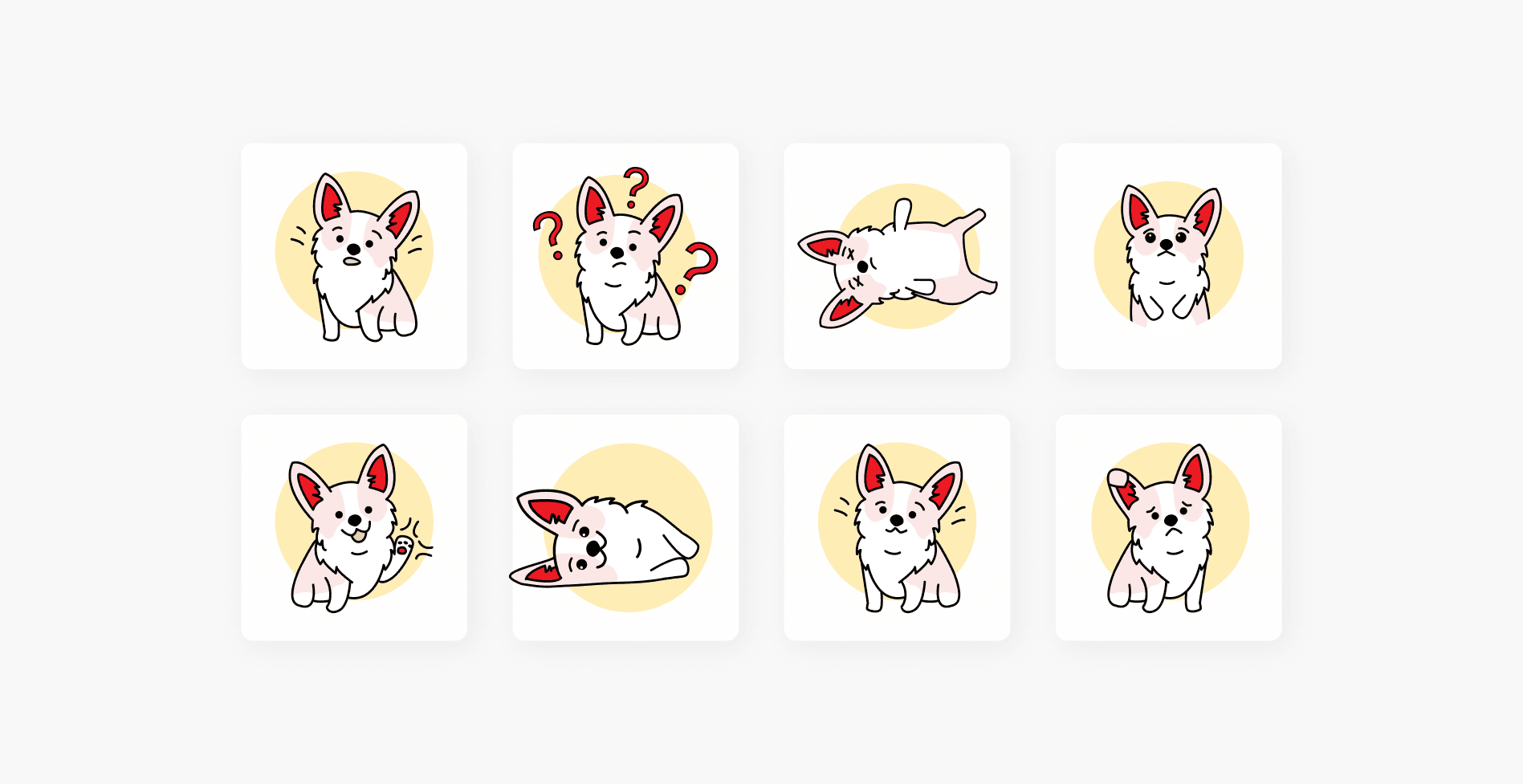
As a bonus, we designed our brand hero - Corgi dog, which has already found its place on the team’s t-shirts!
What we learned
We ran into a few dead ends and had to make a few refactorings. Here are our most important lessons.
1) Scalability and flexibility of the system
The system should be scalable with easily modifiable and reusable components, preventing us from building everything from scratch. Proper project planning and management are crucial to ensure ease of maintenance, including code documentation, regular code reviews, testing, and maintaining code quality.
2) Complexity vs speed of creating new features
As the system design becomes more complex, maintenance, enhancement, and creation of new features can become challenging due to increased complexity and technological debt.
However, a well-designed system allows for quicker and easier development of new applications by leveraging existing solutions and tools. Incrementally extending and improving the library reduces the need to start from scratch each time.
3) Visual layer, without logic
We prioritise separating unnecessary logic from the design system's components to simplify development and maintenance. Balancing universality and specificity, we focus on the component's presentation and user interface rather than incorporating complex logic. This approach enhances flexibility, usability, and customisation for developers who can add specific logic as required in their implementations.
Bonus information
Communication
Communication plays a vital role in developing the design system, primarily for the following reasons:
Understanding needs: Bridging the gap between developers and UI/UX designers ensures a shared understanding of the system's goals and requirements, aligning their perspectives.
Consistency: Communication fosters consistency by allowing designers to clarify their intentions and decisions while enabling developers to discuss technological opportunities and challenges.
Feedback: The design system evolves through regular reviews, updates, and iterations, necessitating continuous communication and collaboration among teams.
Documentation: Collaborative efforts are crucial in creating clear and understandable instructions and guidelines for utilizing the design system effectively.
Understanding constraints: Designers must understand the technical constraints faced by developers during implementation, and developers should grasp design goals and user expectations.
Tech stack and tools
Front-End:
React, Next, NX, TypeScript, Styled-components and Storybook
Versioning, Changelog.
Unit testing with Jest.js + React Testing Library
UI and Documentation:
Figma - currently, previously Sketch and Invision, Storybook + Notion (drafts) - documentation
of new applications are covered with components from the design system; only 10% are one-offs.
time reduction in creating new applications. It took only 42h to design one of the applications.
A modern and well-documented system used by a many applications and developers. Hundreds of components work perfectly together, with many pages of guidelines and manuals.
Business logic: once the UI components are designed and implemented, developers can focus on creating the application's business logic instead of creating UI elements from scratch.
Reduction of errors: the design system ensures consistency in the appearance and behaviour of UI components across different application parts. This reduces the risk of errors and inconsistencies in the user interface.
Easier testing: components that are part of the design system are well-tested, meaning they have fewer bugs and are more reliable. This, in turn, speeds up the process of testing new features.
Documentation: detailed documentation describing how to use each component speeds up the learning process for new developers and helps avoid errors.
