We asked how three leading European newsrooms handle editorial analytics – and here’s what they told us
19 Jun 2023
We reached out to experts from prominent titles to explore their approaches to editorial analytics.
Written by Joanna Kocik, content specialist at Autentika
Janis Kitzhofer from Axel Springer, Yves Van Dooren from Mediahuis, and Bent Steeg Larsen and Mikkel Stampe Davidsen from Politiken share their best practices for editorial data strategy and management.
"Newsrooms operate at a frantic pace, and journalists simply don't have time to wade through hundreds of data points to find insights. So when it comes to metrics, less is more," wrote the Financial Times team as it described how it brought data into the newsroom several years ago.
This view still holds true today: bringing data into the newsroom can be tricky and is one of the biggest challenges of digital transformation. Beyond the technological challenges, cultural barriers often exist to adopting a data-informed mindset and agreeing on commonly accepted metrics. For this work to have an impact, it must be integrated into a clear digital strategy, supported by organisational alignment of processes, tools, and incentives.
Today, hundreds of data points are generated from a single reader's visit to the website, and data management helps newsrooms optimise content strategies and internal workflows and improve editorial decision-making. However, it is critical that editorial teams' use of data is accompanied by journalistic instinct and editorial integrity.
Leading media organisations in Europe have managed to distil their key principles that help bring data into the newsroom. We reached out to three prominent titles to explore their approaches to editorial analytics: Germany's Axel Springer, Denmark's Politiken and the Netherlands' Mediahuis – and we are happy to present their perspectives that shed light on the role of data management in today's news landscape.

Janis Kitzhofer, Axel Springer, Germany
Janis Kitzhofer is a data evangelist with a diverse background in journalism and marketing. While working as a print editor at the Financial Times, Janis found that he had no insight into the behaviour and engagement patterns of the newspaper's readers. This prompted him to change his career path and move into marketing, where he gained 15 years of experience working with publishers.
In 2021, Janis returned to the news publishing business and is now Head of Editorial Analytics at Axel Springer. He bridges the gap between the data department and the newsroom, advocating for data-driven approaches to improve journalism and reader engagement. His mission is to make every journalist aware of the value of data and how it can support their work.
Janis' commitment to storytelling, data-driven journalism and empowering newsrooms has positioned him as a key expert in leveraging data in journalism.
Here are 5 key principles of editorial analytics from Janis:
1) Use empathy to build bridges between the data department and the newsroom
According to Janis, a creative approach and empathy are key to encouraging journalists to use data in their daily tasks. In his work, Janis draws on his experience as a journalist and follows the value of empathy to understand the newsroom's perspective. This helps him connect more closely with authors and editors on the team. In weekly workshops Janis listens to the journalist’s questions and needs, discusses the meaning and value of certain metrics, and most importantly talks about ways of how they can impact those metrics.
"If I showed up in a newsroom as a typical ‘tech guy’ or ‘data analyst,’ there would be a big gap between me and the journalists. So, I use fun and creative techniques to speak their language: Storytelling, interactive presentations, and in-practice workshops," Janis says.
2) Use metrics that are going to stick in people’s heads
For Janis, it's important to introduce metrics that mean something to those who use them and stick in their minds – which only happens if you have an immediate influence on them. "I negotiate between the different needs in the organisation and try to find a good middle ground. Goals are often tight to business metrics with limited informative value for the individual journalist," Janis explains.
"Let’s take visits for example. It’s an important metric for ad bookings and comparability with other publishers but it is not very tangible for authors while a bad read through rate is a clear call to action. Changing the structure, the form, the headline, etc. can impact the results significantly. And seeing these changes to have an immediate effect is what creates stickiness. I call it 'the power of live' in stark contrast to retrospective analyses that look at past events," explains Janis.
Equally important to him is connecting metrics and data with a story. "My team has analysts and data scientists who are great at creating dashboards and data models. But we also have someone who can tell the story: me. All of that helps us teach people the importance of data and empower them to apply what we teach them," he adds.
3) Define the strategic pillars of your work
Axel Springer has three strategic pillars of work with data: educate, empower, and evolve.
"Educate" means bringing people closer to data and its meaning through reports and analysis, direct conversations and fireside chats with editorial teams around the globe and external partners. Janis sees knowledge sharing as an important part of learning best practices and mistakes that help the media industry.
"Empower” means giving people tools for data analysis and teaching them how they work so they can feel confident using them and gaining more insights.
And finally, "evolve" means providing a direction for the organisation. “In data analytics, you can look at many numbers, but you have to define which ones are the most important so as not to divert attention from the real work of writing and producing content,” Janis emphasises.
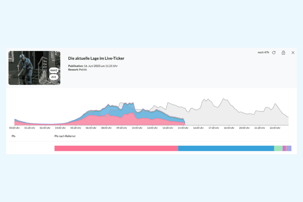
Data chart showing the article performance (image by Axel Springer)

Heatmap showing key metrics for Bild (image by Axel Springer)
4) Think about the long-term effects
When asked about his north star metrics, Janis replies that page views, visits, and subscriptions are important for Axel Springer as for any publisher. However, he points out that these metrics are interrelated and cannot be considered in isolation.
"Of course, some isolated metrics are popular with publishers because they drive the short-term business, are easy to understand and communicate. But they can also be counterproductive. For example, if you have subscription goals, you might think, 'Okay, I'll make 70% of my articles premium, put everything behind the paywall, and create more subscriptions.' But what results will such a decision bring in the long run? Visits and page views might go down – everything affects each other."
"Personally, I am in strong favor of engagement metrics like time on page, as well as read through and recirculation rate," – adds Janis.
5) Share your best practices
As mentioned earlier, knowledge exchange is essential for Janis. He actively participates in conferences, summits, and talks to share his team’s learnings and takeaways.
“I talk a lot to other publishers and visit our internal teams across the world because I believe that this is my mission: inspire others with data”, he says.


Bent Steeg Larsen and Mikkel Stampe Davidsen, Politiken, Denmark
Bent Steeg Larsen (L)is a Research Manager, and Mikkel Stampe Davidsen (R) is Head of Data at Politiken– a Danish newspaper with over 130 years of brand history.
Here are 5 key pieces of advice from Bent and Mikkel in the field of editorial analytics:
1) Build a data tool with a clear understanding of your customer's needs
In creating data dashboards, the main goal of Politiken's data team was to make it easier for key customers – journalists – to access and interpret what they see. For this reason, the data monitoring tools were integrated into the back-office system and the brand identity was maintained, including colours, look and feel.
Every time a journalist logs into the system or views an article through the company IP or VPN, he or she can see how it performs. All pages displayed internally have a data overlay that automatically pops up to show the most important metrics.
2) Make data easily accessible
Another part of Politiken's data strategy also uses commonly accepted metrics that everyone in the newsroom understands. The most important part of the data display is a bar that shows the overall rating of the article based on several predefined parameters such as attention duration, read duration, bounce rate, and how many times the article was shared and saved.
Journalists can also see other easy-to-understand metrics, such as page views, average active attention time and conversion rate, defined as visits to the sales page for subscriptions and successful purchases. Another metric used by Politiken is the ratio of genders in an article to avoid gender bias.
As users scroll through the article, they can also see the average depth of the reader's visit, i.e. how many people read to a given point in the piece.
These examples of data visualisation make it easier for users to understand what they see and compare different content.
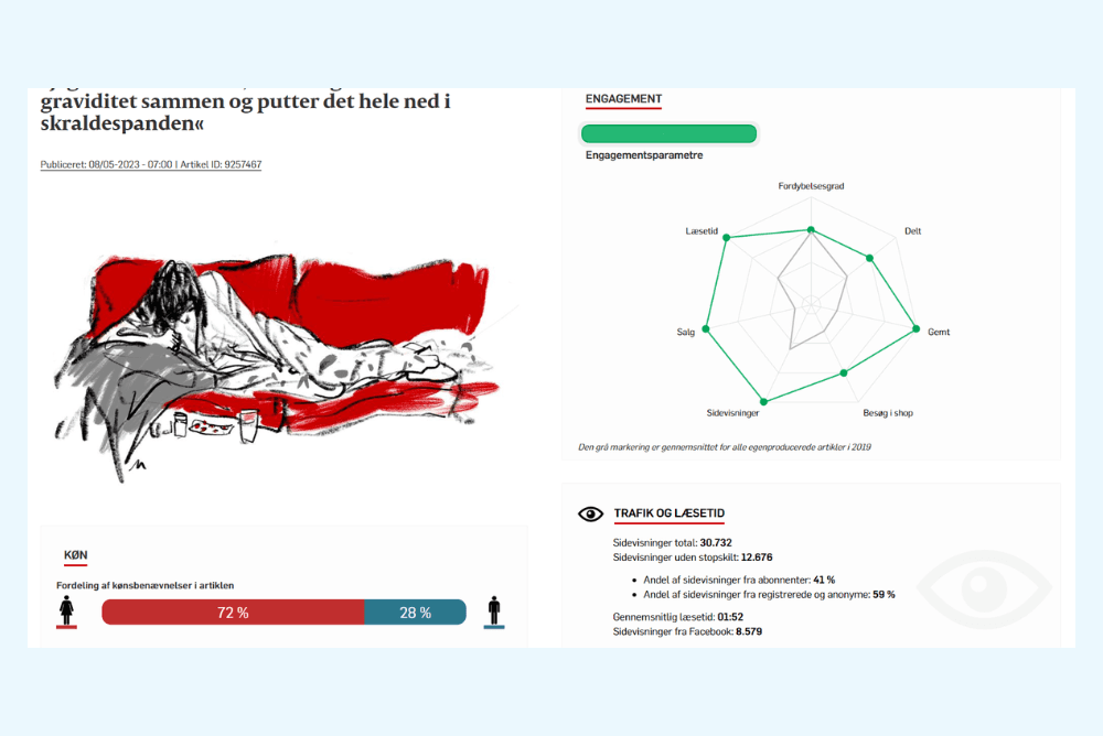
Most important metrics combined to form the overall article score (image by Politiken)
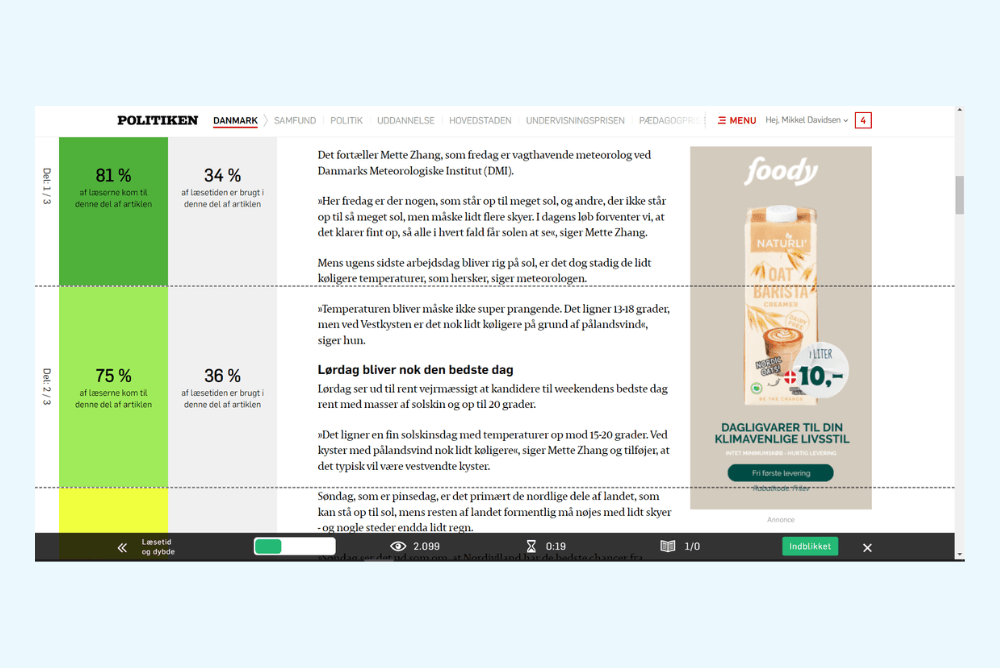
Scroll depth of an article as seen in the Politien data monitorin system (image by Politiken)
3) Make journalists the data-owners
Another important point in Politiken's data strategy was that the data should come from inside the newsroom, not outside. It is the newsroom that has ownership in this matter.
"The insights do not come from the analytics department - the journalists themselves track and analyse the data. You could say that our editor-in-chief owns the data, and when decisions are made based on editorial data, they come from him, not from the data team," Mikkel and Bent say.
"Of course, the data team is there to inform the business about KPIs and the overall "pulse" of the editorial team, but they are not there to give random advice to the editorial team. Their job is to see the bigger picture and discover patterns that can impact the overall state of the business," they add.
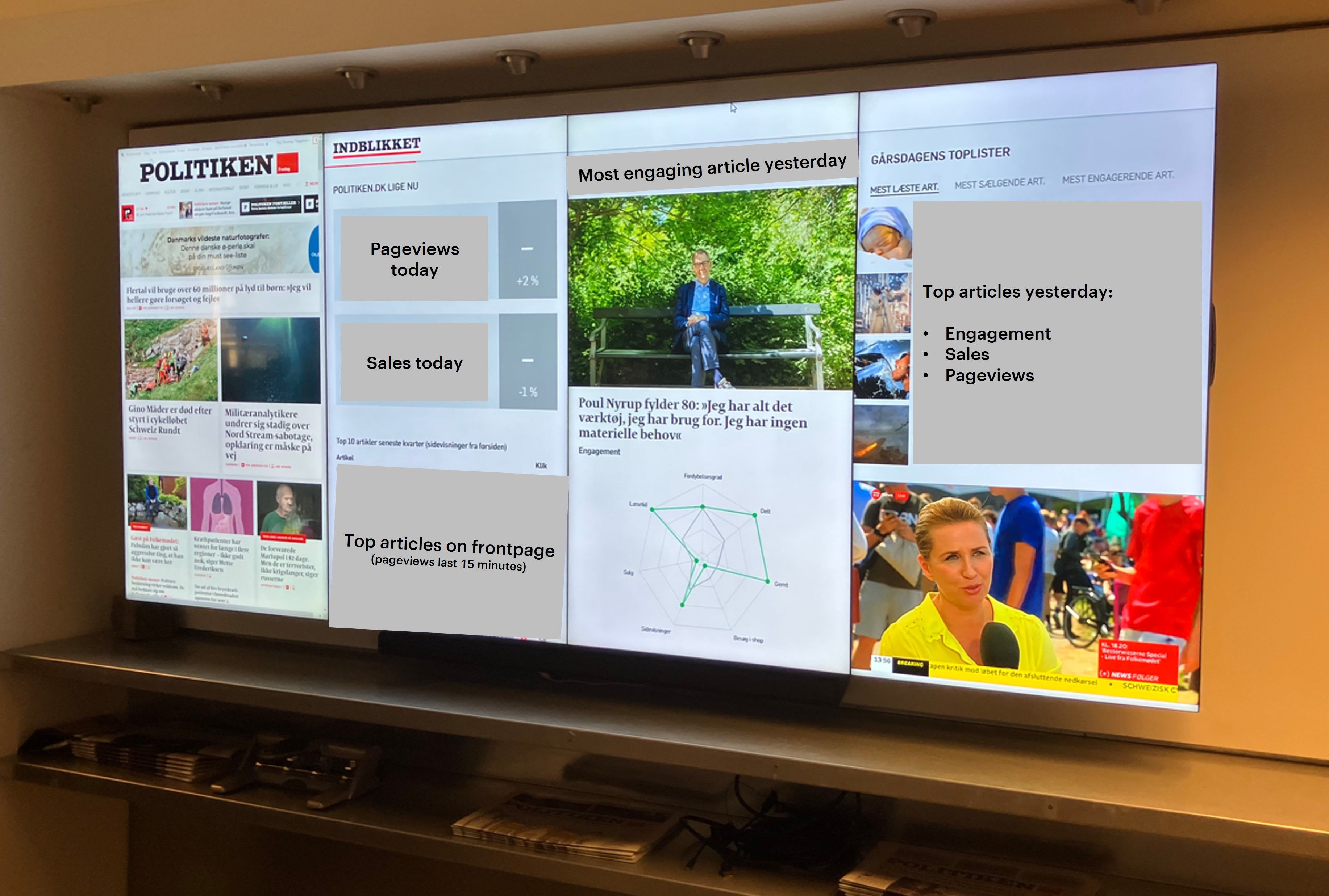
Politiken displays key metrics on large TV screens in newsrooms (image by Politiken)
4) Make data the talk of the newsroom
Mikkel and Bent admit that easy access to editorial data (Politiken also displays key metrics on large TV screens in newsrooms) has made data the "talk of the newsroom" at Politiken. In their view, this is a sign of successful data democratisation.
"Everyone sees these numbers, so people have something to refer to in their daily conversation. Every morning, editors look at the previous day's traffic and discuss: How many page views did we have? How many visits? How many sales? How does it compare to the benchmark numbers?" The journalists themselves also share engagement scores or page views, they say.
5) Keep your culture and values in mind
The data system at Politiken has not emerged without obstacles. There was some scepticism and reluctance when the data-informed approach was introduced to the newsroom several years ago. Crucially, however, journalists longed for feedback from their readers - and that's how Politiken treats the data.
"We could say it's a way to communicate and stay in touch with our readers. Data is not about judging your journalism; it's a feedback loop, a means of communication. And in our company culture, we respect that value very much," said Bent and Mikkel.
They stress that you should never impose decisions that contradict the newsroom culture. For example, they do not compare individual author statistics to avoid a competitive environment.

Yves Van Dooren, Mediahuis, Belgium
An engineer turned media expert. Yves Van Dooren used to work as a project manager, dealing with the challenges of search engines, social media and newsletter optimisation. Since 1999, he has been working with VUM Media and then Mediahuis , one of the leading media groups in Belgium, the Netherlands, Ireland, Germany and Luxembourg, with more than 30 brands in its portfolio, including De Standaard, Het Nieuwsblad, De Telegraaf, NRC and The Irish Independent.
Yves describes his role as a Data Science Business Partner Newsrooms responsible for traffic and audience measurement and coordinating various data and insight projects for the holding. Together with the Mediahuis team, he has created a data framework for journalists and editors in the newsroom to help them with their daily tasks.
Here are 5 key pieces of advice from Yves in the field of editorial analytics:
1) Have a single version of the truth when it comes to data in a newsroom
The team at Mediahuis developed its in-house data tracker to avoid data discrepancies and draw the right conclusions. “A single tool gives us a single version of the truth that everyone uses – so there is no room for doubts and disagreement,” says Yves Van Dooren. Such an approach gives people more confidence in data and helps them develop their own data products.
2) Use metrics that people value and accept
In the Mediahuis newsrooms, the north star metric is net attention time: the time users spend interacting with the website. According to Yves, it is a straightforward metric widely accepted in the ‘attention economy’, where every medium fights for users’ time and attention.
3) Listen to the people
From the beginning, the data team at Mediahuis aimed to give everyone in the newsroom access to all data from the data tracker and external sources such as social media, newsletters, mobile apps, podcasts and video platforms. They created dashboards with data about the content performance, but it turned out that… barely 10% of people in a newsroom were using them!
The team started asking journalists why they were so reluctant to use dashboards and got lots of valuable feedback – for most of them were too complicated and contained too much information. Journalists asked for a simple email or list of best-performing articles. That moment was a breakthrough and allowed for a full data democratisation process.
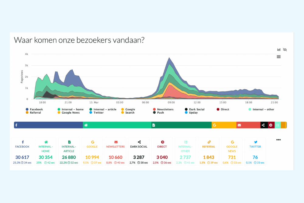
Data diagram at Mediahuis showing the most important article metrics (image by Mediahuis)
4) Don’t reinvent the wheel: leverage channels that people use to democratise data
The dashboard experiment helped the data team make the data more accessible through the channels people already used, like TV in newsrooms, email and Slack. Walking into most Mediahuis newsrooms, you can see real-time data displayed on a big TV screen.
“What’s more, we explain what people see every time we show the insights. Sometimes we even leave out the numbers and focus on explaining what the data presented means,” adds Yves.
Another communication channel Mediahuis uses is email as a daily newsletter. Instead of logging into the data dashboard, journalists receive key insights directly into their inboxes. They also get personalised emails every Monday to see how their content performs.
5) Don’t over optimise
Newsroom analytics is extremely useful and helps media organisations make better decisions, but Yves warns against over-optimisation. “A good news site is not just optimised content. You need a mix of inspiring posts, regular updates, insights and entertainment. Otherwise, you might end up with a super-optimised site that no one reads”.
Read more about editorial analytics at Mediahuis: 6 pillars of editorial analytics at Mediahuis – with Yves Van Dooren


