Why business app design stands apart in UX/UI? My top conclusions
30 Jan 2024
I have spent years developing internal business applications that streamline organisational workflows and optimise processes.
Written by Michał Samojlik
I have spent years developing internal business applications that streamline organisational workflows and optimise processes. I found that such projects are very different from UX/UI design of B2C and customer-facing solutions. Below I list five key elements that make the project challenging and the factors to consider when working on such an app.
By business apps – also known as work tools – I mean software applications that are designed to support and improve various aspects of business operations. They can look different and serve different purposes – they improve productivity, collaboration, communication and overall efficiency in the workplace. When we talk about a business app, we can mean an internal application for geologists in the oil and gas industry, an editorial system for journalists in a media holding company, an internal mobile app for couriers in a delivery company or software for warehouse management.
But they all have one thing in common: people spend their whole day with them. We are not talking about the app that is used for 10-15 minutes a day to order food or a taxi. We’re talking about it being used 8 or sometimes 12 hours a day – both on an office computer and on a mobile device, sometimes in highly unwelcoming conditions.
Imagine that: What should an app that you use for many hours a day look like? How does this context affect the UX/UI design? What do you as a designer need to consider when working on it? I have summarised five key conclusions I have come to about work tools – and what that means for both designers and their clients.
1) Measurability: Quantifying efficiency
One of the greatest things about designing business apps lies in their measurability. By incorporating analytics into enterprise tools, companies can track the time individuals spend on specific activities within an app and gain insight into the efficiency of their employees. For example, identifying frequently performed scenarios and the time spent on them provides a tangible entry point for calculating potential profits or savings.
Consider a scenario where an employee saves 8 minutes daily thanks to an app's improved UX/UI design. If you extrapolate this to a month, the savings are significant – with 200 employees using the app, that's around 32,000 minutes per month, which equates to 6400 hours saved annually for the company. This can be a significant saving and might directly impact the company’s revenue.
This underlines that improving usability isn't just about aesthetics, it has a direct impact on the bottom line. It can mean significant cost and time savings – the more streamlined and intuitive the tools are, the more time employees have for meaningful tasks.
But this is the ideal.
And it happens even though one doesn’t need a sophisticated analytics system to do that. Employees may spend years using inefficient tools, developing workarounds and adapting to sub-optimal workflows. Some end up frustrated and even decide to change jobs. Others complain about the tools but stay with the company and resist any change. I will return to the roots of this resistance in the next section – where we will focus on the business apps’ users.

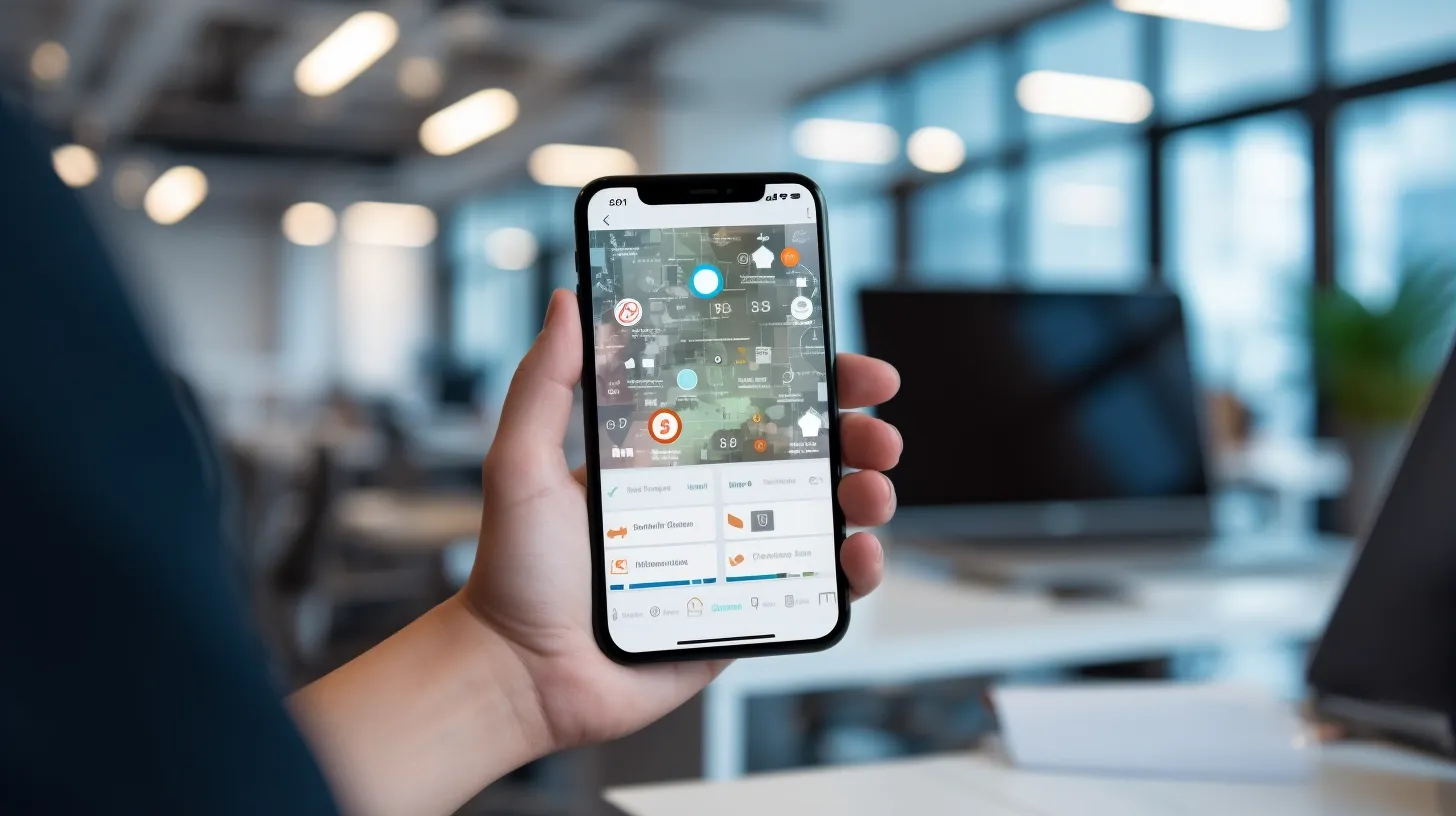
Improving usability isn't just about aesthetics – it can mean significant cost and time savings (image by Midjourney)
2) User-centric approach
I am fond of developing business tools because they allow us to go beyond web analytics. We can talk to the people using the app and not just rely on surveys and web analytics (which is typical for customer-centric products).
Don’t get me wrong – web analytics is essential to our discovery process (BBUD). But it’s also highly impersonal and doesn’t show the entire picture. This is why we always combine qualitative and quantitative research methods and engage the end users when working on an app. Observing how employees work, talking to them, and incorporating their insights into the design process ensures a solution that resonates with end users.
Furthermore, involving users in the design stage fosters collaboration. Through iterative sprints, users contribute their knowledge, providing real-time feedback on the existing tool, sharing pain points, and influencing the development of a more user-friendly solution. This collaborative approach bridges the gap between us – designers and end-users, ensuring that the final product aligns with the needs and preferences of those who interact daily. It also offers a firsthand understanding of their workflows, pain points, inefficiencies, and – as I mentioned – reasons for resisting change.
Breaking the inefficiencies vs the challenge of change
Let me anticipate your doubts: collaborating with end-users of the tool doesn’t mean we favour “wishful thinking” and make every wish come true. We know that if we work for a large organisation, the users we interview might not be with the company when the app is launched due to natural turnover or changes in the market.
We are also aware that there are different user groups. Our experience proves that some will resist change, as they have used a tool for years and want to keep their habits. They may also fear that a new tool will be hard to learn. On the other hand, some don’t want the existing tool to change because a faulty system serves as an excuse whenever something goes wrong. Once the tool is fixed, they will lose this excuse. Both groups can also associate new tools with job reductions and lay-offs and thus might oppose the change. Finally, there is usually a group that genuinely hates their work apps and would welcome an earthquake. They will exaggerate the shortcomings of the tool and inflate their pain points.
Acknowledging what the business expects sets the background for the entire process and helps avoid misunderstandings in later stages. We have described how we do it in this article, so look if you’re interested.
One more thing (which could be a separate article). When you decide to transform an organisation’s business apps, you need to think twice about whether you genuinely want to break the patterns and habits of your employees. Sometimes, “better” can be the enemy of “good enough”. Users can reject a new tool because they still prefer the old one. So sometimes the answer to your needs is not a revolution but an evolution. It might be sufficient to improve the app and add new functionalities to give people more time to adjust and adapt.
3) The need for scalability and flexibility
Another factor we must consider when designing an enterprise app is anticipating the future. Obviously, businesses don’t redesign their tools every 2-3 years – these apps should serve as long-term solutions, given time and investments. Still, when designing a particular tool, we should consider that it might grow and be developed. Maybe a group of applications will be developed out of a single app? For us, this means we need to think about a modular and scalable ecosystem, a collection of building blocks that can be flexibly arranged to construct a tailored toolset.
This approach addresses the need for scalability and emphasises the importance of aligning design strategies with broader business goals. The key lies in convincing stakeholders that redesigning tools is a strategic investment to optimise costs and future-proofing operations, emphasising the value-added through sustained efficiency gains.

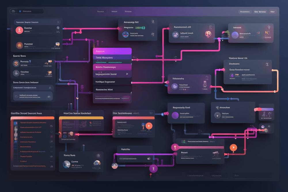
It's worth thinking that your business app might grow and be developed (image: Midjourney).
4) Hardware-centric design challenges
Today’s business tools are not just enterprise software used on company computers in the office. Many tools have transitioned to mobile applications operating on phones or terminals. Here, the focus must shift towards hardware compatibility and resilience in diverse environmental conditions – extreme temperatures, rain, or the need for users to wear gloves or operate the device with one hand.
This entails a couple of things. First, it means designers must get input from people at different organisational levels: executives, mid-level managers, people directly responsible for day-to-day operations and end-users themselves. Balancing these perspectives ensures that the design caters to all stakeholders' unique needs, challenges, and preferences.
Second, the user interface must prioritise accessibility and functionality in real-world scenarios – freezing cold and sizzling hot, at night and in locations without mobile reception. Designers must also remember who will be using the tool – and often, these are not Gen Z employees but older generations, rarely tech-savvy, who need simple, intuitive design. Additionally, they will spend 8 or more hours with the app, so the UX/UI must be crystal clear. It’s worth thinking about implementing a double confirmation feature or micro-interactions, sounds and animations that would wake up people who do something automatically for the 100th time this day.
5) The reliability factor
In smaller companies, the motivation for software UX design updates often extends beyond time-saving metrics. The catalyst for change is frequently rooted in the ageing infrastructure of systems built over a decade ago. These legacy systems, once sufficient, are now grappling with technological challenges, lack of support, and maintenance issues. The reason for software updates lies in the need to adjust to the evolving technology and user expectations, avoiding the pitfalls of working with outdated, unsupported systems.
This is why internal business tools must be reliable, predictable, and utilitarian. Functionality takes precedence over sophisticated design. The focus is on providing users with tools that reliably fulfil their roles, facilitating smooth operational processes without unnecessary complexities. The key is to make routine tasks more efficient – which is why it’s good to explore other applications and the entire ecosystem in which users operate, getting a point of reference for ongoing design.
Observing user interactions across various tools unveils recurring patterns, habits, and solutions. While the goal is not uniformity, recognising these familiar elements allows designers to incorporate elements that resonate with users' established practices, which enhances the overall user experience.
UX-driven business apps design
I have seen many companies underestimate the importance of UX/UI design of their internal tools. They are rarely taken into consideration during strategic planning. If the app serves its purpose, UX becomes a secondary factor. Many managers still do not realise that the overall employee efficiency can be improved with UX/UI – and that their KPIs can be translated into UX-driven design.
Let me know if you see any potential for your growth through the UX/UI of your internal tools. If so, let’s talk – we have a proven track record in the area, and we can help you achieve your KPIs with the UX-driven design. Take a look at our case studies and give us a call – so we could turn your product into an app users enjoy.


