Online product catalog that guides users to a decision
31 Mar 2026
In manufacturing companies, the online product catalog still works mostly as a showcase. It presents the offer, lists parameters, shares files, and sometimes lets you put together a request for quote.
Today, with advanced marketplaces, search engines and AI advisors around, that is no longer enough for the user.
Someone who lands on the site is not there for the “full offer”. They come because they want to solve a specific problem. They want to pick the right product, understand the differences, check availability, download documentation or find a contact person who will help them move forward in the process.
This is why a modern product catalog should not be just a set of product cards. It should work as a decision support system.
In this article we show a few solutions that help guide different groups of users through a manufacturer’s offer: from the investor who does not know the industry terminology, to the specialist who needs fast access to files, technical data and contacts.
Users don’t want to analyze the whole offer
One of the common mistakes in catalog design is assuming that the user wants to compare many products on their own. In practice it usually looks different. The user lands on a specific product and asks themselves: “Is this model good for me, or should I consider something similar?”
That is a completely different intent than the classic “add a few products to compare”.
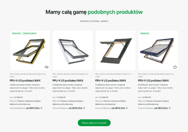
This is why a comparison tool can work much better when it sits directly on the product card. The user does not have to leave the context they are already in. They do not have to build the list manually. They do not have to go back to the catalog and wonder what else is worth comparing. The system can suggest the closest alternatives to the model being viewed.
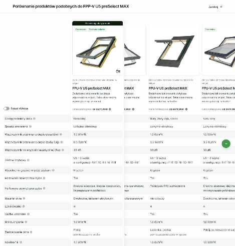
What also matters is how we show the differences. In technical industries a parameter table quickly becomes unreadable. Coefficients, materials, variants, classes, certificates and add-on options may be obvious to the manufacturer, but for the customer they are often a foreign language.
That is why a good comparison should not only line up the data, but also explain it right where the user needs it.
What helps here:
- pinning the currently viewed product as the reference point,
- highlighting only the differences against that product,
- short parameter explanations in tooltips,
- the logic of “this model versus the closest alternatives”, not “everyone against everyone”.
The effect is simple: the user understands faster whether it is worth staying with the chosen product or moving to an alternative.
For the manufacturer this matters too. When the user does not find the answer on the site, they usually leave it. They ask a friend, a salesperson, a contractor or Google. And there the manufacturer loses control over the path.
A configurator as the answer for those who don’t know what to look for
Not every user starts from a product.
Some people do not know what solution they need. They know their situation, but they do not know the offer, the categories, the parameters or the relationships between the individual components. In that case a classic catalog can be an obstacle for the person searching, not a help.
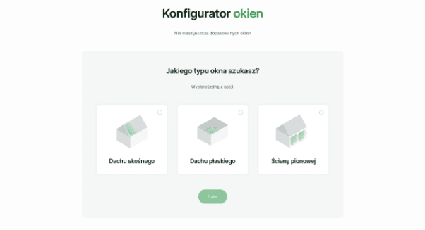
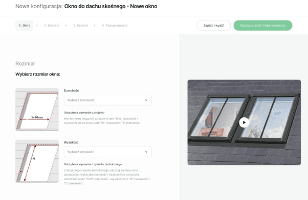
In a situation like this a configurator works much better. Not as a sales gimmick, but as an alternative entry point into the offer. A good configurator does not ask about technical details right away. First it guides the user through their context: where the product will be used, what problem it should solve, what the constraints are, what has already been chosen and what still needs to be selected.
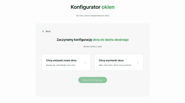
In practice such a process can replace a good part of the educational content on the site. Instead of expecting the user to read guides, compare categories and draw conclusions on their own, the system leads them step by step to a final recommendation.
Three elements matter here.
First, plain language and visual choices. If the user does not know the industry, they should not have to decide based on technical parameters alone. Pictograms, contextual photos and short explanations lower the barrier to entry.
Second, dependency logic. If one answer rules out a later option, the system should show it clearly. A “selection unavailable” message is not enough. The user should know which earlier decision caused the block and where they can change it.
Third, one specific recommendation. A configurator that ends by showing ten similar products often just moves the problem somewhere else. The user went through the process to get an answer, not another list to analyze.
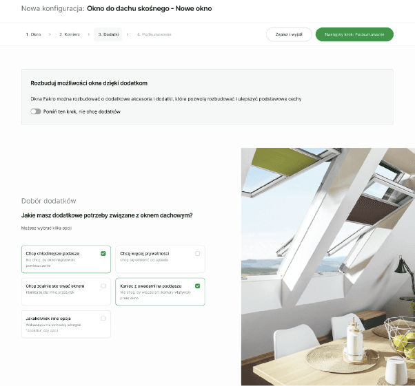
A well designed configurator can also handle complementary sales (cross-sell / up-sell), but only when it does it at the right moment. First we help choose the main product. Only then do we show accessories, premium variants or add-ons that improve comfort of use.
As a result the user does not leave with the product alone, but with a ready set of decisions. They can download a summary, come back to the configuration later, compare a few variants or move on to the distributor’s card.
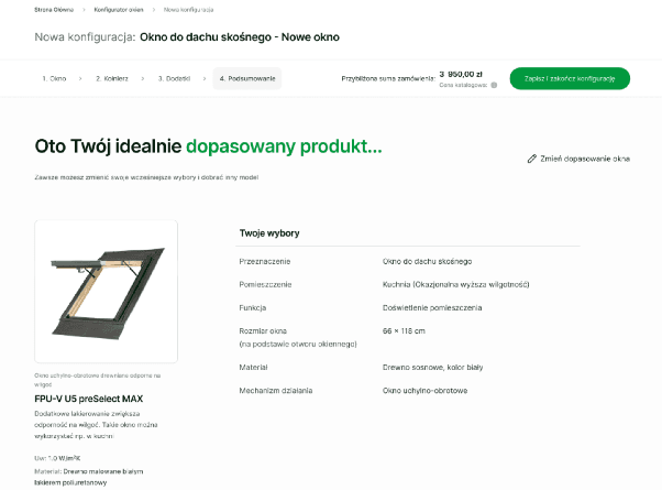
This is especially important in industries where the decision does not happen right away. The user comes back to the topic after a few days, consults the choice, shows it to a contractor, a partner, a client or an investor.
“Where to buy” in the context of a decision
On many manufacturer sites the “Where to buy” section is a separate part of the site.
That works well for a user with a general intent: they want to find the nearest showroom, point of sale or distributor. It is not enough, however, for a user who has just chosen a specific model.
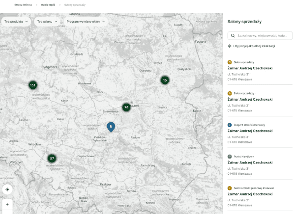
After going through the product card, the comparison or the configurator, a very practical question shows up: “Where can I buy exactly this product?”. If the user only gets a map of all the points, they still do not know whether a given model is available. They do not know whether they can see it on display. They do not know whether to drive to the showroom or call first.
That is why it is worth separating two scenarios. The first is a global distribution map. The user can search by location, filter points, check opening hours and contact details, and get directions. The second is a contextual entry from the product card. Clicking “See and buy this product” should not push the user out to the general map. It is better when it opens a panel with a list of points matched to the specific model.
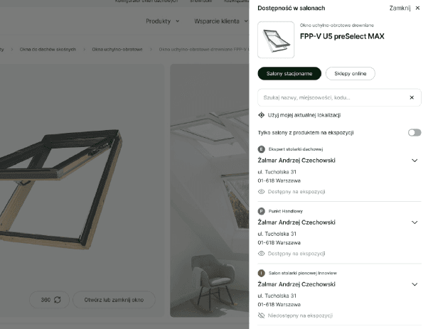
Even better if the list shows a clear status:
- product available to order,
- product available on display,
- option to buy online.
It is a small difference in the interface, but a big difference in the experience. The user does not have to call, ask around and confirm. They know where to go and what to expect.
For the manufacturer it is an extra safeguard for the purchase path. If the user leaves for Google after choosing a product, they may run into a competitor there, an outdated point of sale or a salesperson who will redirect them to another brand.
The product card is not only for the end customer
In many manufacturing companies the product card tries to serve everyone at once: the end customer, the architect, the installer, the distributor, the service technician and the purchasing department. The result is content that is “everything for everyone”.
A good solution is to carve out a separate section for professionals on the product card. Not as a separate site detached from the product, but as a clearly marked block within the same card.
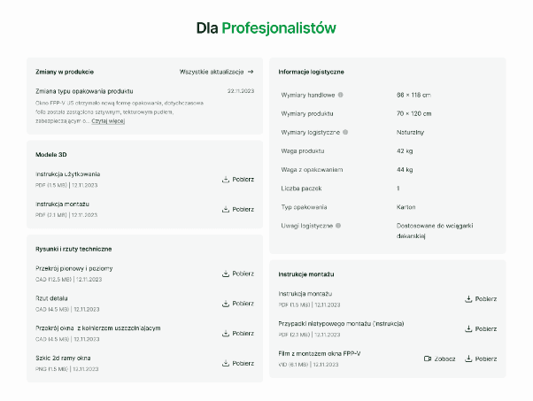
A specialist does not need a marketing description. Most often they are looking for specifics: documentation, 3D models, technical drawings, installation manuals, certificates, logistics data or information about changes to the product.
If they have to look for it in a separate file library, they lose context. If a link takes them to a “bag of all the manuals”, they lose time. If they cannot find the logistics data, they call the manufacturer.
A well designed section for professionals should work like a quick working panel next to the specific model.
In one place there should be:
- technical documents,
- 3D and CAD models,
- installation manuals,
- instructional videos,
- logistics information,
- file update dates,
- notices about changes to the product.
This matters, because a specialist often works in a completely different context than the end customer. The architect is in a project. The contractor is on site. The service technician may be dealing with an emergency. In those conditions there is no time to search through the whole site.
What counts here is access to the right file in a few clicks.
Search can be more than a field to type a phrase into
On a manufacturer’s site, search is often treated as an add-on. It is supposed to find a product, an article or a category. Yet for some users it can become the main working tool. Especially when a user comes back to the same products and documents over and over. This applies to architects, contractors, salespeople, service technicians and trade partners.
That is why search should not start from an empty field.
When the user clicks the magnifier icon, you can show them recent searches and recently viewed products, even when no user account has been created. This light browser-side memory works as a working stash. It is especially useful on sites that have no login, no cart and no favorites list.
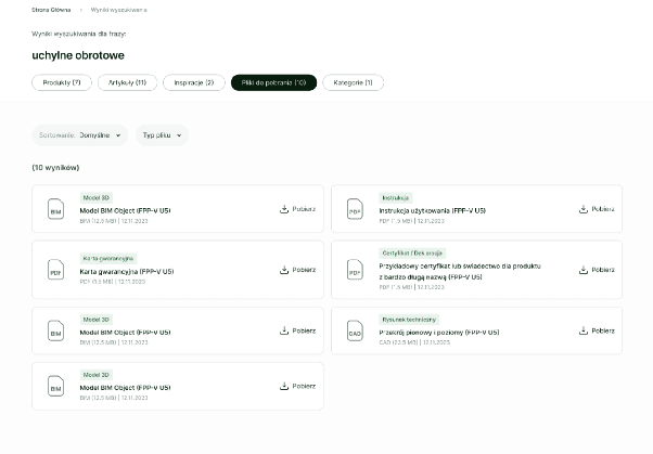
It is equally important to split results by type. The investor usually looks for a product or inspiration. The specialist often looks for a file. If everything lands in one stream of results, both groups get information noise. That is why a separate “Downloads” tab can matter more to a professional than the product list itself.
A file should be described clearly: type, format, size, update date and a download button without having to open the product card. For the user this saves time. For the manufacturer it means fewer questions to customer service and the technical department.
A separate portal for the specialist
Some groups of users have intents specific enough that a section on the product card is not enough on its own.
Architects, designers, installers or technical partners are a good example. These users do not come to the site for the classic product narrative. They do not want to go through the end customer’s path. They want to get their tools.
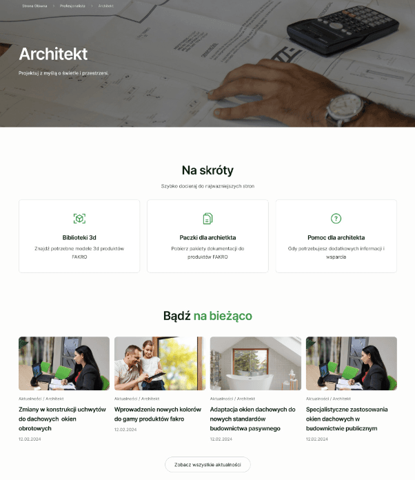
That is why it is worth creating a separate entry for them, though it does not have to mean a separate site. Often a portal within the same site is enough, one that groups the most important resources:
- documentation,
- CAD/BIM libraries,
- design inspiration,
- training,
- industry news,
- contact to dedicated advisors,
- case studies tied to specific products.
A portal like this works as the specialist’s “desk”. They do not have to start from the main navigation every time. They go into their place and immediately see shortcuts to what they use most often.
Contact matters in particular. A general form or a number to customer service is often not enough. A professional wants to know who specifically is responsible for their region or type of case. A name, a photo, a phone number and an email build more trust than an anonymous “we will get back to you”. In many industries, having the contact to the right person decides whether the user moves forward or gives up.
A good catalog does not show everything at once
The most important lesson from projects like these is simple: a product catalog should not be a collection of information for everyone.
It should recognize different intents.
The investor needs guidance, simplification and certainty in the choice. The specialist needs speed, documentation and access to data. The distributor needs information about availability and specific models. The architect needs files, inspiration, contact and industry credibility.
If we show each of these groups the same page in the same way, we end up with a compromise. And a compromise in a product catalog usually means more effort on the user’s side.
A better approach is to design paths around real tasks. Not “how do we present the offer?”, but:
- how do we help choose the right product?
- how do we show the closest alternatives?
- how do we explain parameters without sending people off to guides?
- how do we lead the user to a distributor?
- how do we give the specialist documentation without contacting customer service?
- how do we shorten recurring tasks?
- how do we keep the user in our funnel instead of pushing them out to Google?
Because a well designed manufacturer’s site does not just inform. It also works for the user, organizes the decision, reduces uncertainty and shortens the path to action.