How turning a product into an app employees enjoy fuels business growth
11 Dec 2023
Why the UX of work tools falls behind modern standards?
Enterprise apps and work tools have long been known to be visually dull and cumbersome. Since their primary goal is to support employees in critical work processes and accomplish complex tasks, their UX and aesthetic appearance have been secondary. However, more and more companies are understanding the importance of good UX for enterprise users – and here’s why.
As consumers, we have become accustomed to intuitive, simple apps that are supposed to help us in our daily lives: Ordering food and taxis, managing our finances or tracking exercise progress. If we’re not happy with the app – because it’s slow, doesn’t allow instant payments or has some clunky features – we simply switch providers and look for another product.
Most companies know excellent UX is crucial for paying customers but struggle to integrate this value into their internal audience. Many enterprise apps are still labelled outdated and anything but user-friendly. Why is it so? Shouldn’t it go without saying that work tools offer a good user experience and consequently increase the productivity and efficiency of internal processes?
Why the UX of work tools falls behind modern standards?
The case is not so simple. The discrepancy between the usability of consumer apps and enterprise applications arises from the specificity of internal tools. Enterprise software is often tailored to specific workflows that are highly complex, multi-layered and rarely linear. It must contain long forms, charts, tables and data and is used by professionals (as opposed to consumer apps that can be downloaded by anyone).
These specific workflows mean that most companies require custom solutions that are quite expensive to build and maintain. The long-term benefits of increased productivity and employee satisfaction may not be immediately apparent, making it difficult for decision-makers to prioritise UX investments over other necessary needs.
On top of that, many companies are struggling with legacy systems that have been used for years. Integrating modern, user-centric applications into these legacy systems can be hard, and compatibility issues and data migration problems often arise when companies try to modernise their internal tools.
Finally, designing user-friendly enterprise applications requires specialised skills beyond traditional software development, and many companies lack internal expertise in user-centred design. This lack of expertise can lead to developing tools that work well but are not user-friendly, perpetuating the cycle of dissatisfaction among employees. If the company does not value the employee experience highly, the UX of the apps they use will become a lower priority. And unlike in the consumer sector, users are not spoiled for choice here: they can not simply go to the app store and find an alternative if they don’t like the application. At best, employees develop workarounds to supplement their work if their software is inadequate.
Read also: 13 numbers that show measurable results behind the improved publishing workflow

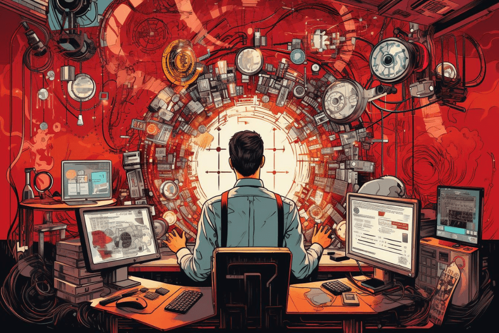
The discrepancy between the usability of consumer apps and enterprise applications arises from the specificity of internal tools (image generated by Midjourney).
The risks of poor internal app’s UX
Poorly designed apps have a negative impact on the workplace in many ways. They can lead to lower employee engagement, affecting productivity and frustration. In some cases, this can even incline employees to seek a better working environment.
In some cases, applications with poor UX are more prone to user error, leading to various problems, from inaccurate data to disrupted workflows. Higher error rates reduce overall efficiency, and lead to information silos and communication breakdowns. An unreliable work tool also means that employees lose confidence in the technology and become more resistant to new products or changes in the business.
Neglecting a user-centred design often leads to low adoption rates and requires extensive training to bring employees up to speed. This results in additional costs and wastes valuable time that could be better spent on productive tasks.
What you gain with user-friendly work tools
The design and functionality of workplace applications are more than just cosmetic considerations; they are strategic assets that can profoundly impact a business's overall efficiency and success. This is why the principles that drive consumer app success – intuitive interfaces, streamlined workflows, and an emphasis on user feedback – are equally applicable within an organisational context.
Let’s now look at the key benefits of good UX in enterprise tools and search for real use cases that illustrate them.
1) Streamlined processes, improved productivity and efficiency
According to research, 69% of customers prefer to solve as many problems as possible by using self-service options – so, logically, people want the same option in the workplace.
For example, a well-designed scheduling function can make it easy for employees to view and manage their schedules, request time off and swap shifts with their colleagues, reducing the amount of time and effort spent on these tasks.
In one of the apps we reviewed, employees were frustrated that they had to log in to the internal app to check the work schedule (there was no auto-login or FaceID feature) and that requesting a shift swap took a long sequence of clicks. In this case, adding an automatic login feature and an efficient self-service system for requesting and confirming shift changes could greatly help users process their requests and reduce the time spent juggling the work schedule.
Another example is the app we have developed for a parcel delivery and e-commerce company, DPD and its couriers. As couriers often work in difficult conditions, at night or in places without mobile reception, we introduced features to support them in their daily tasks. For example, a flashlight turns on at night every time a courier scans a barcode on a parcel to improve and speed up the process. The app also works offline and synchronises all data once coverage is restored.
In another project, a holistic digital transformation of the back office system at a media tech holding Wirtualna Polska , we introduced a number of features in the content management system for journalists. Thanks to improvements in several workflows, the average time to publish urgent news was reduced by 70%, and the efficiency of daily content production increased by 10%.

Intuitive UX design reduces costs of training of new employees (image by Midjourney).
2) Reduced training time and costs
User-centric design simplifies employee onboarding and allows newcomers to find their way around more quickly, reducing the need for extensive training programs. This accelerates the integration of new hires into the workforce and minimises the associated training costs. People don’t spend weeks learning new systems and constantly ask colleagues how to do something. The more intuitive the interface, the easier it's to learn and use, which can mean significant time and cost optimisation.
This is what happened in our project for Kadme – one of the leading software vendors in the hydrocarbons industry. Their apps are designed mostly for data specialists and analysts within their portfolio – but geologists and field experts needed an app that would not require specialised knowledge about data analysis and a significantly lower learning curve than the previous solution.
We faced a similar challenge when designing the app for DPD. While being complex and covering over 40 work processes, it had to be easy to use by couriers who are not always familiar with advanced technology because of their age.
3) Reduced errors
Apps with poor UX can be frustrating and prone to errors, leading to employee frustration, mistakes, and potential interruptions to their companies' service. Clear instructions, visual indicators, and intuitive interactions can help employees complete tasks accurately and efficiently, reducing the need for repeated attempts and corrections.
This can be particularly important in financial institutions where employees process thousands of customer transactions. A cluttered interface with complex navigation and a lack of clear prompts for transaction verification can result in frequent errors, leading to financial discrepancies and customer dissatisfaction.
By adopting a user-centric design approach, the app can be redesigned to improve overall usability. The new interface could, for example, incorporate visual cues, such as colour-coded transaction statuses and clear confirmation prompts. We also keep in mind shapes so as not to discriminate against people with eye disorders. This way, employees are less likely to make mistakes, leading directly to decreased customer complaints related to transaction errors and improved customer satisfaction.
Another industry where errors are especially costly is health care. In one case described by Finnish media in 2022, the complexity of the hospital information system has contributed to the wrong medication, threatening customer and patient safety.
4) User adoption and satisfaction
The success of any workplace tool depends on its adoption by users. Well-designed applications are more likely to be embraced by employees due to their ease of use and the positive experiences they offer. High user satisfaction not only contributes to increased productivity but also minimises the resistance often associated with the introduction of new technologies.
In the case study of the Indian driver’s app TRAX , the author points out an interesting feature that was added to the app – the break state. During the discovery process, it turned out that some drivers intentionally switched their internet off to avoid receiving orders. The team designing the app realised that the scorching heat was why some of them got extremely tired and needed a break from delivering orders. Since this was recognised as a serious pain point, a “break state” was introduced in the app, allowing the user to take occasional breaks when tired in between working hours.
Need an expert in work app design?
When people have a positive experience at work, they are more likely to be engaged, motivated and committed to their work. This, in turn, helps your business thrive and achieve its goals. We understand that digital transformation is a serious project, but we can help you make a seamless transition – we have over 17 years of experience in this field.
Our thorough discovery process is the cornerstone of our approach. We take a close look at our clients’ unique challenges and goals and ensure that the solutions we develop are not only functional but also fit into their workflows. Through this careful process, we pave the way for a user-centred design that goes beyond aesthetics and addresses employees' core needs.
If you want your work tools to help drive your business to unprecedented success, call us. You might also want to check how we work and the projects in our portfolio.


